Author: Ann Jackson
-
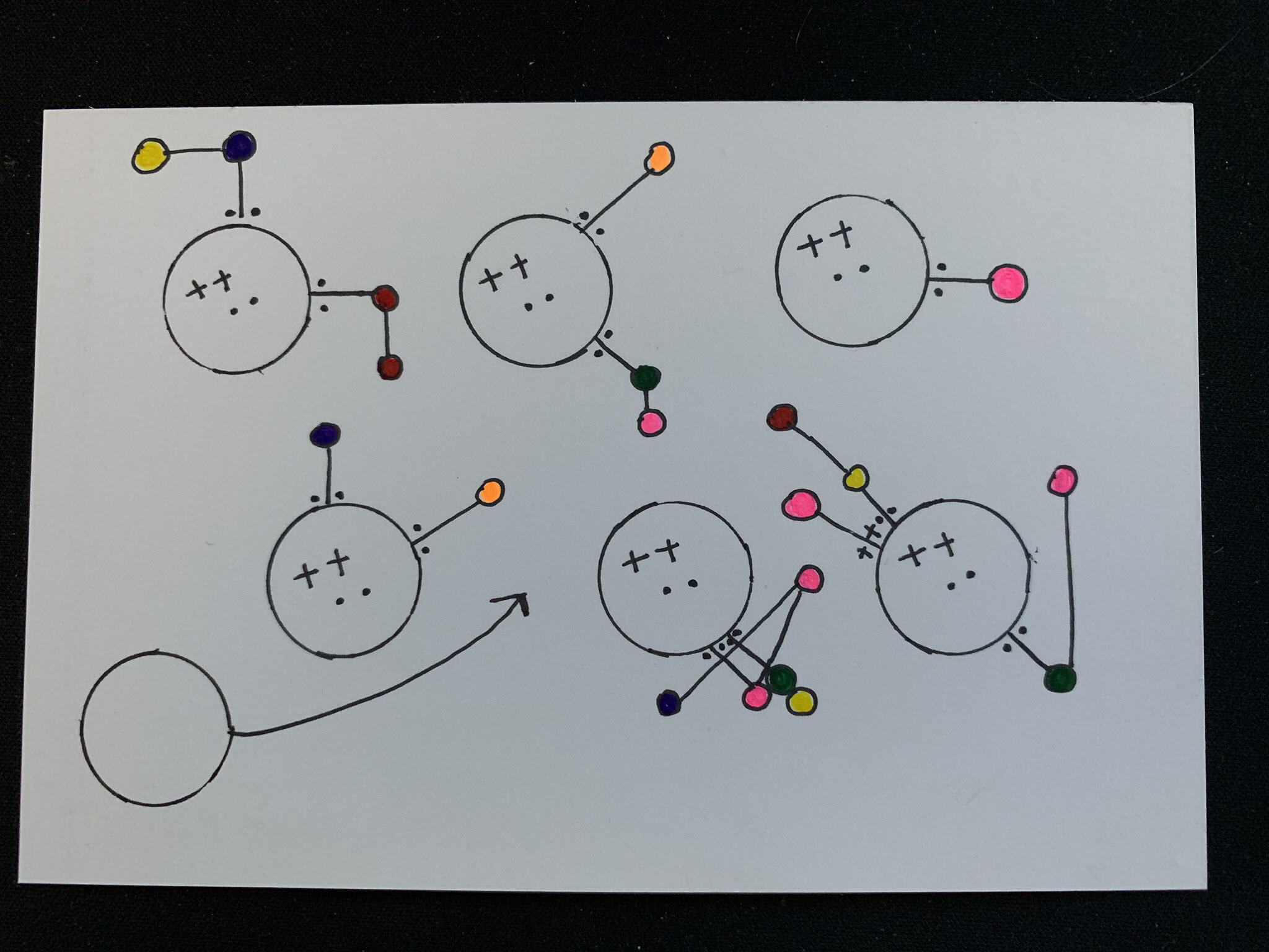
Dear Data 2019 – Week 2, Transportation
It’s time for week two of the data postcard project Sarah Bartlett and I are working on this year. During this week our focus was spent on transportation, essentially how we get to different places. I live in the suburbs of Phoenix, AZ, tend to work from home, and drive to most places (read that…
-
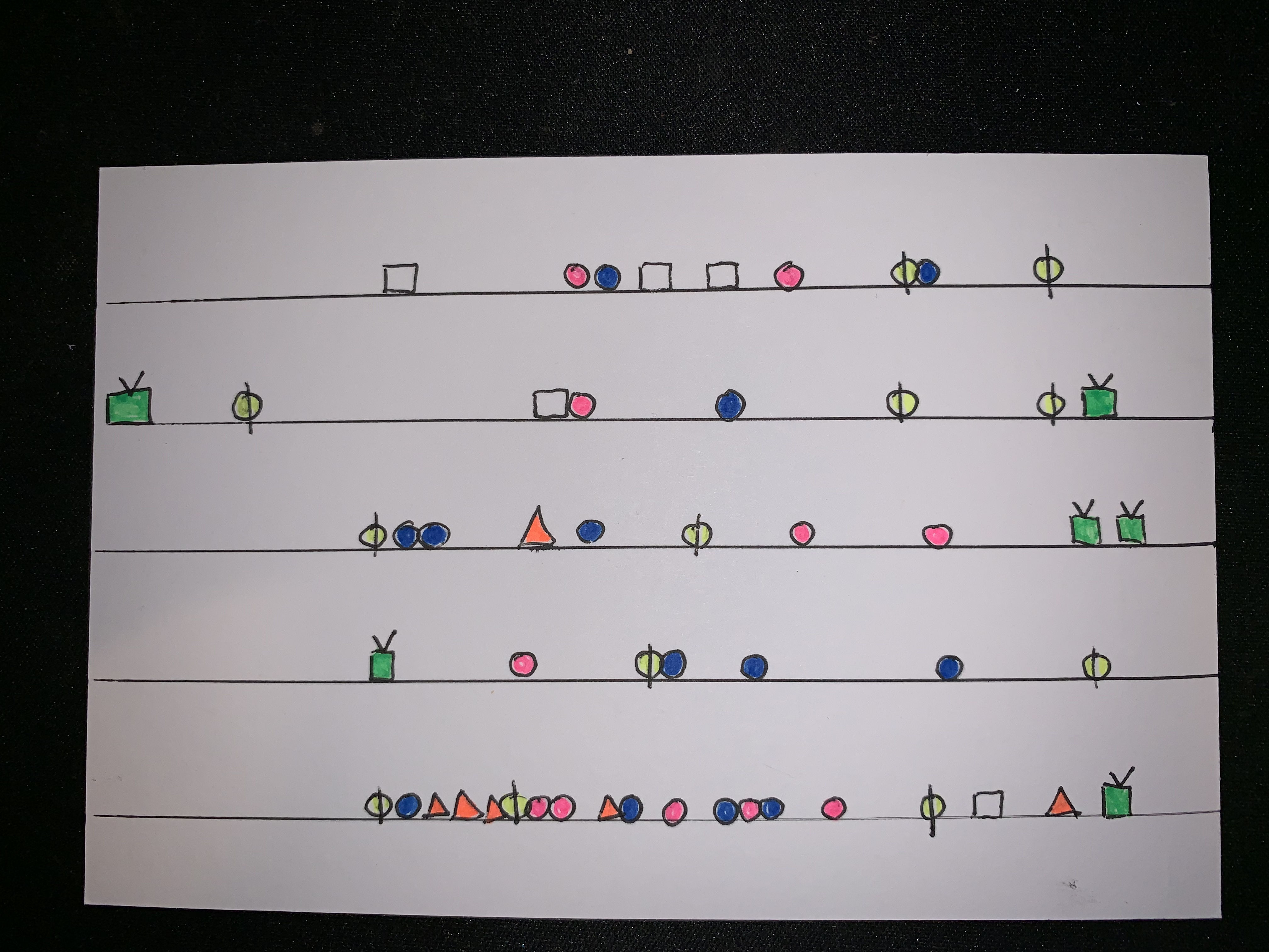
Dear Data 2019 – Week 1, Clocks
Late last year Sarah Bartlett and I announced on the Hashtag Analytics podcast that we would be doing our own version of Giorgia Lupi and Stefanie Posavec’s data postcard project, dear data. The project is pretty simple – each week we record personal data, visualization the results via sketching, and send our postcards to each…
-
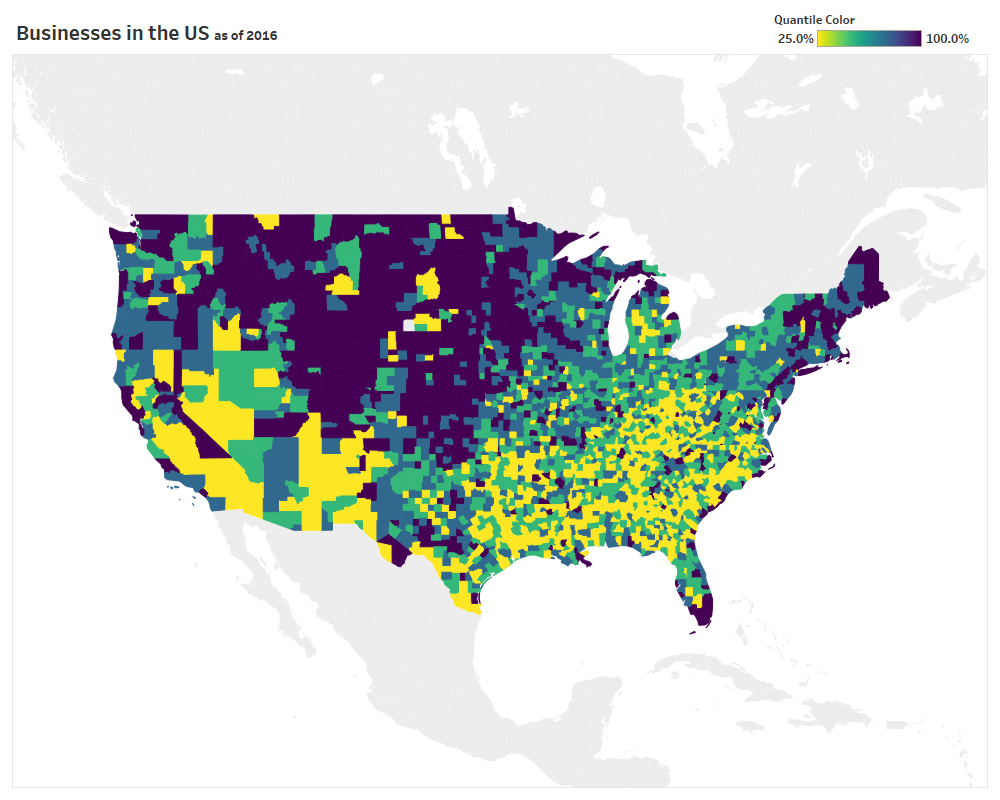
Dynamic Quantile Map Coloring in Tableau Desktop
Last week at Tableau’s customer conference (TC18) in New Orleans I had the pleasure of speaking in three different sessions, all extremely hands on in Tableau Desktop. Two of the sessions were focused exclusively on tips and tricks (to make you smarter and faster), so I wanted to take the time to slow down and…
-
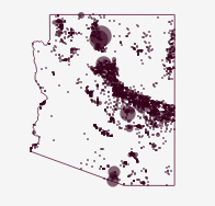
Without Water an Iron Viz feeder
Jump directly to the viz At the time of writing it is 100°F outside my window in Arizona and climbing. It’s also August and we’re right in the middle of feeder round 3 for Tableau Public’s Iron Viz contest. Appropriately timed, the theme for this round is water. So it’s only fitting that my submission…
-
Building Out Your Analytics Brand
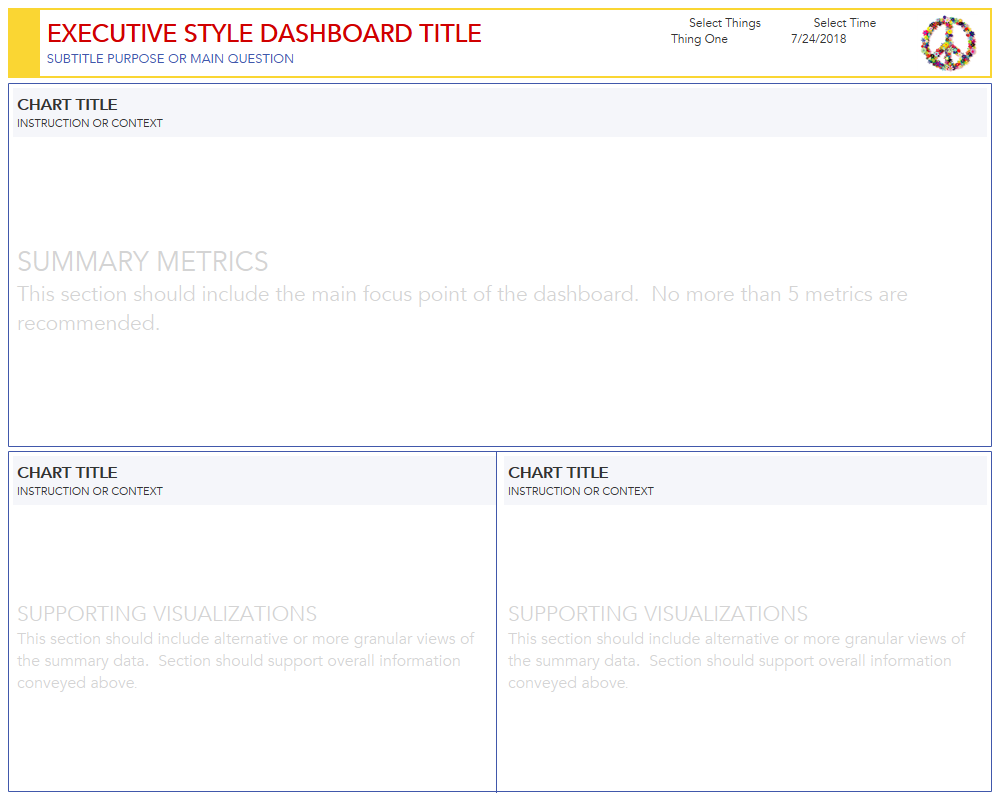
We all know the value of having a brand, whether it’s your personal brand or your organization’s brand, it’s the differentiator that distinguishes you from others. It’s what makes us trust certain companies, emulate celebrities, and visit trendy places. A great brand encompasses a wide array of important components – style, voice, preferences, value systems,…
-
Building an Interactive Visual Resume using Tableau
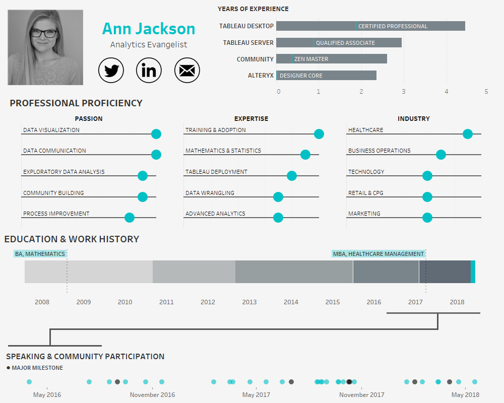
In the age of the connected professional world it’s important to distinguish and differentiate yourself. When it comes to the visual analytics space, a great way to do that is an interactive resume. Building out a resume in Tableau and posting it on Tableau Public allows prospective employers to get firsthand insight into your skills…
-
Aiming for data-driven? Don’t forget the people.
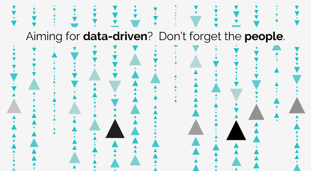
I’ve been in this situation too much recently: I’m having a conversation with someone about the state of analytics and there’s a sudden turn to product feature comparison. What follows are a series of strengths and weaknesses bulletpoints. The kicker? Often the points are focused on what the tool can do, or how the tool…
-
Blending Visualizations of Different Sizes
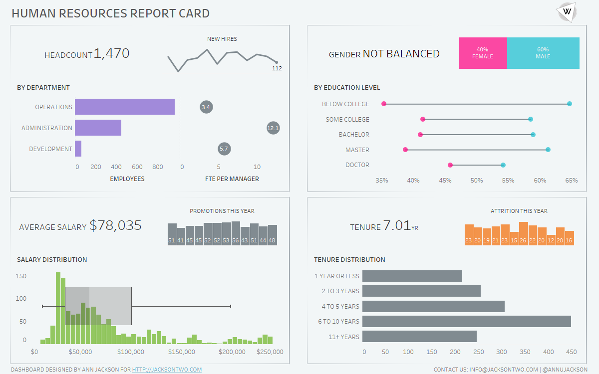
One of my favorite visualizations is the sparkline – I always appreciated how they are described by Edward Tufte “data-intense, design-simple, word-sized graphics.” Meaning the chart gets right to the point: conveying a high amount of information without sacrificing real estate. I’ve found this approach works really well when trying to convey different levels of…
-
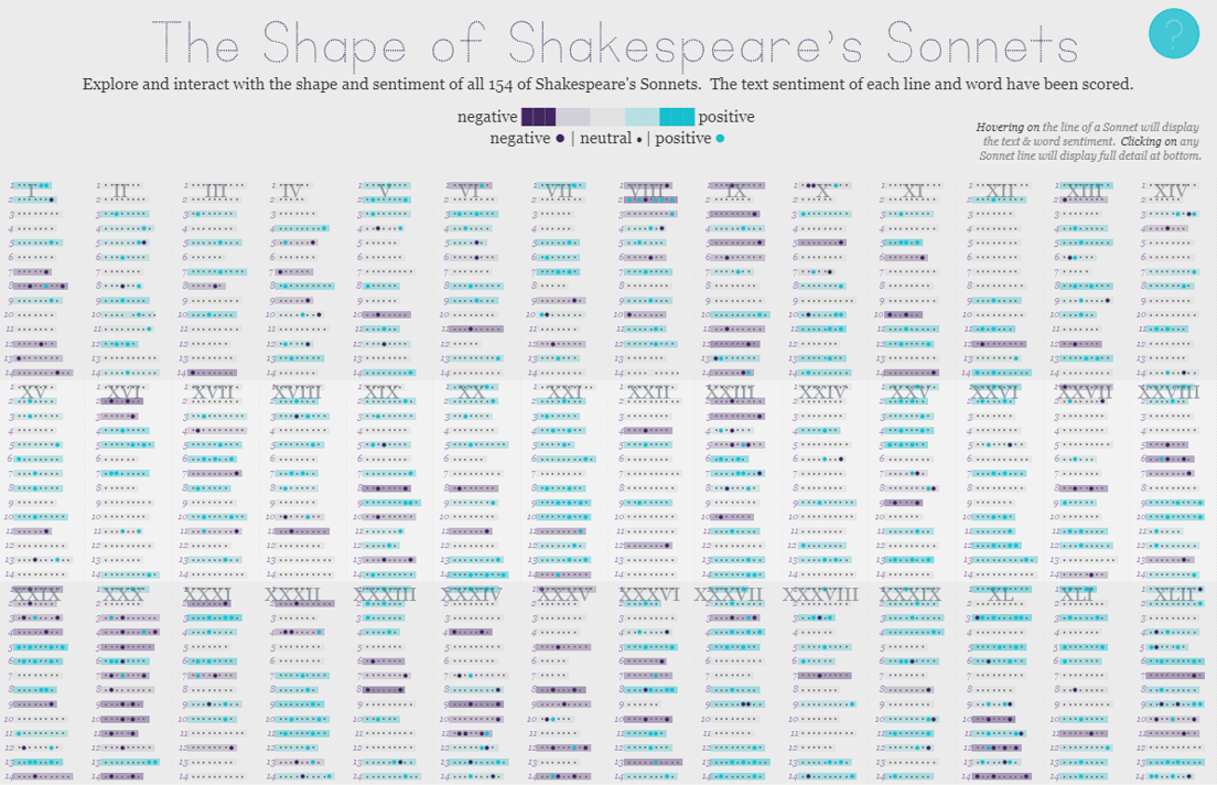
The Shape of Shakespeare’s Sonnets | #IronViz Books & Literature
Jump directly to the viz If it’s springtime that can only mean that it’s time to begin the feeder rounds for Tableau’s Iron Viz contest. The kick-off global theme for the first feeder is books & literature, a massive topic with lots of room for interpretation. So without further delay, I’m excited to share my…
-
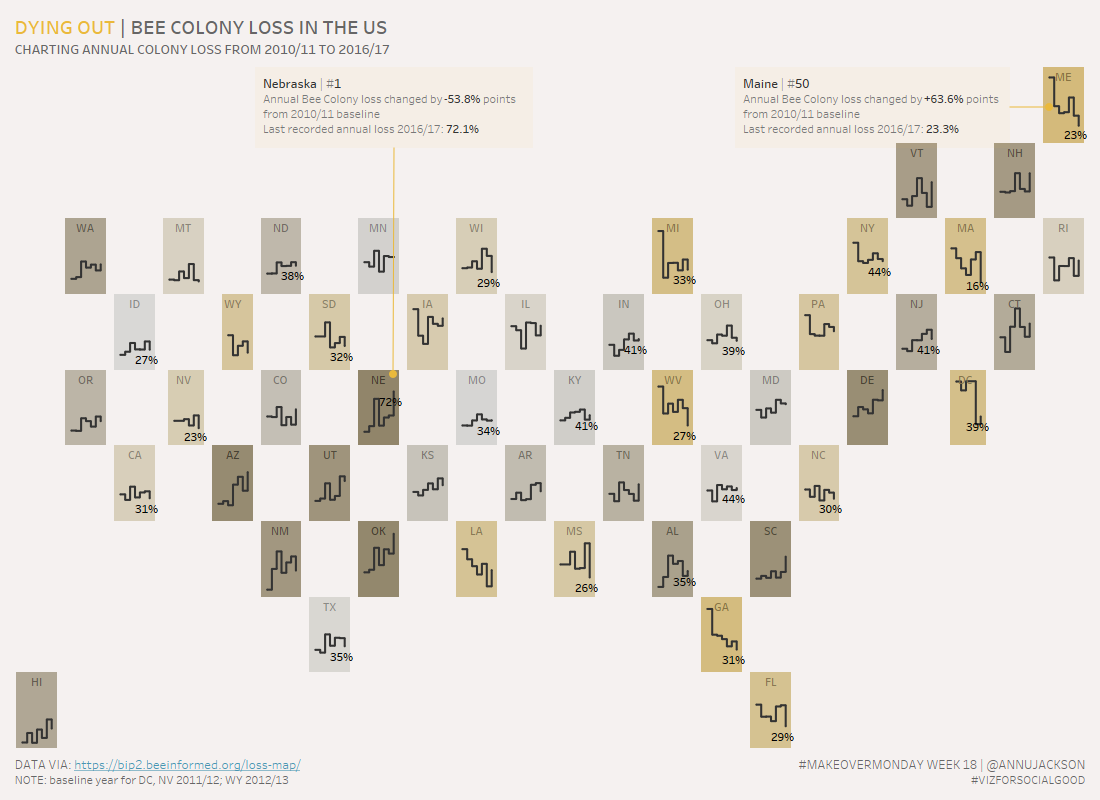
Dying Out, Bee Colony Loss in US | #MakeoverMonday Week 18
Week 18 of Makeover Monday tackles the issue of the declining bee population in the United States. Data was provided by BeeInformed and the re-visualization is in conjunction with Viz for Social Good. Unfamiliar with a few of the terms – check out their websites to learn what Makeover Monday and Viz for Social Good…