Category: Personal
-
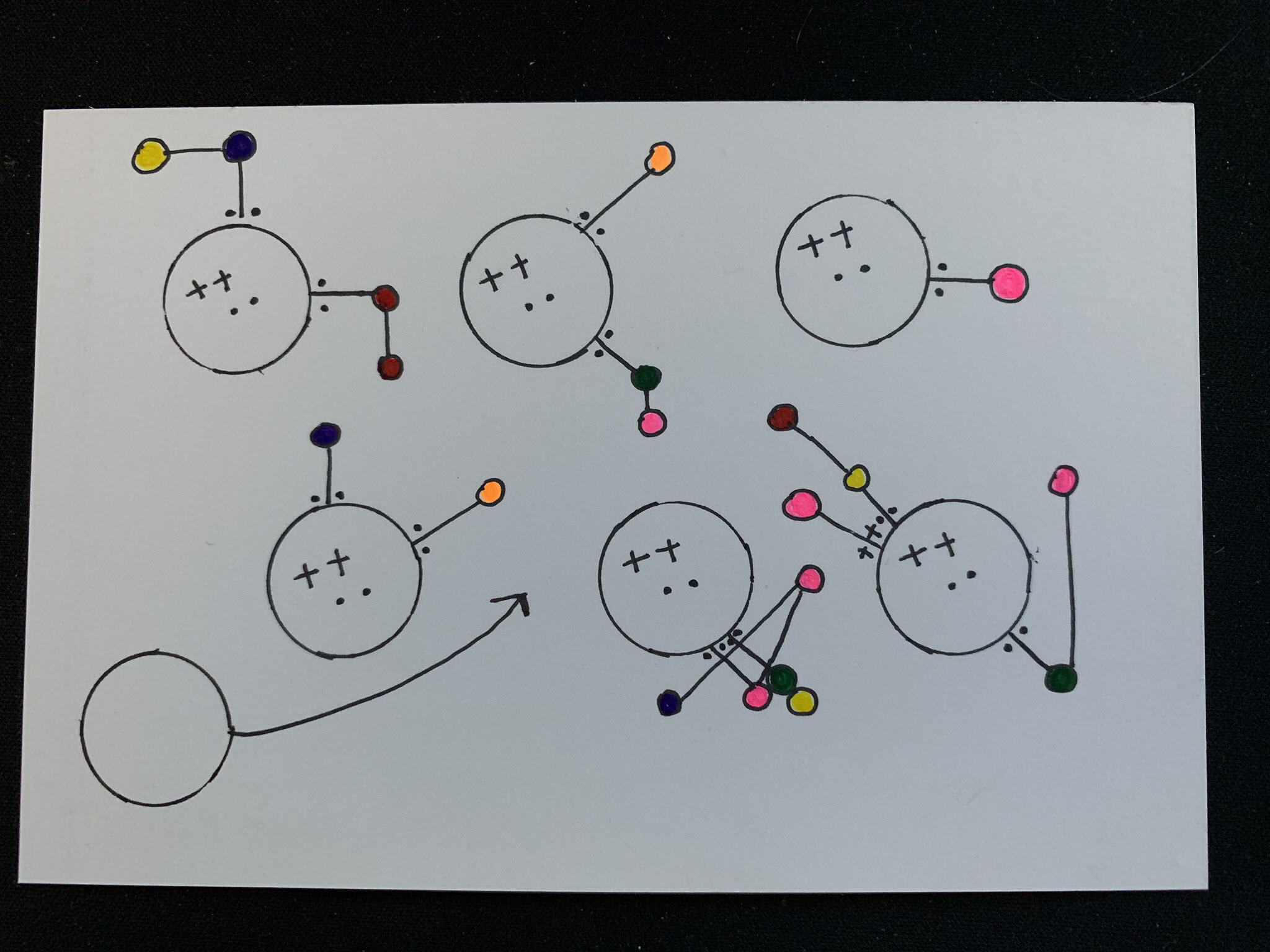
Dear Data 2019 – Week 6, Physical Contact
Week 6 postcards of the data project Sarah Bartlett and I are working on are here and I couldn’t be more excited. The theme of week 6 was physical contact. During the original project Giorgia and Stefanie tracked people they touched and who touched them, but I decided to switch things up and include my…
-
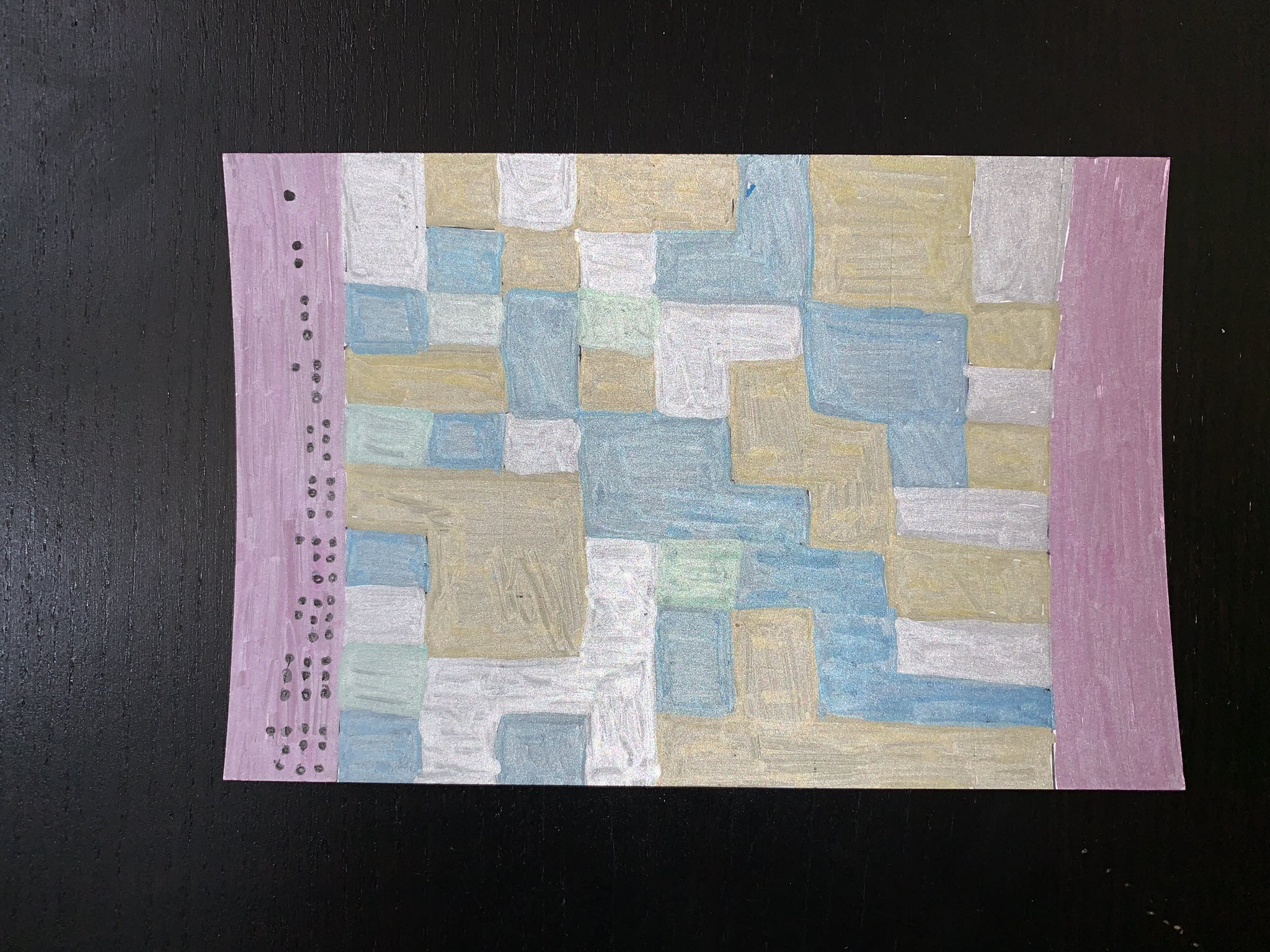
Dear Data 2019 – Week 4, Mirrors
Week 4 of the data postcard project Sarah Bartlett and I are working on this year is here. We still have yet to reach consistent timing for postcard arrival. Sarah usually receives mine 2 days or more before I receive hers, but this week we were only one day apart. Week 4’s topic was all…
-
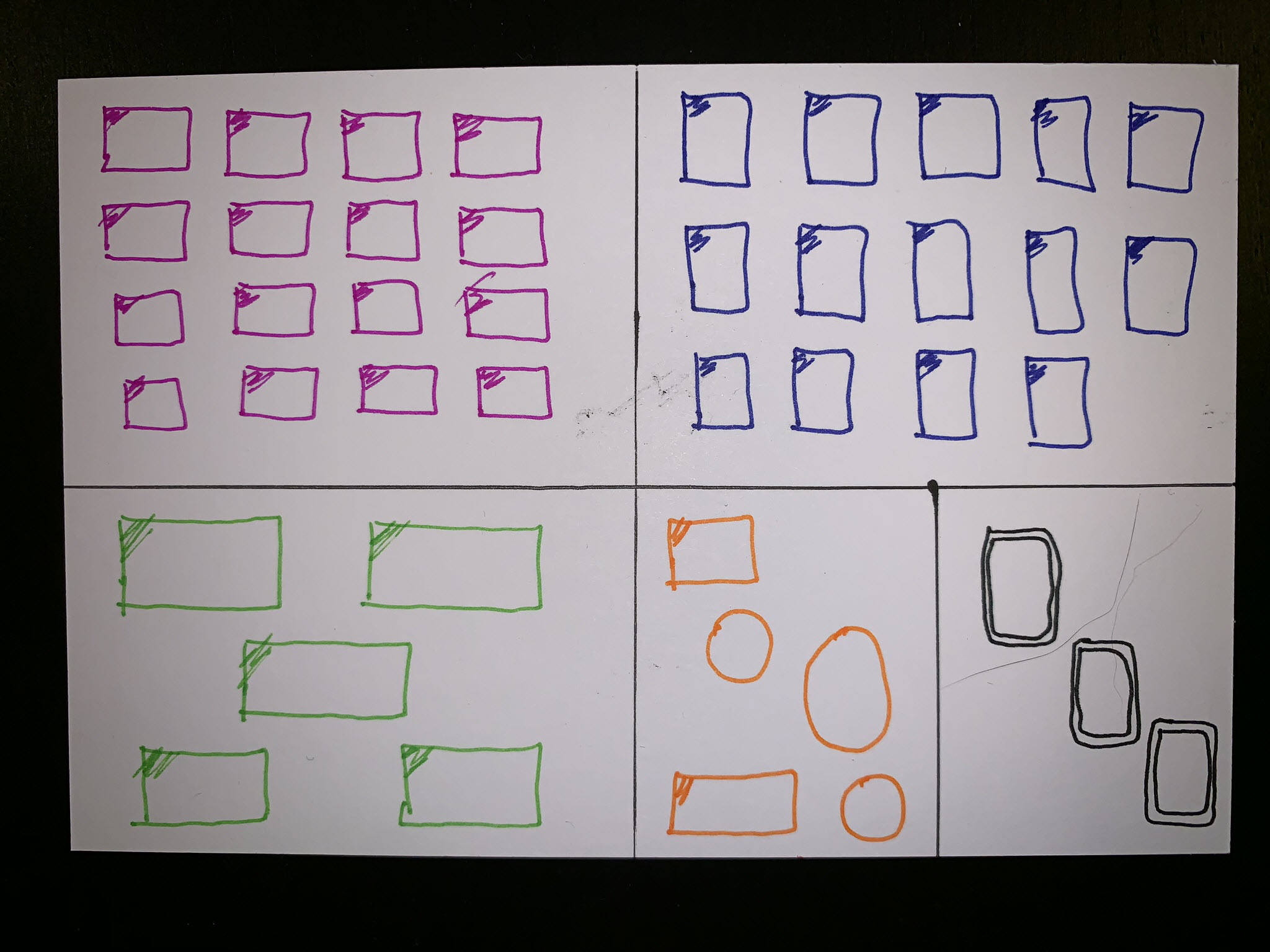
Dear Data 2019 – Week 3, Thank Yous
Week 3 postcards for the data project Sarah Bartlett and I are working on this year have finally reached their destinations. I think we both felt that the mail was slower than normal, perhaps due to the abnormally cold weather here in the US. Week 3’s topic was tracking how often we say “thank you.”…
-
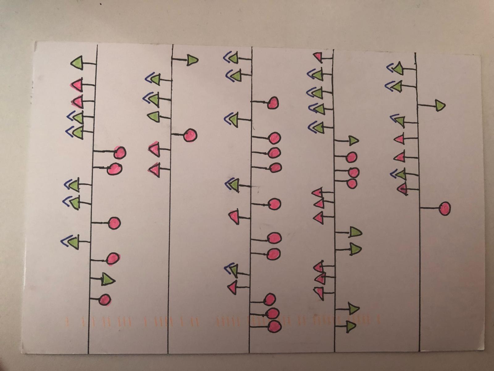
Dear Data 2019 – Week 2, Transportation
It’s time for week two of the data postcard project Sarah Bartlett and I are working on this year. During this week our focus was spent on transportation, essentially how we get to different places. I live in the suburbs of Phoenix, AZ, tend to work from home, and drive to most places (read that…
-
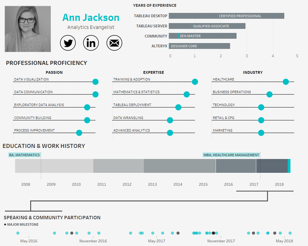
Building an Interactive Visual Resume using Tableau
In the age of the connected professional world it’s important to distinguish and differentiate yourself. When it comes to the visual analytics space, a great way to do that is an interactive resume. Building out a resume in Tableau and posting it on Tableau Public allows prospective employers to get firsthand insight into your skills…
-
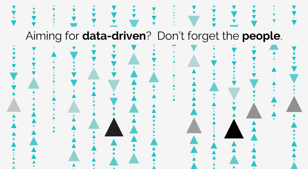
Aiming for data-driven? Don’t forget the people.
I’ve been in this situation too much recently: I’m having a conversation with someone about the state of analytics and there’s a sudden turn to product feature comparison. What follows are a series of strengths and weaknesses bulletpoints. The kicker? Often the points are focused on what the tool can do, or how the tool…
-

Go Give Back: Tableau Foundation Service Corp
Recently I had the opportunity to finish my first Tableau Foundation Service Corp consult. Something that’s been 2 years in the making. Since my early exposure to the Tableau community I’ve wanted to be actively involved in the Tableau Foundation – so I was delighted when I received an email in November expressing that they’ve…
-
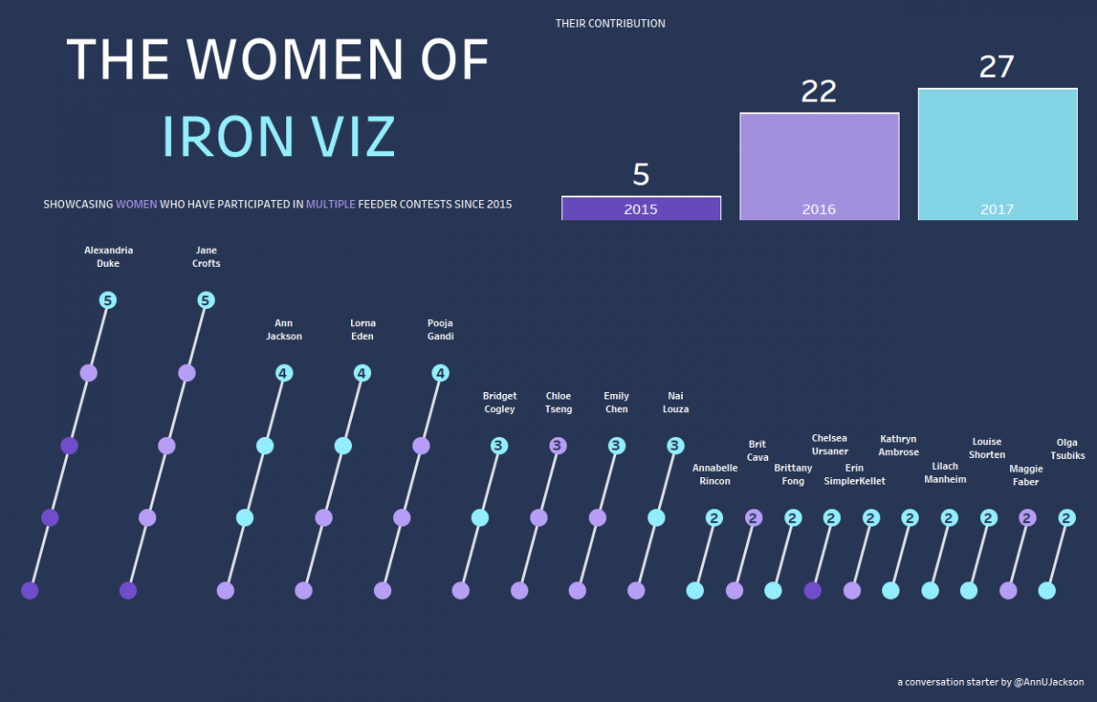
A follow up to The Women of #IronViz
It’s now 5 days removed from the Tableau Conference (#data17) and the topic of women in data visualization and the particularly pointed topic of women competing in Tableau’s #IronViz competition is still fresh on everyone’s mind. First – I think it’s important to recognize how awesome the community reception of this topic has been. Putting…
-
Don’t be a Bridge, Instead be a Lock
Lately I’ve spent a lot of time pondering my role in the world of data. There’s this common phrase that we as data visualization and data analytics (BI) professionals hear all the time (and that I am guilty of saying): “I serve as the bridge between business and IT.” Well – I’m here to say…
-
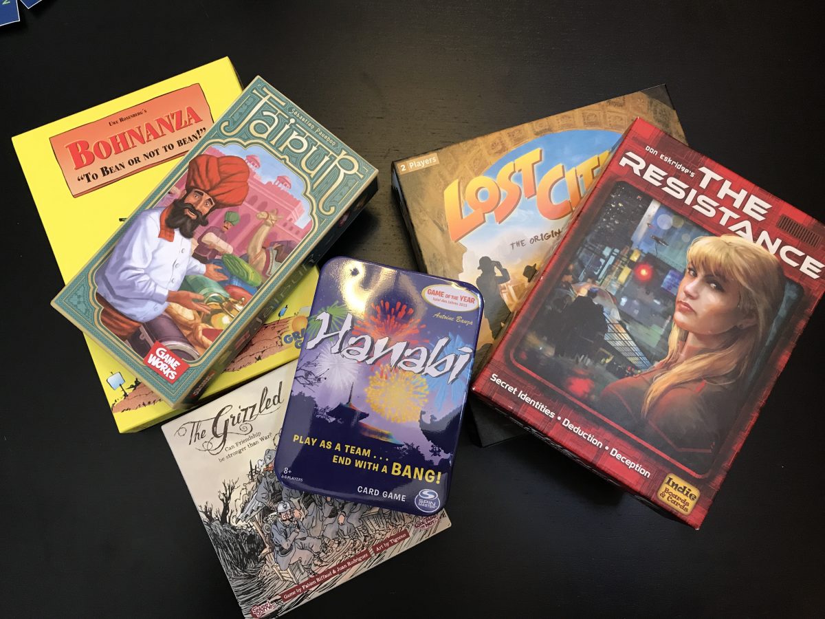
Boost Your Professional Skills via Games
Have you ever found yourself in a situation where you were looking for opportunities to get more strategic, focus on communication skills, improve your ability to collaborate, or just stretch your capacity to think critically? Well I have the answer for you: pick up gaming. Let’s pause for a second and provide some background: I…