It’s been over 2 years since we wrote our original blog post on installing Tableau Server on a Linux machine, to date it remains our most trafficked blog post. Since Tableau has continued to release new versions, we decided it was time to update our blog to reflect a new deployment.
Just like before, we’re starting with a fresh OS installation, still using Ubuntu LTS 16.04 (hey, it’s LTS for a reason!). We’ve upgraded our hardware, this time we’re installing on an actual data center server, an HP ProLiant ML350 Gen9 8-Port, with the following specs:
- (2) 2.6 GHz 8 Core Intel Xenon Processors with 20MB Cache (e5-2640v3)
- 128 GB Memory PC4-17000R (8 x 16GB sticks)
- 250 GB SSD
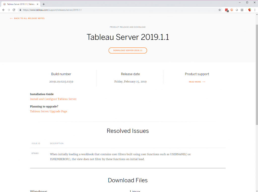
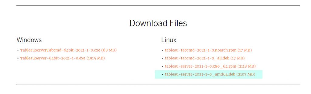
Tableau Server 2021.1 just released, so we’re installing the latest and greatest version. Since we’re on a Debian like distribution of Linux, we’ll use the .deb file type.
We still like following along to Everybody’s Install Guide that Tableau makes available. This is great for an IT generalist or someone doing a POC installation of Tableau Server. It gives you start to finish the steps you need to take and links out to many important knowledge articles along the way.
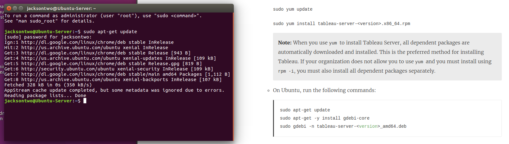
Before you get started, make sure the user you’ll be doing the installation with on the Linux machine can sudo – meaning it can perform operations like root. This will be necessary throughout the course of the installation. You’ll also want to do a general update on the OS.
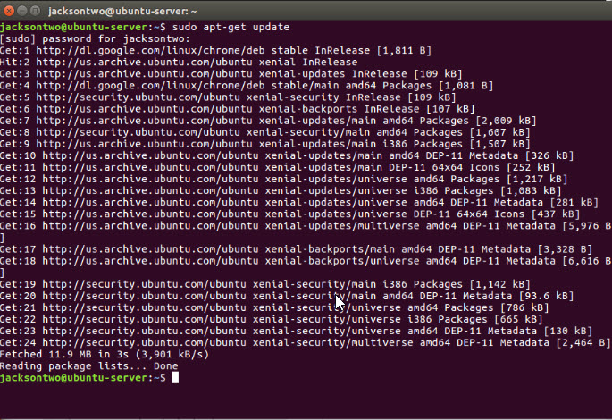
sudo apt-get updateIf you’re following along with the guide mentioned above, Step 1 of the deployment is to install the Tableau Server package and start Tableau Services Manager (TSM). Since we’ve got a version of Linux with a GUI, we did this by downloading from the webpage. If instead you are downloading onto a headless server, you’ll want to install curl and use it to download the installer. Alternatively you can use wget.
sudo apt install curl
curl -O https://downloads.tableau.com/esdalt/2021.1.0/tableau-server-2021-1-0_amd64.deb
sudo apt-get install wget
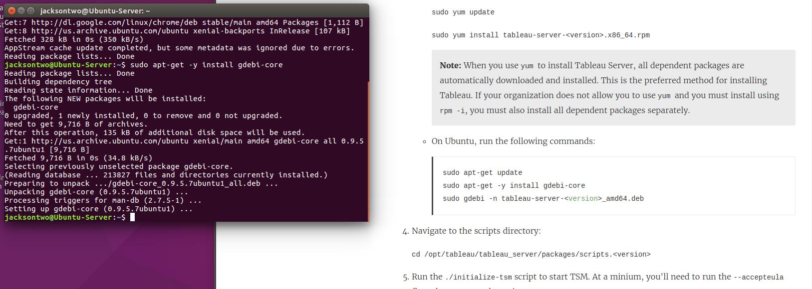
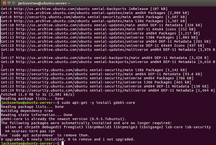
wget https://downloads.tableau.com/esdalt/2021.1.0/tableau-server-2021-1-0_amd64.debDepending on where you are within the terminal, you may want to navigate to a different folder before downloading the file. After you download the installer, but before you execute it, you’ll want to make sure you’ve got gdebi-core installed.
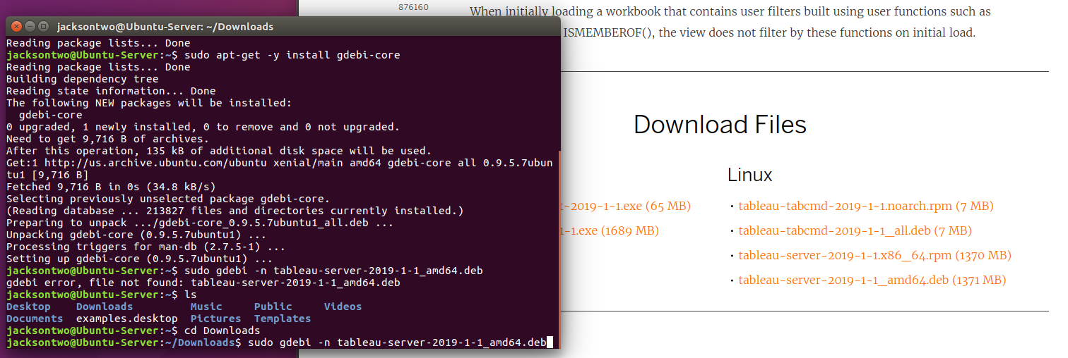
Now we’re all set and ready to actually install Tableau Server! In your terminal navigate to the folder where the file was saved.
cd Downloads
sudo gdebi -n tableau-server-2021-1-0_amd64.deb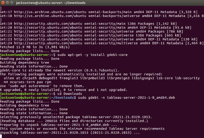
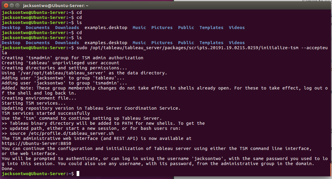
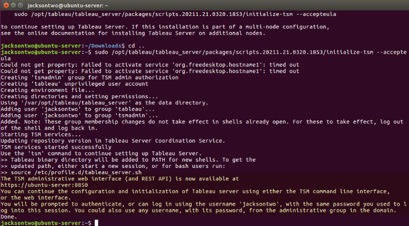
From here, you’ll open the package and unpack Tableau Server. Tableau does you a solid and will provide the exact location and command to run the installation script. Don’t forget that tab-complete is your friend in the terminal.
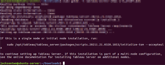
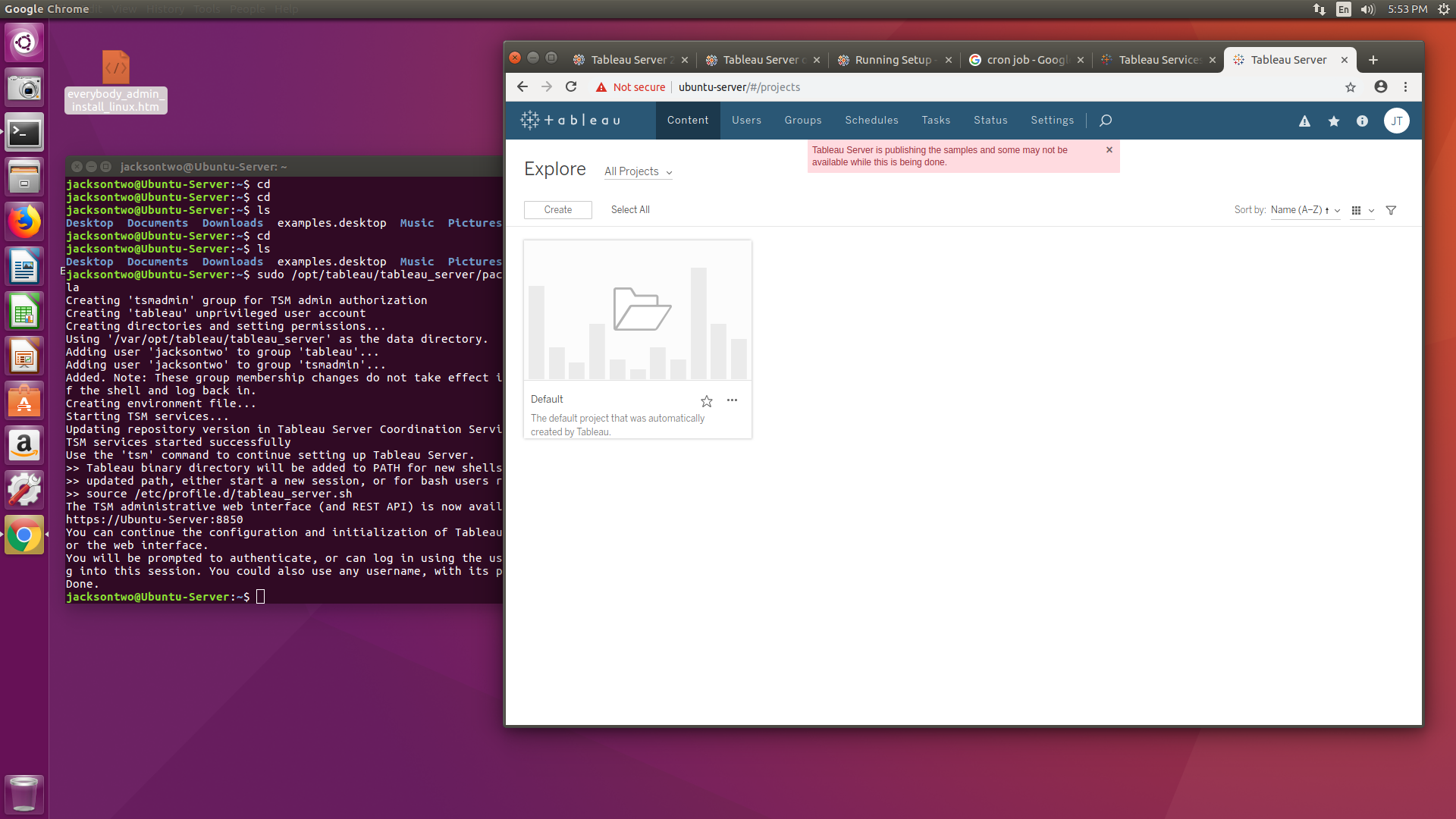
sudo /opt/tableau/tableau_server/packages/scripts.20211.21.0320.1853/initialize-tsm --acceptaeulaTableau will now begin the initial installation. This happens in 2 steps, first it will go through a short process to initialize, then you’ll be prompted to continue the install either via the TSM GUI (servername:8850) or via TSM command line. It even reminds you what your initial user credentials should be for the next step (which are typically the same as the user you’re logged in as) and what the default URL for the server is.
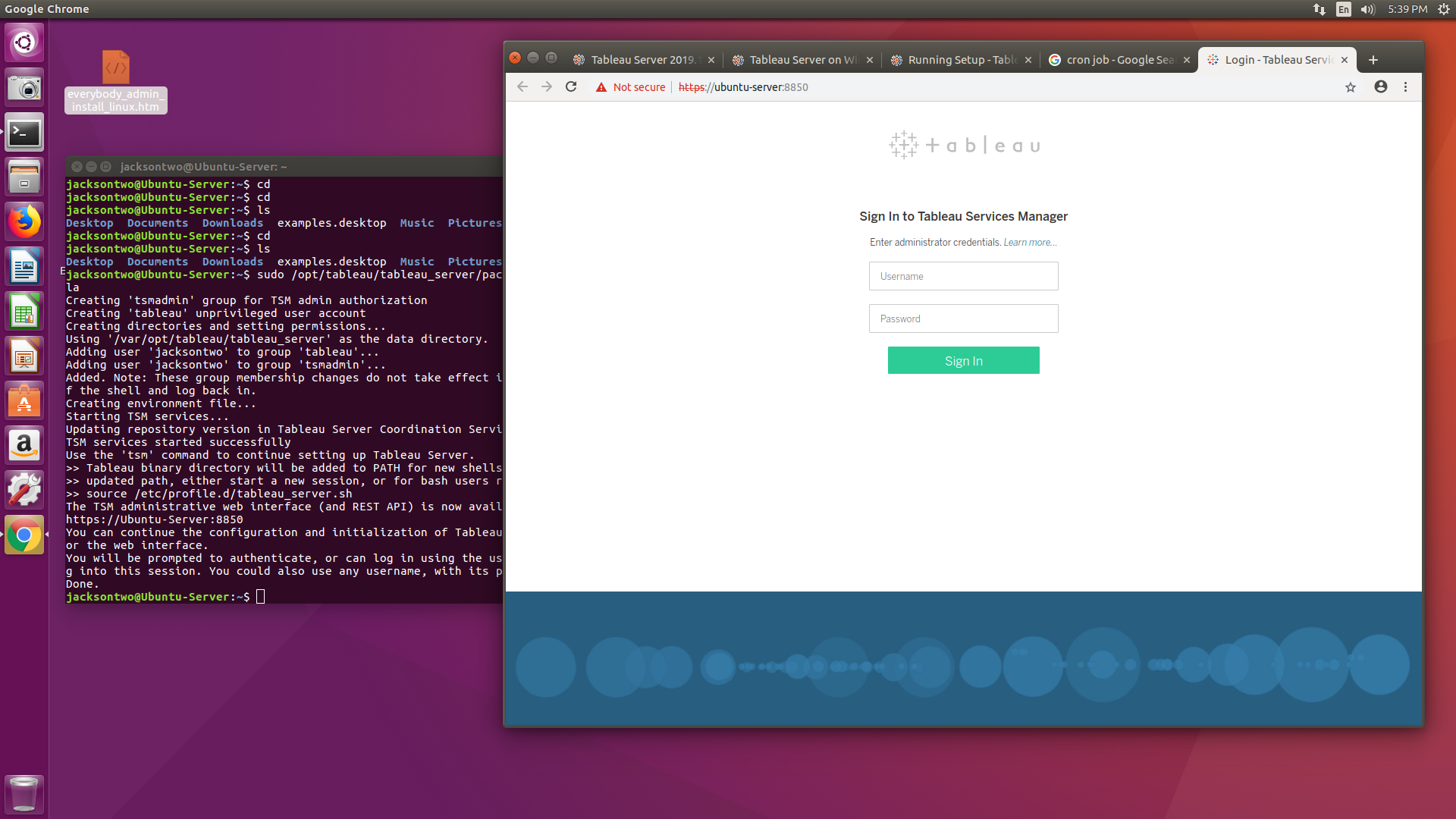
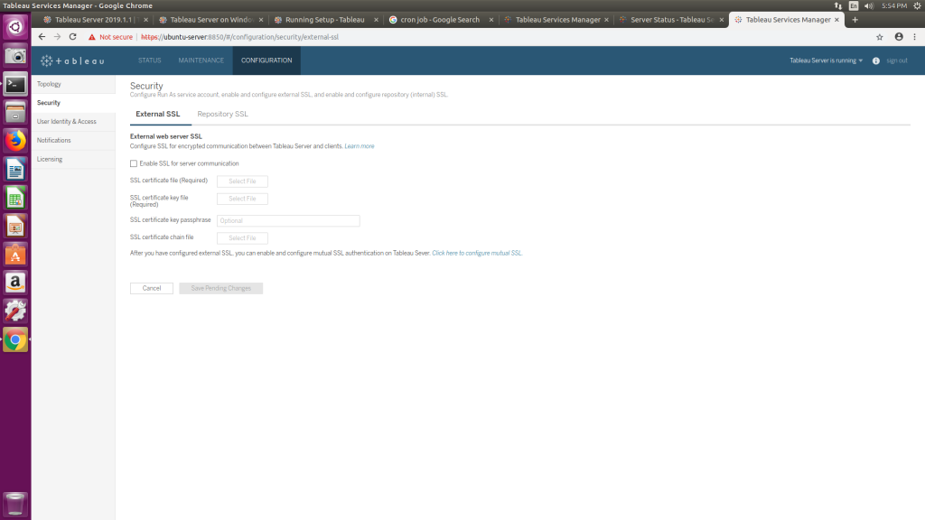
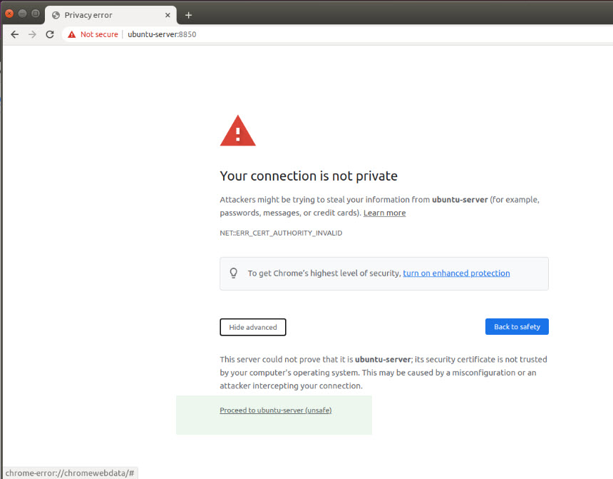
If you’re working in the TSM GUI (from browser), now is the time to go to the TSM page. Tableau Server generates a self-signed SSL certificate when it initializes, so you may see an untrusted message in your browser. You can go ahead and bypass this error message to login to TSM.
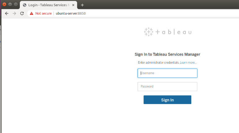
Remember, your user name and password used to log in to the machine are what you’ll enter here. The time to enter users will come after you decide which Identity Store method you’ll be using.
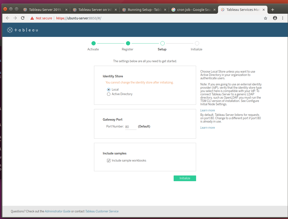
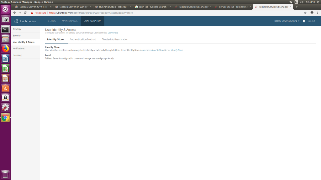
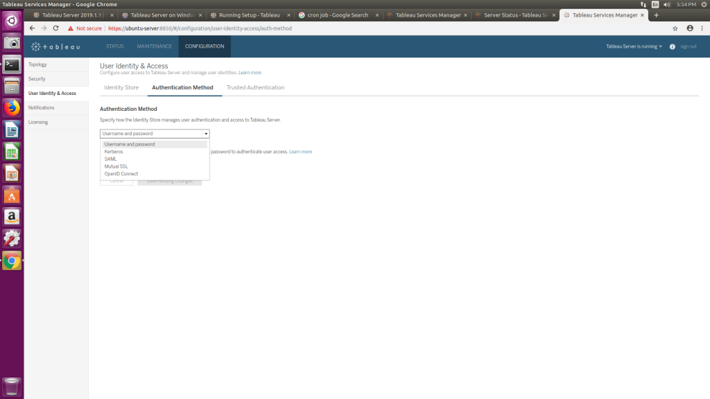
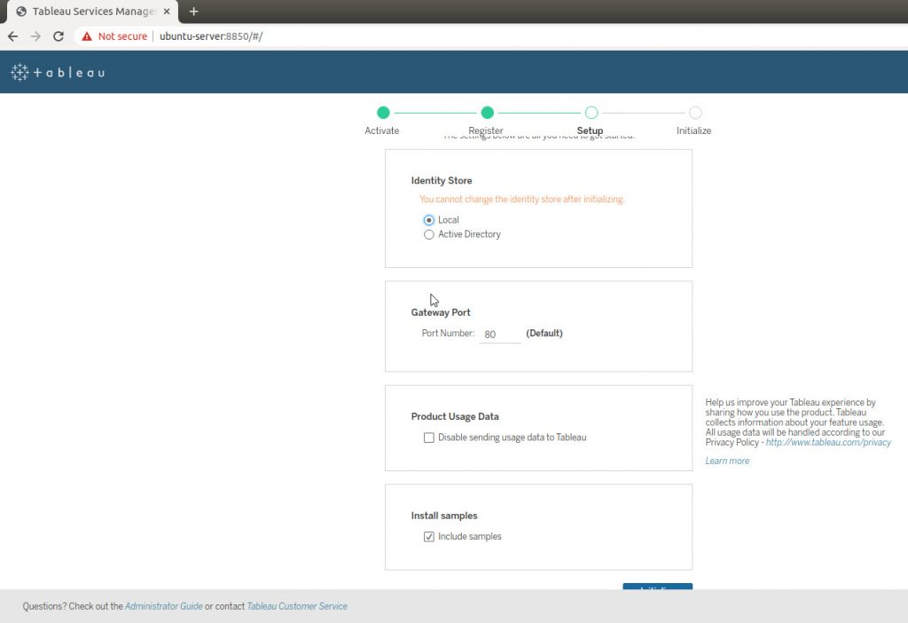
You’ll be prompted to register the product, and then get hit with 4 immediate configuration requests. Identity Store is the most serious setting on this page, because once you set it, you can’t change it. For our deployment we’ll be using Local (meaning we’ll create user names and the Server will manage passwords) authentication. If instead you wanted to do Active Directory (or another LDAP), selecting that option will prompt you to fill in the name of the AD domain.
If you’re unsure of any of these initial settings, remember you can hover over the section to get a nice paragraph from Tableau about the setting’s purpose. They also have a link at the bottom for the Administrator’s Guide.
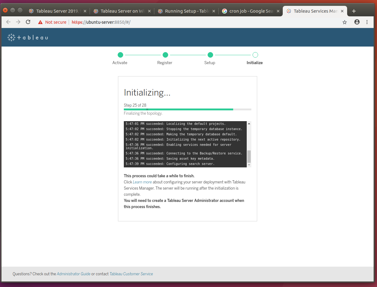
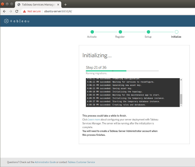
For this next part, go ahead and make yourself a cup of coffee, because this is the longest part of the install. Tableau will go through initializing several components, including setting the initial topology. Depending on the hardware you’re running, this can take anywhere from 10 to 30 minutes.
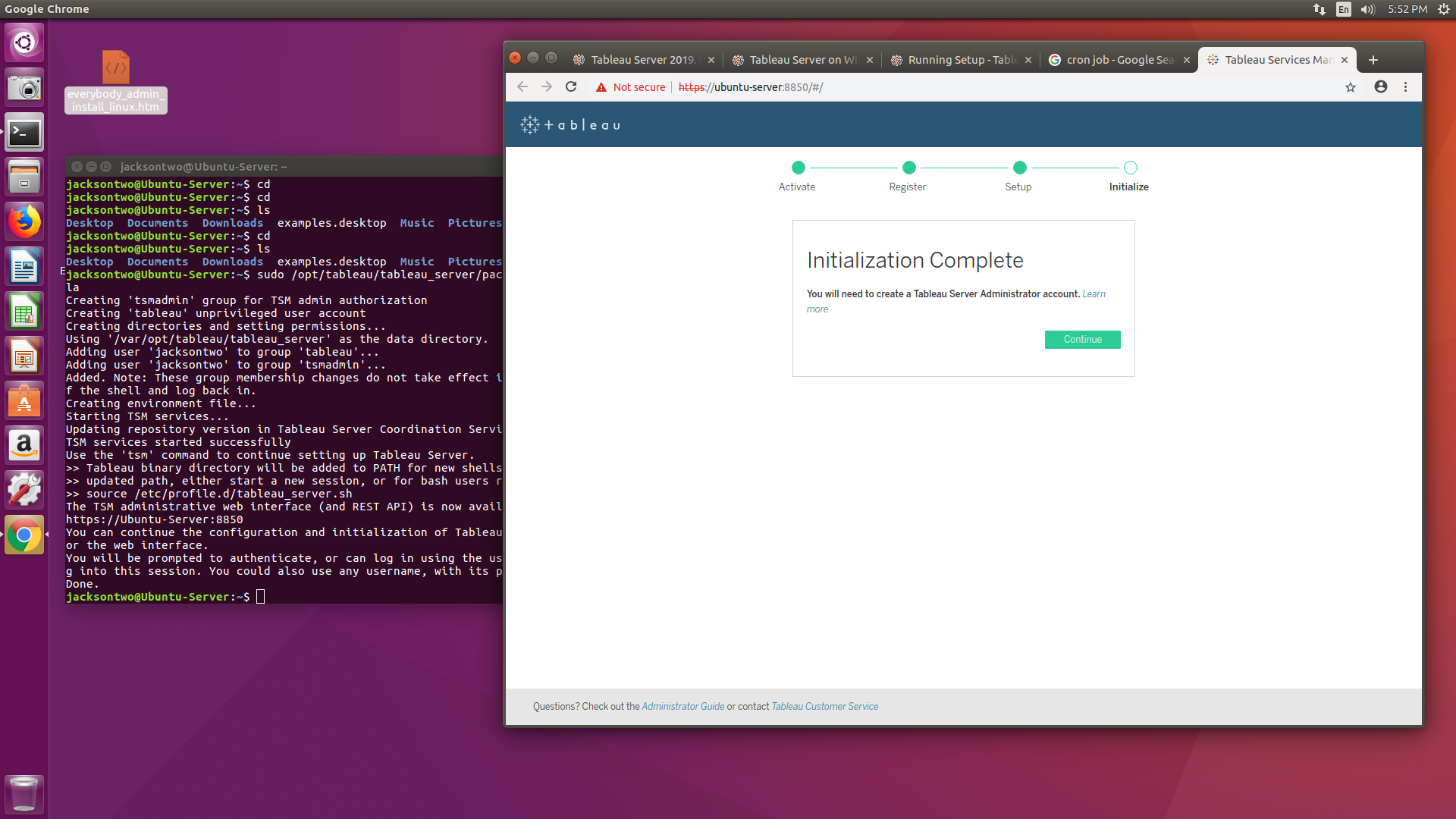
Once this step completes your Server is nearly up and running. The webpage should prompt you to create your first Administrator account. If you’re using Local Directory, you can use any username you’d like (for simplicity we’re repeating the same username). If you’re using Active Directory, you’ll have to pick a user ID associated with the domain. The password for AD will be slightly different, instead of requesting you to generate one, you’ll simply be prompted to enter your password.
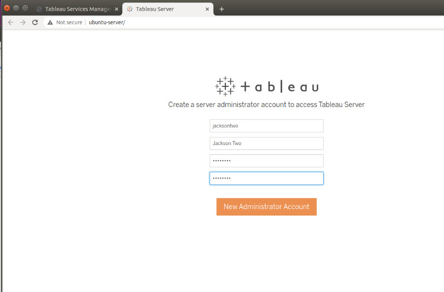
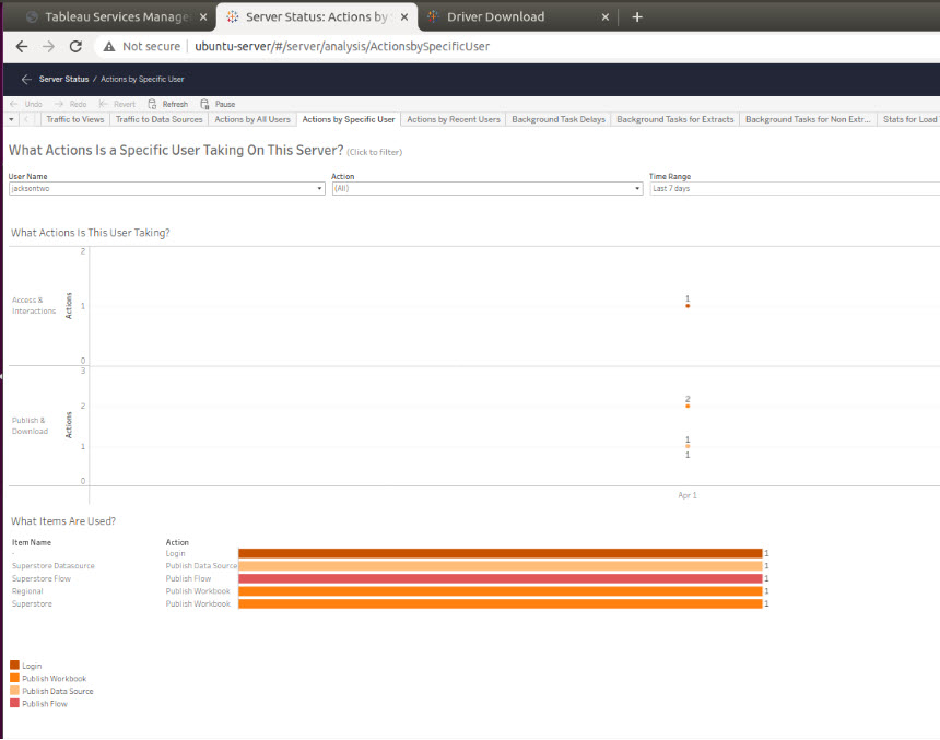
Once you create an administrator account, you’ll be immediately logged into the Server environment (in fact you can see in the screenshot above, it opens a new tab for the server and keeps TSM up).
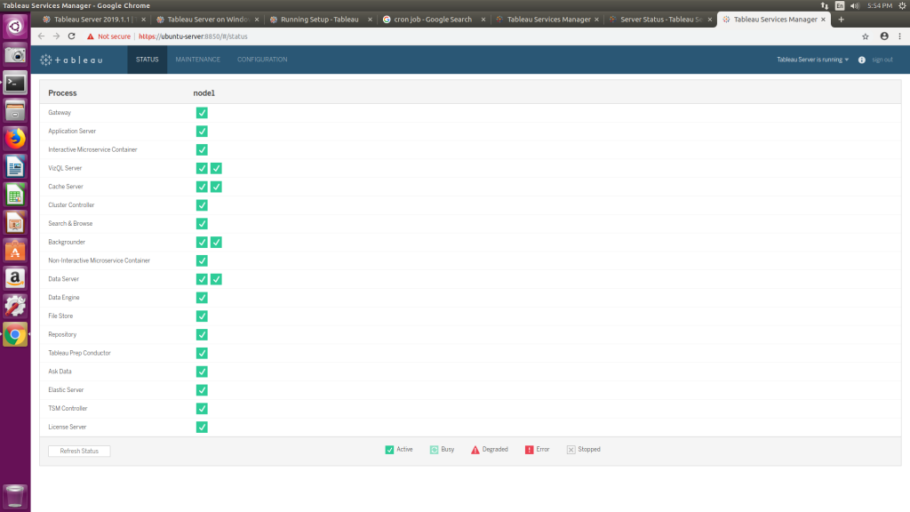
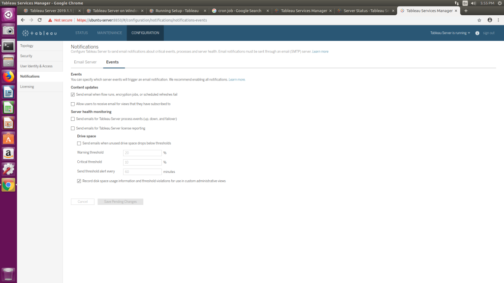
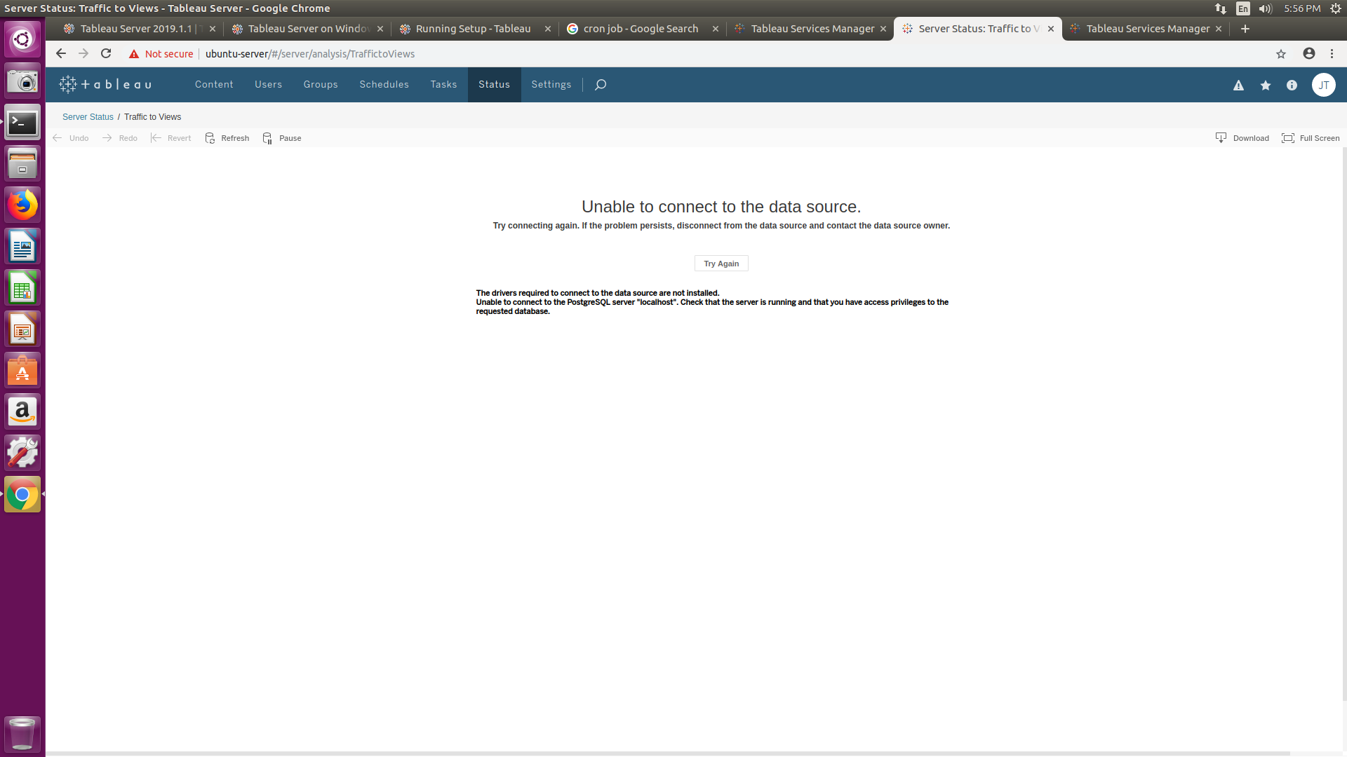
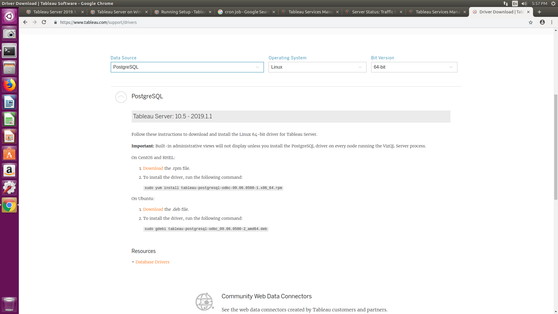
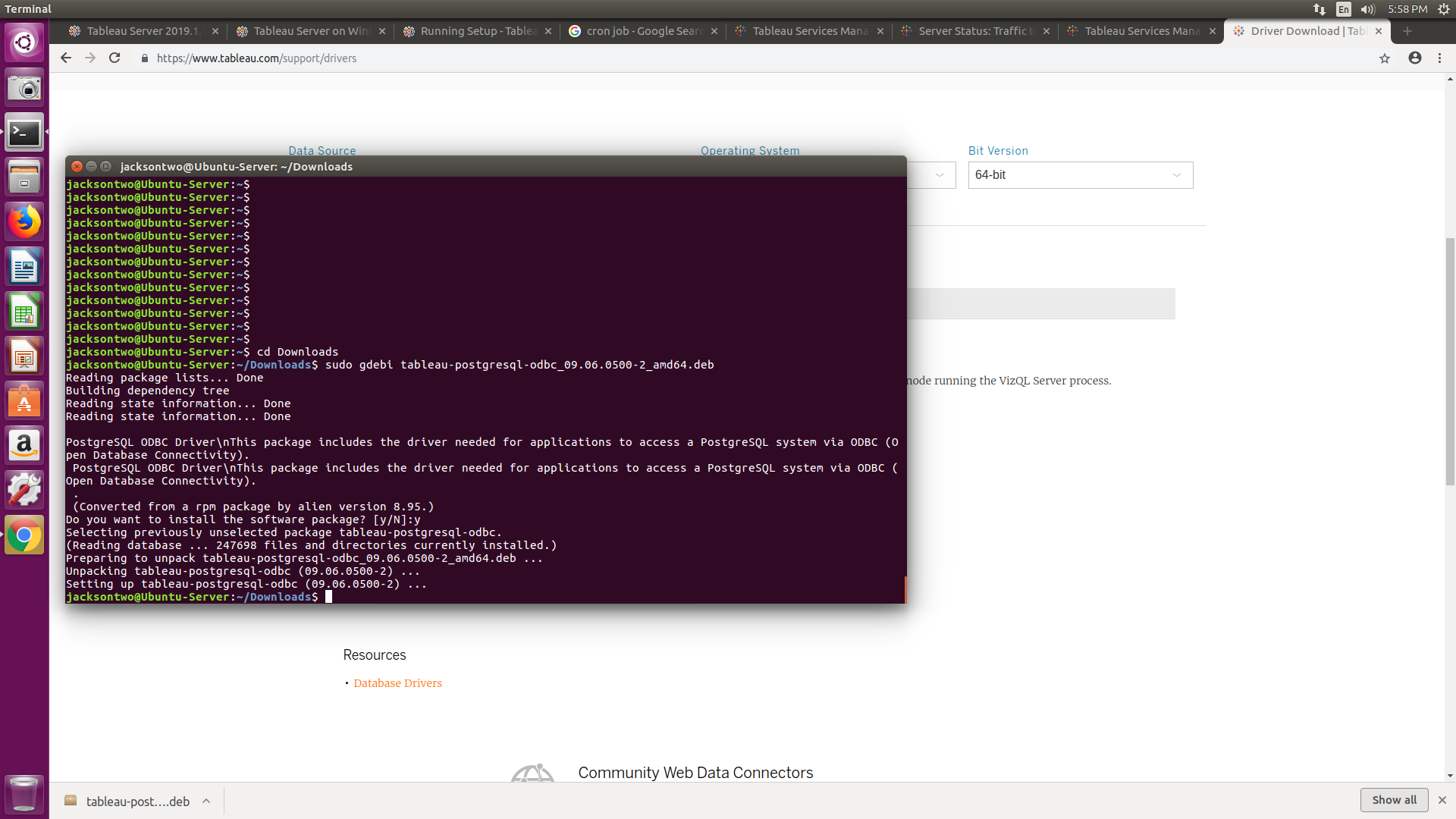
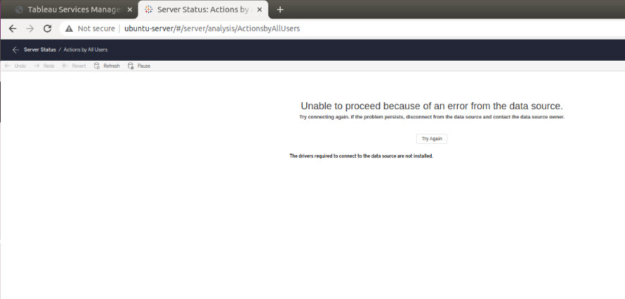
Now, because it’s a Linux installation, as a final step you’ll want to download and install the drivers for PostgreSQL. Remember that Tableau Server uses PostgreSQL as the backend to store all of your content, so you’ll need to install the driver to see the Administrator views (located in Server Status).
New with 2020.4 +, is a new version of the PostgreSQL database. In these newer installations, you’ll have to add a JDBC (previously we would use an ODBC) driver to connect to PostgreSQL. So make sure you navigate over to the Drivers Download page Tableau provides. At time of writing, Tableau linked to the following driver: https://downloads.tableau.com/drivers/linux/postgresql/postgresql-42.2.14.jar. If you’ve got a GUI you can use, go ahead and download it from the page – otherwise use curl or wget to download the .jar.
curl -O https://downloads.tableau.com/drivers/linux/postgresql/postgresql-42.2.14.jar
wget https://downloads.tableau.com/drivers/linux/postgresql/postgresql-42.2.14.jar
Final steps are to create and drop the driver into /opt/tableau/tableau_driver/jdbc, which Tableau mentions you may have to manually create. We did have to create it, so here’s the code snippet. Make sure you’re at the root when you try to navigate to /opt/tableau. This is also a protected folder, so you’ll need to sudo to create the new directories.
cd /opt/tableau
sudo mkdir tableau_driver
cd tableau_driver
sudo mkdir jdbc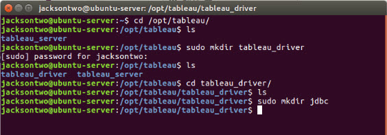
And finally, copy the file into the new directory you just created.
sudo cp postgresqul-42.2.14.jar /opt/tableau/tableau_driver/jdbc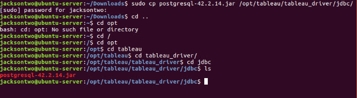
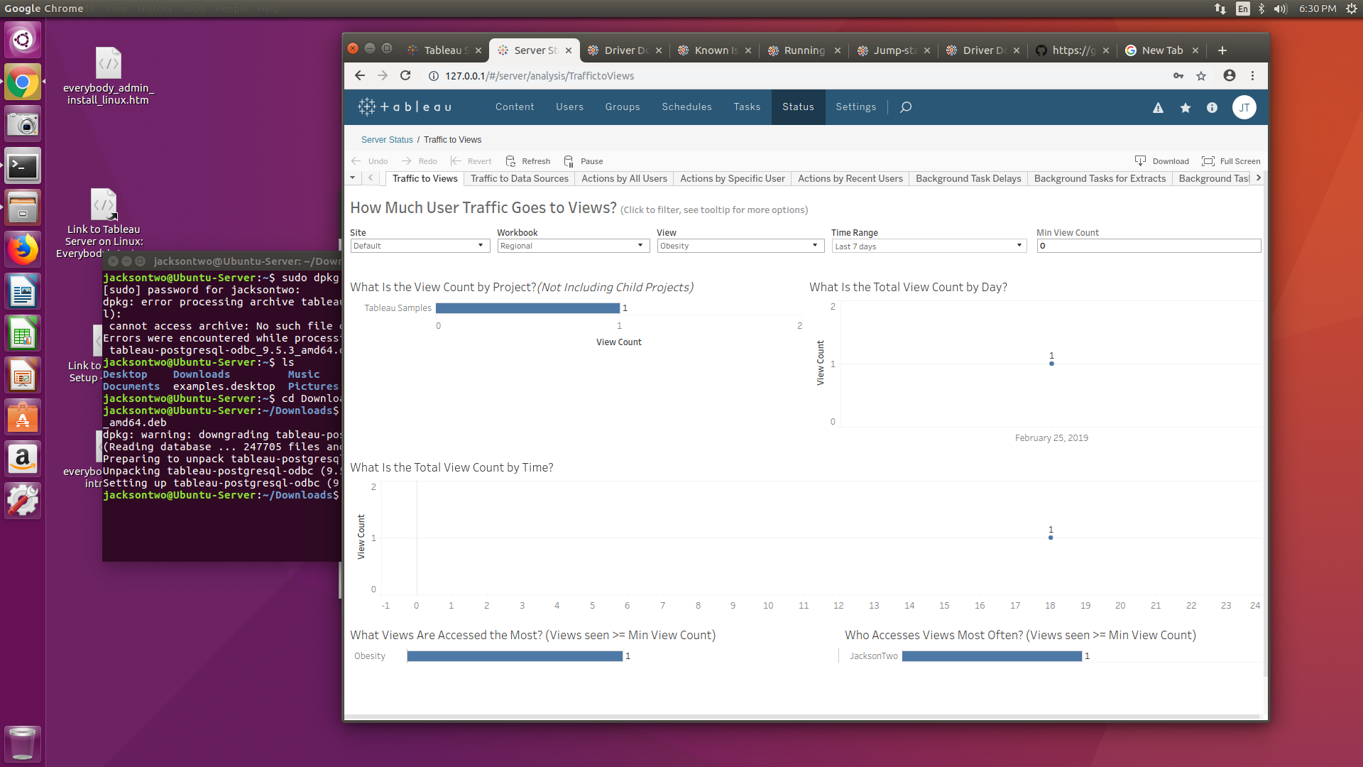
After we dropped the JDBC driver, our Server install still wasn’t loading the visualizations for the Admin views. So we went ahead and restarted the Tableau Server. That immediately cleared up the issue and we could see our admin views!
And that’s it – installation is complete! There are definitely more customizations and configurations we’re sure you’ll want to implement, but pause for a moment and rejoice in setting up a platform for people to interact with their data.