One of my favorite visualizations is the sparkline – I always appreciated how they are described by Edward Tufte “data-intense, design-simple, word-sized graphics.” Meaning the chart gets right to the point: conveying a high amount of information without sacrificing real estate. I’ve found this approach works really well when trying to convey different levels of information (detail and summary) or perhaps different metrics around a common topic.
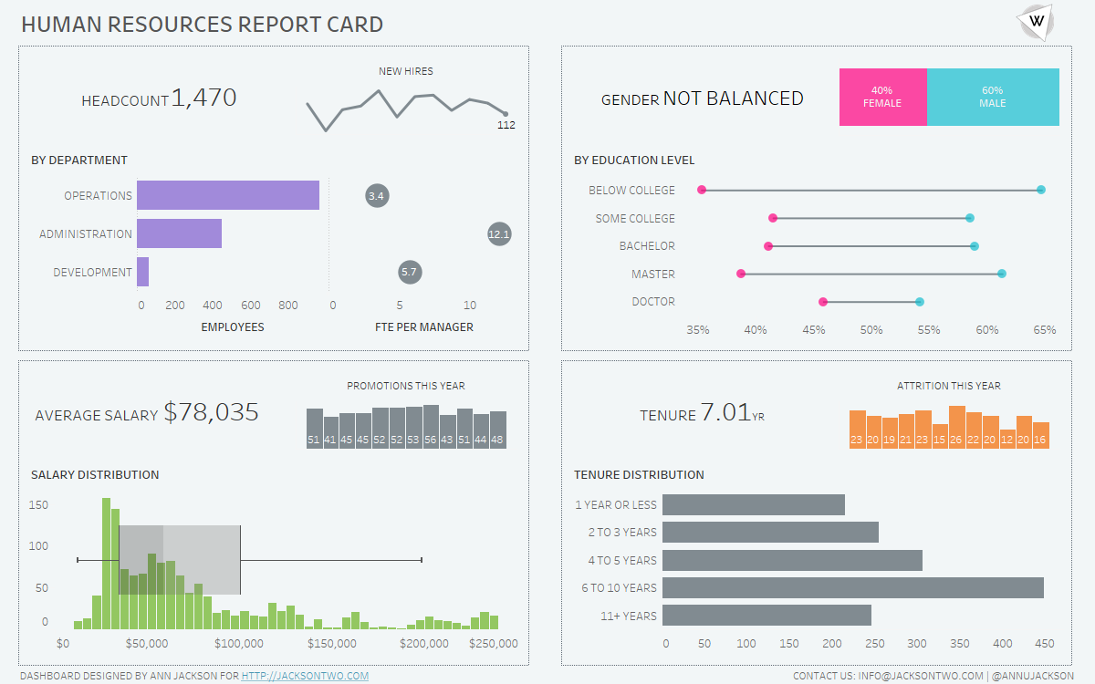
I recently built out a Report Card for Human Resources that aims to do just that. Use a cohort of visualizations to communicate an overall subject area and then repeat the concept to combine 4 subject/metric areas. Take a look at the final dashboard below.

The dashboard covers one broad topic – Human Resources. Within it there are 4 sub-topics: number of employees, key demographics, salary information, and tenure. As your eyes scan through the dashboard, they likely stopped at the large call outs in each box. You’ve got your at-a-glance metrics that start to bring awareness to the topic.
But the magic of this dashboard lies in the collection of charts surrounding the call outs. Context has been added to surround each metric. Let’s go through each quadrant and unpack the business questions we may have.

- How many active employees do we have?
- How many new employees have we been hiring?
- How many employees are in each department?
- What’s the employee to leadership ratio?
The first visualization (1) is likely the one a member of management would want. It’s the soundbite and tidbit of information they’re looking for. But once that question is asked and answered, the rest of the charts become important to knowing the health of that number. If it’s a growing company, the conversation could unfold into detail found in chart 2 – “okay we’re at 1500 employees, what’s our hiring trend?” The same concept could be repeated for the other charts – with chart 4 being useful for where there might be opportunity for restructuring, adding management, or checking up on employee satisfaction.
The next quadrant focuses specificly on employee demographics. And the inclusion of it after employee count is intentional. It’s more contextual information building from the initial headcount number.

- Do we have gender equity?
- What is the gender distribution?
- How does the inclusion of education level affect our gender distribution?
Again, we’re getting the first question answered quickly (1) – do we have gender equity? Nope – we don’t. So just how far off are we, that’s answered just to the right (2). The second chart is still a bit summarized, we can see the percentages for each gender, but it’s so rolled up that we’d be pressed to figure out how or where the opportunity for improvement might be. This is where the final chart (3) helps to fill in gaps. With this particular organization, there could be knowledge that there’s gender disparity based on levels of education. We don’t get the answers to all the questions we have, but we are starting to narrow down focus immensely. We could go investigate a potentially obvious conclusion and try to substantiate it (this company hires more men without any college experience).
The next quadrant introduces salary – a topic everyone cares about.

- What’s the average salary of one of our employees?
- Are we promoting our employees? (A potential influence to #1)
- What’s the true distribution of salaries within our organization?
The design pattern is obvious at this point – convey most important single number quickly, and then dive into context, drivers, and supporting detail. I personally like the inclusion of the histogram with a boxplot, a simple way to apply statistics to an easily skewed metric. Even in comparing the average number to the visual median, we can see that there are some top heavy salaries contributing to the number. And what’s even more interesting about the inclusion of the histogram is the frequency of salaries around the $25k mark. I would take away from this section the knowledge of $78k, but also the visual spread of how we arrive at that number. The inclusion of (2) here serves mostly for a form of context. Here it could be that the organization has an initiative to promote internally and thus goes hand-in-hand with salary changes.
And finally our last section – focused closely on retention.

- What’s our average employee tenure?
- How much attrition/turnover do we have monthly?
- How much seniority is there in our staff?
After this final quadrant, we’ve got a snapshot of what a typical employee looks like at this organization. We know their likely salary, how long they’ve been with the company, some ideas on where they’re staffed, and a guess at gender. We can also start to fill in some gaps around employee satisfaction – seems like there was some high turnover during the summer months.
And let’s not forget – this dashboard can come more to life by the inclusion of a few action filters. We’ve put down the groundwork of how we want to measure the health of our team, now it’s time to use these to drive deeper and more meaningful questions and analysis.
I hope this helps to demonstrate how the inclusion of visualizations of varying sizes can be combined to tell a very rich and contextual data story – perfect for understanding a large subject area with contextual indicators and answers to trailing questions included.

Leave a Reply