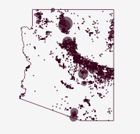
At the time of writing it is 100°F outside my window in Arizona and climbing. It’s also August and we’re right in the middle of feeder round 3 for Tableau Public’s Iron Viz contest. Appropriately timed, the theme for this round is water. So it’s only fitting that my submission for this round would take into consideration the mashup of these two and form my submission: Without Water, 2 decades of drought & damage in Arizona.
The Genesis of the Idea
I’ll start by saying that water is a very tricky topic. The commonplace of it makes searching for data and a narrative direction challenging. It’s necessary for sustaining life, so it seems to want to have a story tied directly to humankind – something closely related to water quality, water availability, loss of water – essentially something that impacts humans. And because it’s so vital, there are actually several organizations and resources doing fantastic things to demonstrate the points above. Unicef tracks drinking water and sanitation, Our World in Data has a lengthy section devoted to the topic, there’s the Flint Water Study, and the Deepwater Horizon oil spill.
This realization around the plethora of amazing resources associated with water led me to the conclusion that I would have to get personal and share a story not broadly known. So what could be more personal than the place I’ve called home for 14 years of my life: Arizona.
Arizona is a very interesting state, it’s home to the Grand Canyon, several mountain ranges, and of course a significant portion of the Sonoran desert. This means that in October it can be snowing in the mountains of Flagstaff and a stifling 90°F two hours south in Phoenix. And, despite the desert, it needs water. Particularly in the large uninhabited sections of the mountains covered with forests. Getting to the punchline: since my time in Arizona, the state has been in a long sustained drought. A drought that’s caused massive wildfires, extreme summer heat, and conversation thread that never steers far from the weather.
Getting Started
A quick google search led me to my first major resource: NOAA has a very easy to use data portal for climate data which includes: precipitation, various drought indices, and temperatures – all by month/state/and division. This served as the initial data set along with the joining of climate division shapefiles maintained by NCEI. Here’s the first chart I made showing the divisions by their drought index. This uses the long term Palmer Drought Severity Index and any positive values (non-drought) are zeroed out to focus attention on deficit.

My next major find was around wildfire data from the Federal Fire Occurrence website. Knowing that fire is closely associated with drought, it seemed a natural progression to include. Here’s an early iteration of total acres destroyed by year:

It’s clear that after 2002 a new normal was established. Every few years massive fires were taking place.
And after the combination of these two data sets – the story started developing further – it was a time bound story of the last 20 years.
Telling the Story
I headed down the path of breaking out the most relevant drought headlines by year with the idea of creating 20 micro visualizations. Several more data sources were added (including dust storms, heat related deaths, and water supply/demand). An early iteration had them in a 4 x 5 grid:

As the elements started to come together, it was time to share and seek feedback. Luke Stanke was the first to see and gave me the idea of changing from a static grid to a scrolling mobile story. And that’s where things began to lock into place. Several iterations later and with input from previous Iron Viz winner Curtis Harris – the collection of visualizations was starting to become more precisely tuned to the story. White space became more defined and charts were sharpened.
My final pass of feedback included outsourcing to Arizona friends (including Josh Jackson) to ask if it evoked the story we’re all experiencing and it’s what led to the ultimate change in titles from years to pseudo-headlines.
Wrapping Up
My one last lingering question: Mobile only or to include a desktop version? The ultimate choice and deciding factor was to create a medium and version that was optimized for getting to the largest end audience – thus, mobile only.
WITHOUT WATER
And now that all leads to the final product. A mobile only narrative data story highlighting the many facets of drought and it’s consequences for the state of Arizona. Click on the image to view the interactive version on Tableau Public.


Leave a Reply