Late last year Sarah Bartlett and I announced on the Hashtag Analytics podcast that we would be doing our own version of Giorgia Lupi and Stefanie Posavec’s data postcard project, dear data. The project is pretty simple – each week we record personal data, visualization the results via sketching, and send our postcards to each other.
Sarah and I both thought this would be a fantastic growth opportunity – particularly around getting to know ourselves better, pushing the boundaries of our drawing skills, and expanding how we think and interact with data (given that we are both data professionals).
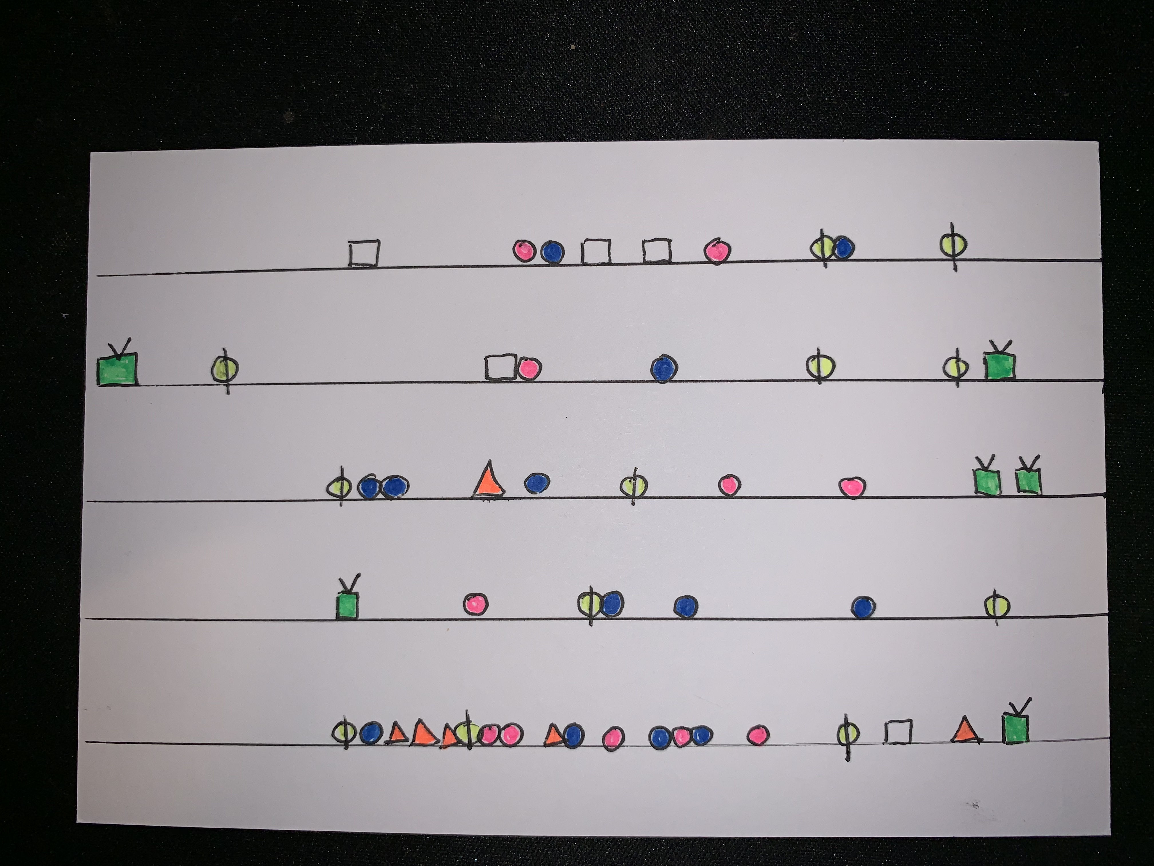
We’ve decided to ease the load a bit by following the same general weekly themes that Giorgia and Stefanie originally selected. So for week one, we focused on time and clocks. Here’s my week 1 postcard:
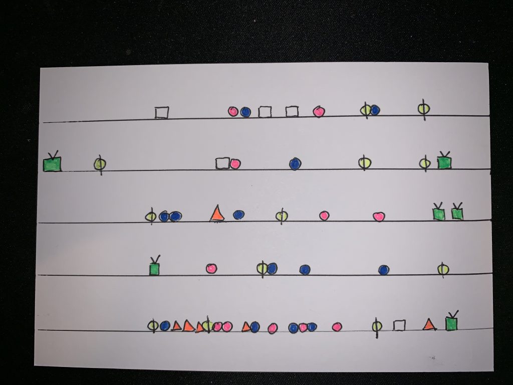
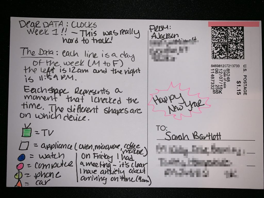
My approach was to catalog all of the major types of clocks that I look at and track when I looked at the time. My original data set included recording whether looking at the clock was intentional or by happenstance, but I ended up dropping that from the data set due to bias the project placed on knowing (and it also made every clock look intentional, since I knew I would have to track it!).
For the visual, I chose to represent things in a very linear fashion, starting at 12 AM and going up to 11:59 PM of the day (Monday to Friday). This was during a holiday week, with New Year’s Day being on Tuesday – which I’m quite pleased you can see with the TV right at the far left of the second line.
My working schedule this week was a bit less patterned than usual, but you can see that I typically wake up around 6:45 to 7 AM. And what I can see from this is clearly how the work I am doing influences how often I look at the clock. On Thursday I spent the entire day focused on a project – avoiding phone calls and emails. On Friday, I had to go to an in person meeting, which is completely visible by the continuous clock-checking that occurred from when I woke up to the conclusion of the meeting (I hate being late).
I really like that I can see when I am deep in thought (or in the flow) that I’m less aware of time. And I also like how much anxiety can be seen on days where I have to be somewhere. The last thing that I know (and can somewhat be seen) is that I usually watch the news right before bed. So I can tell that Monday and Thursday were off-routine days (Monday being NYE).
In contrast, Sarah chose to track her sleeping patterns for the week, since she knew her daytime schedule would be a bit hectic due to the holidays.

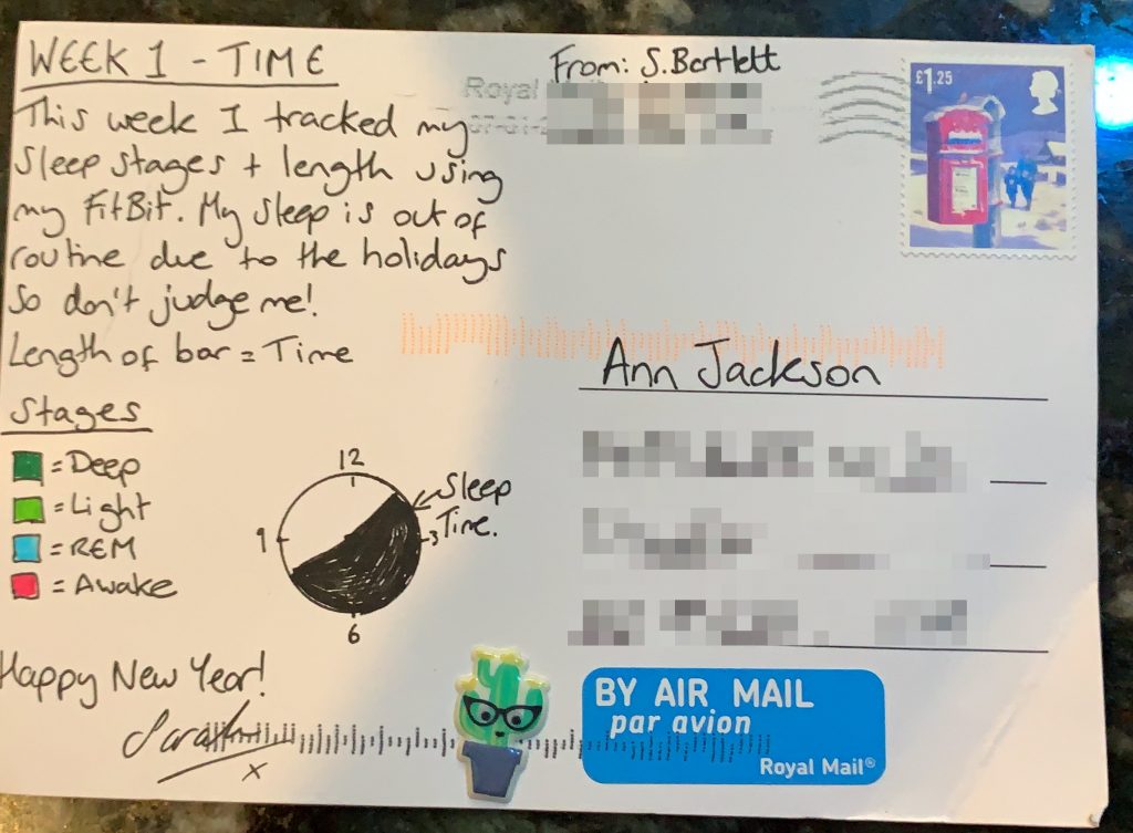
I really like how she chose to visualize the length of sleep time as both a clock and a bar. The clock added in quite a bit of additional context to my understanding what her daily schedule looks like. (BTW: in contrast to Sarah going to bed after midnight consistently, I am typically tucked in by 10 PM).
This week’s tracking was tough – it took a lot of persistence and reminder to ensure that every time I looked at something as basic as the time that I captured the details so specifically. Surprisingly I don’t check my watch or phone as much as I thought I do (for the time alone anyway).
Don’t forget to check out Sarah’s blog and read her take on week one.
Leave a Reply