Category: Dear Data
-
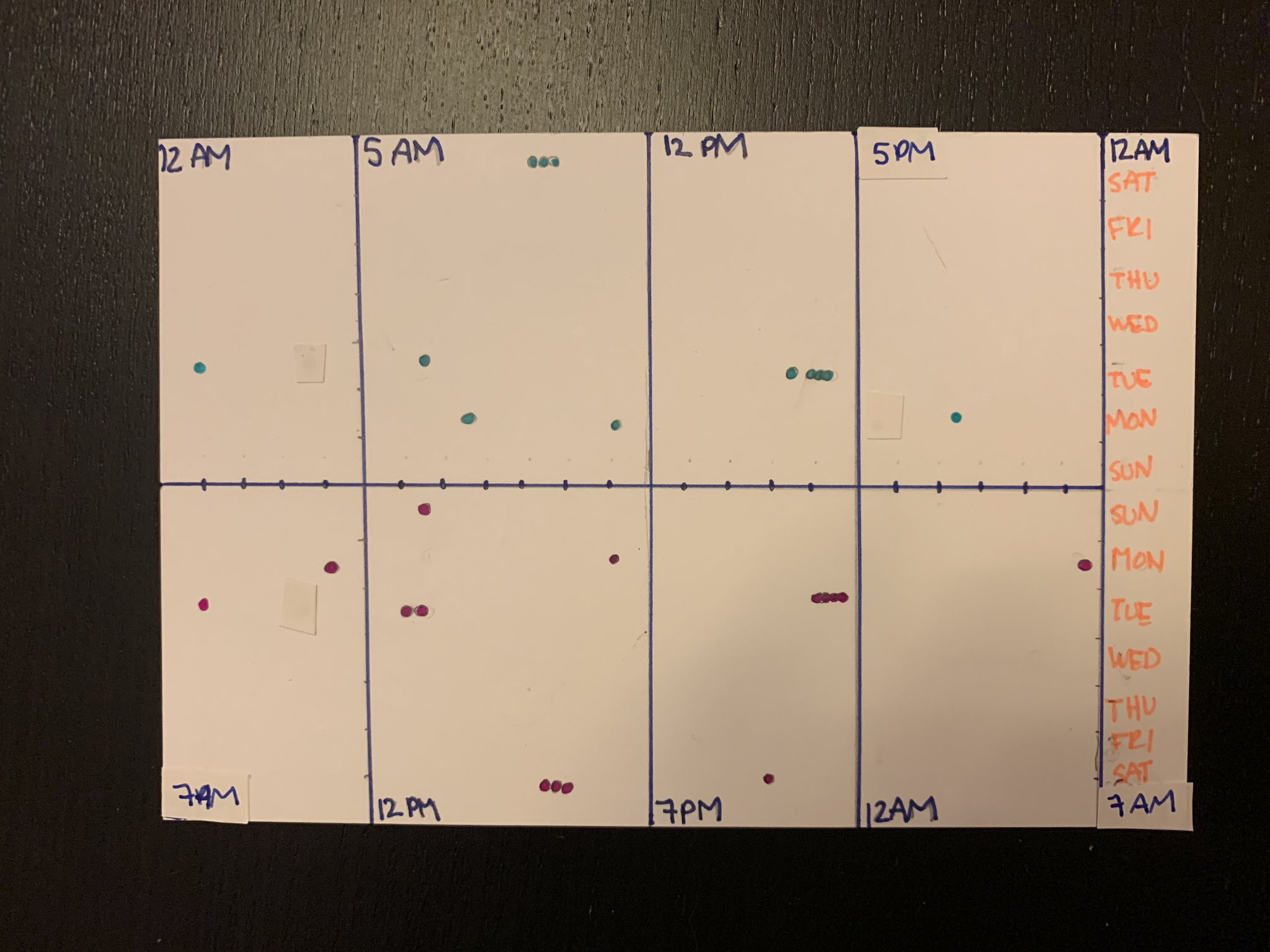
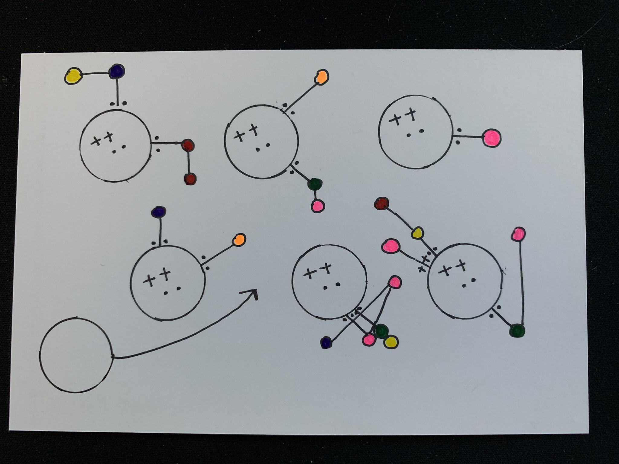
Dear Data 2019 – Week 10, Data Pals
Week 10 postcards are finally here for the data postcard project Sarah Bartlett and I are working on. The topic for the week was our relationship with each other. How much do we communicate, how often, when, and so on. And the timing was fantastic – Sarah and I recorded a video feedback session for…
-
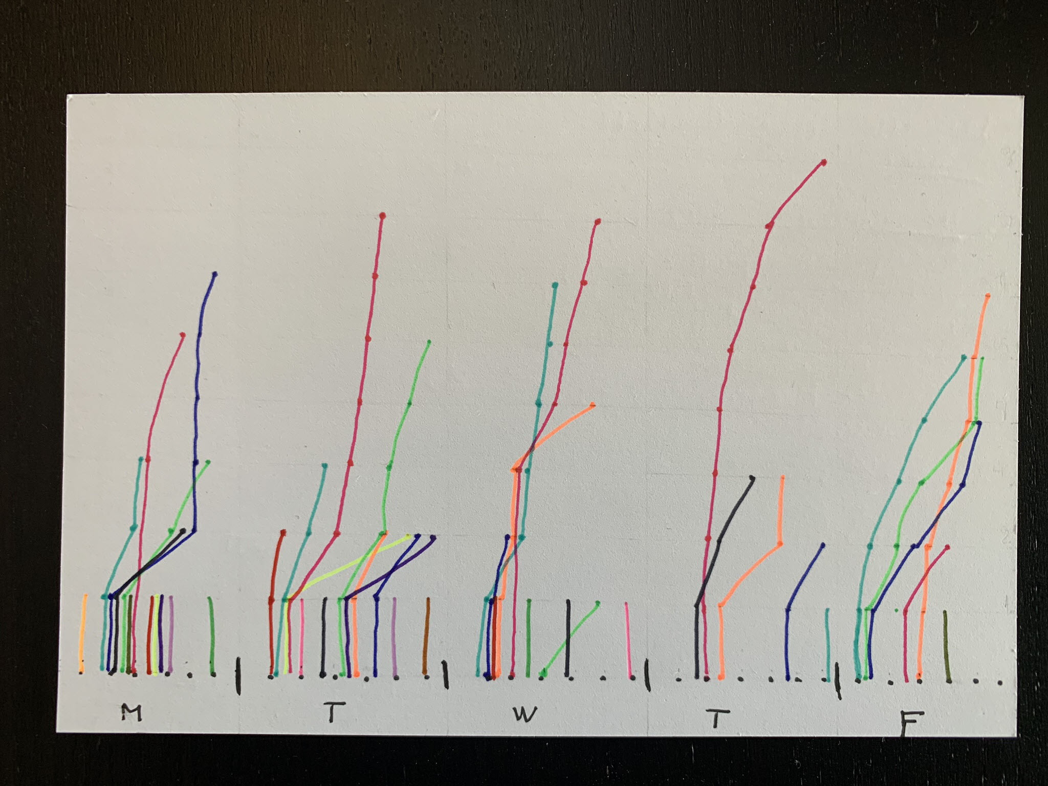
Dear Data 2019 – Week 9, To Do Lists
Week 9 of the data postcard project Sarah Bartlett and I are working on have arrived. The topic of the week was To Do Lists. I don’t actively keep good lists of tasks – they make me sad – especially when I have tasks that continue to go undone. I also think they miss describing/capturing…
-
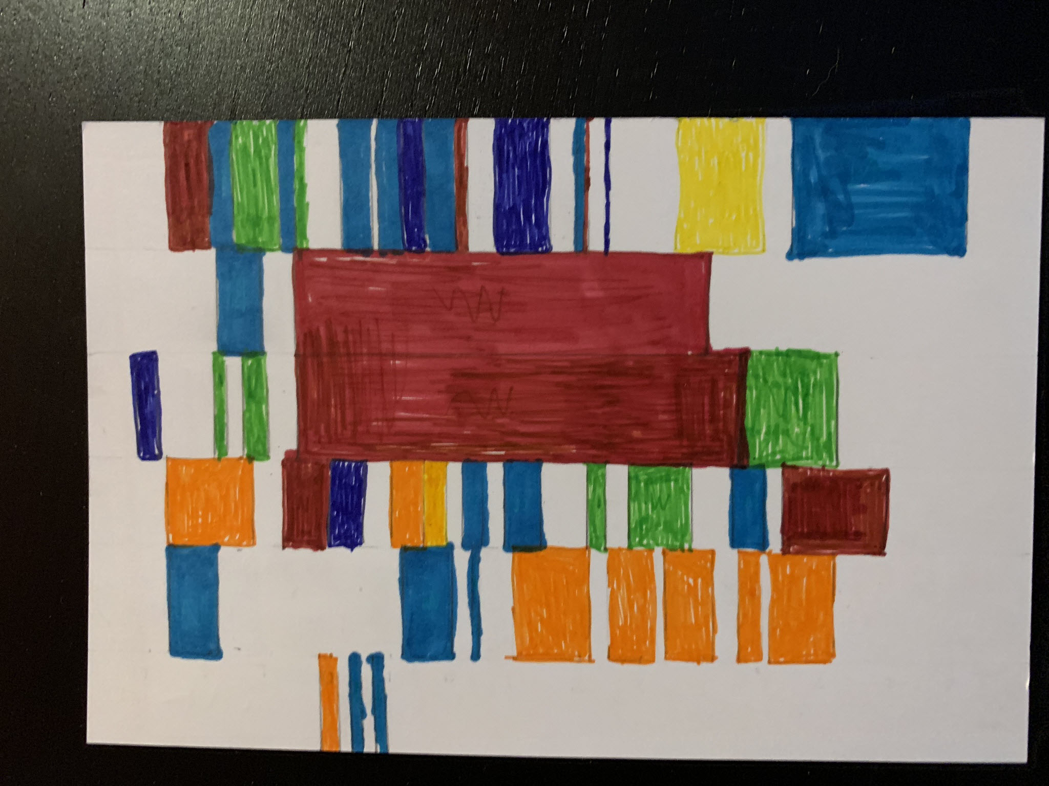
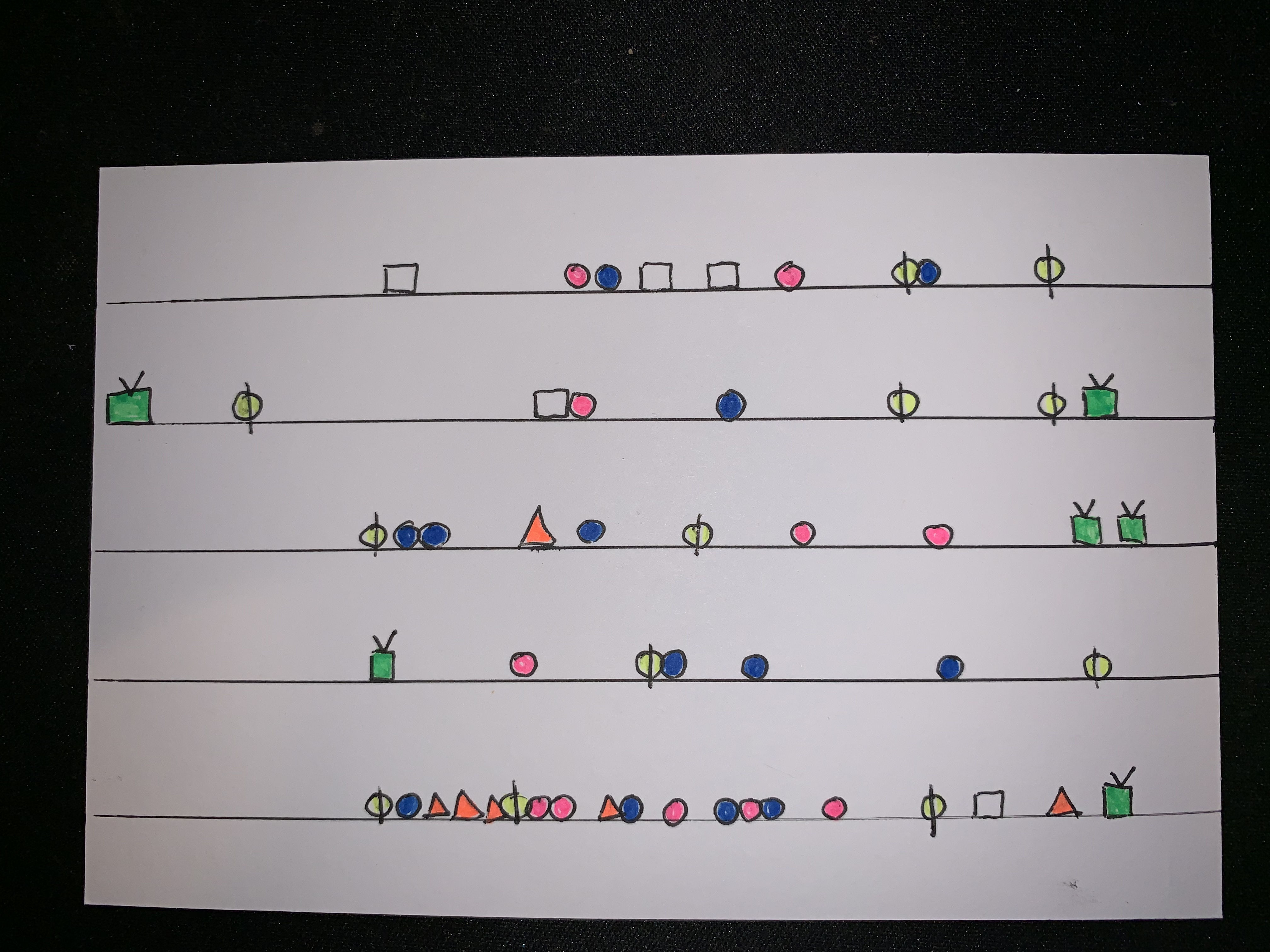
Dear Data 2019 – Week 8, Phone Addiction
After the terrible flurry of complaints, Sarah and I continued on with week 8 of the dear data postcard project we’re conducting. Week 8 was a welcome change, tracking how often we use our phones. I was excited to jump on this topic to know more insight into what I’m doing on my phone (although…
-
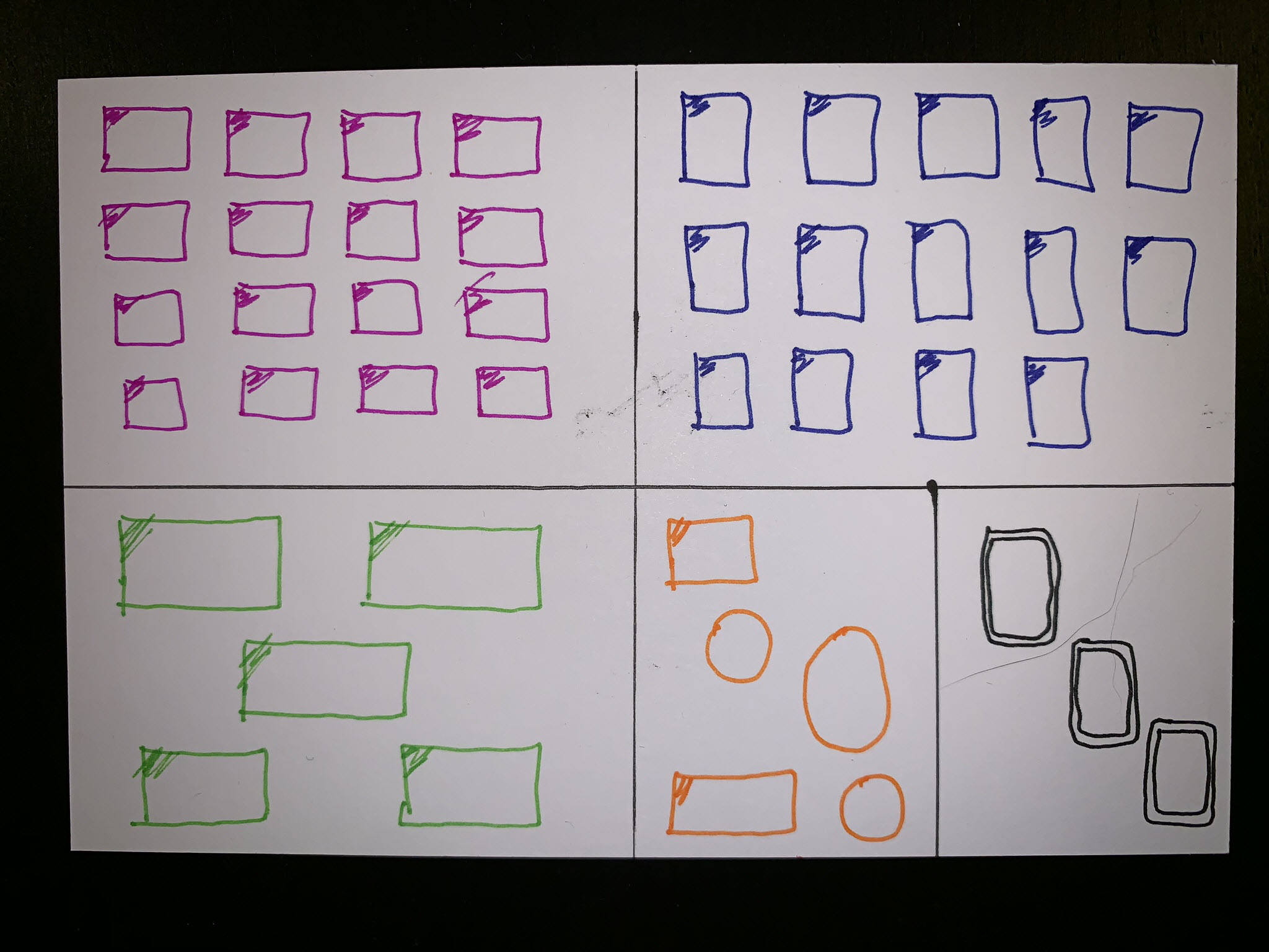
Dear Data 2019 – Week 4, Mirrors
Week 4 of the data postcard project Sarah Bartlett and I are working on this year is here. We still have yet to reach consistent timing for postcard arrival. Sarah usually receives mine 2 days or more before I receive hers, but this week we were only one day apart. Week 4’s topic was all…
-
Dear Data 2019 – Week 2, Transportation
It’s time for week two of the data postcard project Sarah Bartlett and I are working on this year. During this week our focus was spent on transportation, essentially how we get to different places. I live in the suburbs of Phoenix, AZ, tend to work from home, and drive to most places (read that…
-
Dear Data 2019 – Week 1, Clocks
Late last year Sarah Bartlett and I announced on the Hashtag Analytics podcast that we would be doing our own version of Giorgia Lupi and Stefanie Posavec’s data postcard project, dear data. The project is pretty simple – each week we record personal data, visualization the results via sketching, and send our postcards to each…