Tag: tableau
-

Exploring Python + Tableau
This month I’ve been taking a night class at Galvanize aimed at being an introductory to Python and Data Science. It’s a 4 night/week boot camp with a mix of lecture and hands-on assignments. My primary interest with the course was the data science component, but I also felt extremely strong about the necessity to…
-
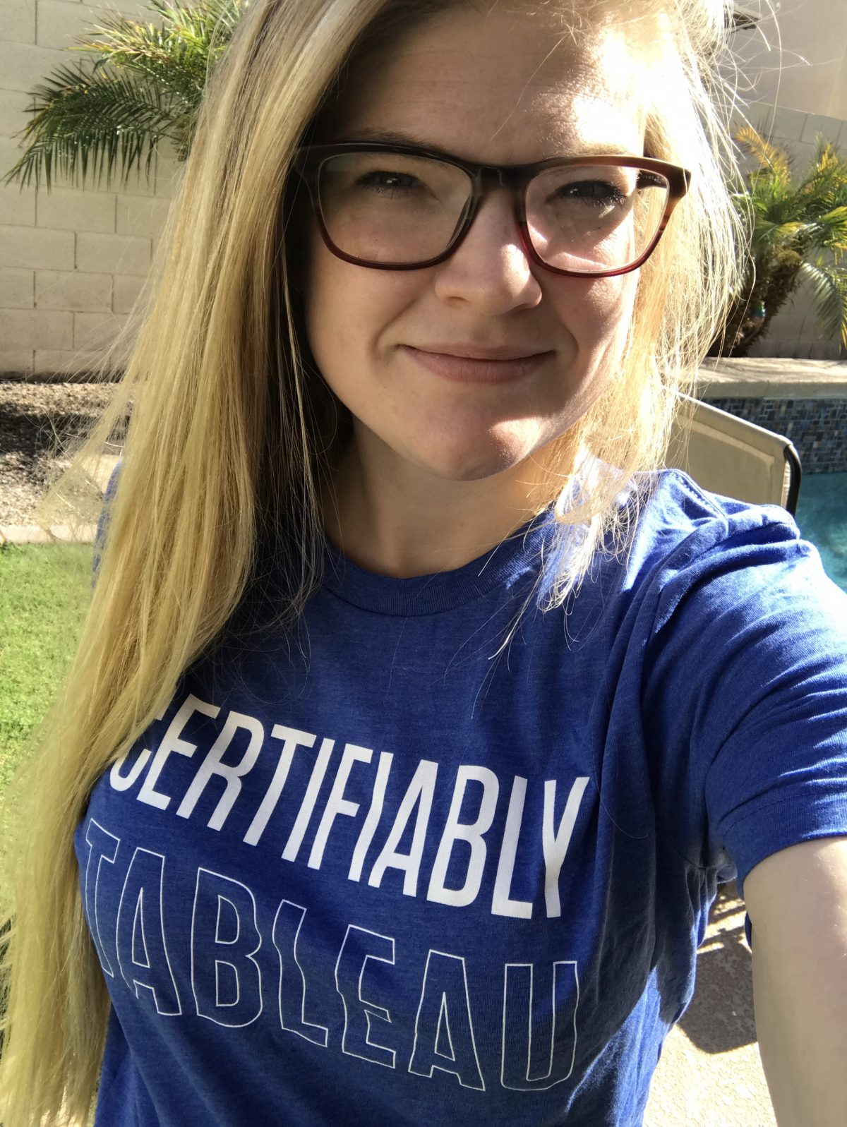
The Importance of Certification
I’ve long been a huge advocate of certification in technical fields. I think it is a great way to actively communicate and demonstrate the skill level you have in a particular area. Even further in my mind it represents the ability to set a foundation to build off of with others. I personally started my…
-

Star Trek The Next Generation: Every Episode (#IronViz 3)
It’s that time again – Iron Viz feeder contest! The third and final round for a chance to battle at conference in a chef coat is upon us. This round the focus was on anything ‘Silver Screen.’ With a limitless topic I was certain that I would find myself in a creative rut that would…
-
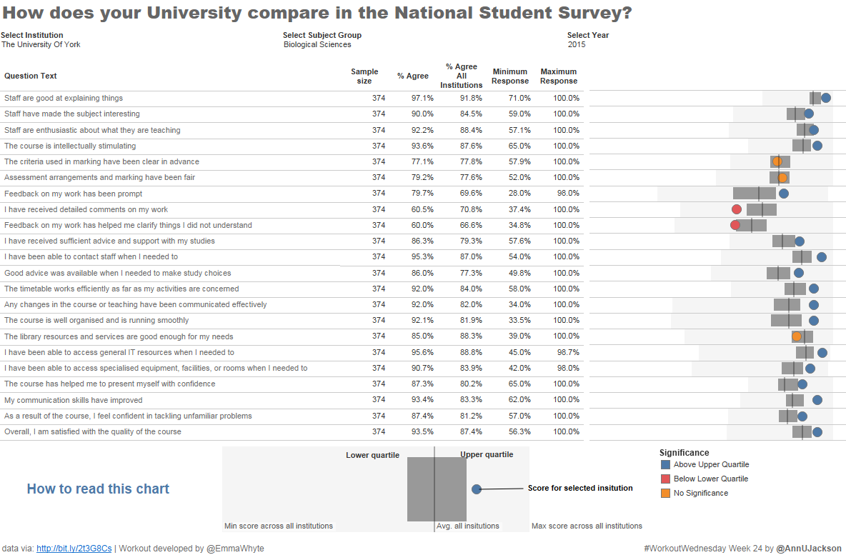
#WorkoutWednesday Week 24 – Math Musings
The Workout Wednesday for week 24 is a great way to represent where a result for a particular value falls with respect to a broader collection. I’ve used a spine chart recently on a project where most data was centered around certain points and I wanted to show the range. Propagating maximums, minimums, averages, quartiles,…
-
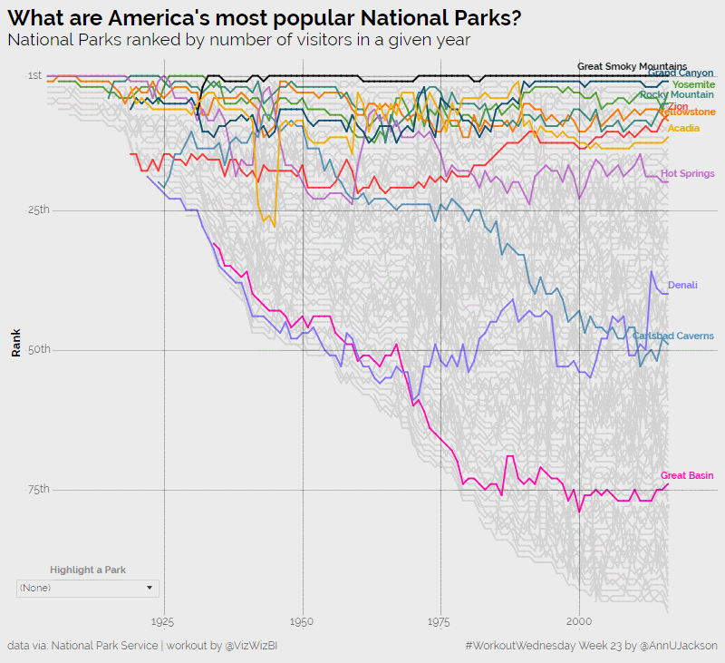
#WorkoutWednesday Week 23 – American National Parks
I’m now back in full force from an amazing analytics experience at the Alteryx Inspire conference in Las Vegas. The week was packed with learning, inspiration, and community – things I adore and am honored to be a part of. Despite the awesome nature of the event, I have to admit I’m happy to be…
-
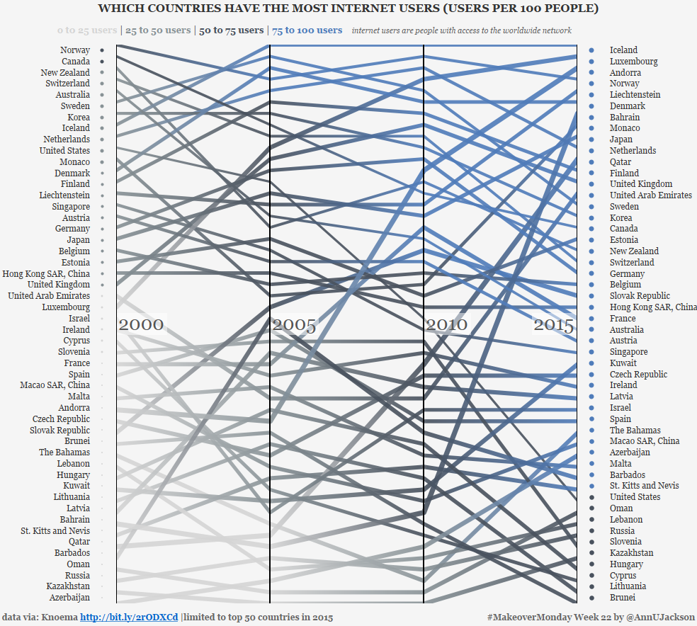
#MakeoverMonday Week 22 – Internet Usage by Country
This week’s data set demonstrates the number of users per 100 people by country spanning several years. The original data set and accompanying visualization starts as an interactive map with the ability to animate through the changing values year by year. Additionally, the interactor can click into a country to see percentage changes or the…
-
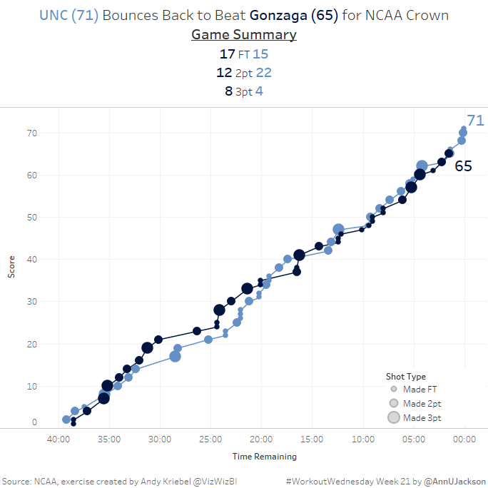
Workout Wednesday Week 21 – Part 1 (My approach to existing structure)
This week’s Workout Wednesday had us taking NCAA data and developing a single chart that showed the cumulative progression of a basketball game. More specifically a line chart where the X axis is countdown of time and the Y axis is current score. There’s some additional detail in the form of the size of each…
-

#MakeoverMonday Week 21 – Are Britons Drinking Less?
After some botched attempts at reestablishing routine, #MakeoverMonday week 21 got made within the time-boxed week! I have one pending makeover and an in-progress blog post to talk about Viz Club and the 4 developed during that special time. But for now, a quick recap of the how and why behind this week’s viz. This…
-
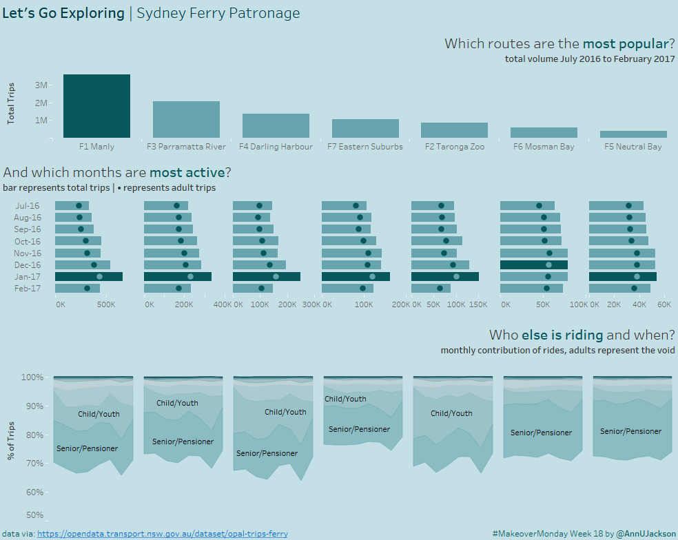
#MakeoverMonday Week 18
{witty intro} This week’s makeover challenge was to take Sydney ferry data for 7 ferry lines and 8 months. What’s even better is there was another dimension with a domain of 9 members. This is a dream data set. I say it’s a dream from the perspective of having two dimensions that can be manipulated…
-
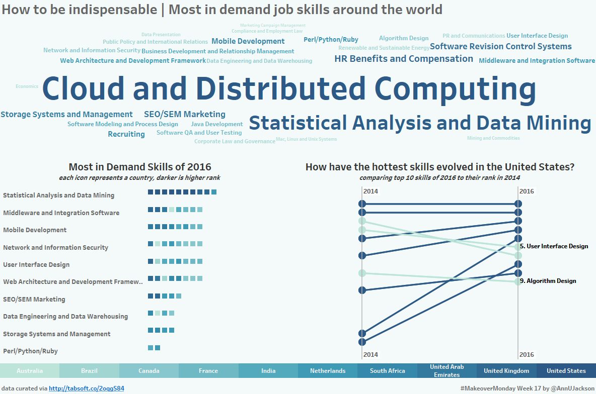
#MakeoverMonday Week 17
After a bit of life prioritization, I’m back in full force on a mission to contribute to Makeover Monday. To that end, I’m super thrilled to share that I’ve completed my MBA. I’ve always been an individual destined not to settle for one higher education degree, so having that box checked has felt amazing. Now…