Tag: tableau
-

Without Water an Iron Viz feeder
Jump directly to the viz At the time of writing it is 100°F outside my window in Arizona and climbing. It’s also August and we’re right in the middle of feeder round 3 for Tableau Public’s Iron Viz contest. Appropriately timed, the theme for this round is water. So it’s only fitting that my submission…
-
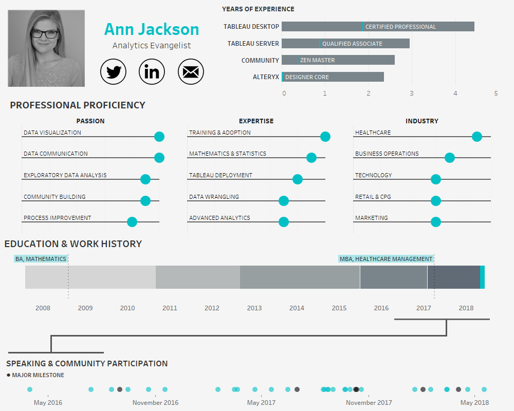
Building an Interactive Visual Resume using Tableau
In the age of the connected professional world it’s important to distinguish and differentiate yourself. When it comes to the visual analytics space, a great way to do that is an interactive resume. Building out a resume in Tableau and posting it on Tableau Public allows prospective employers to get firsthand insight into your skills…
-
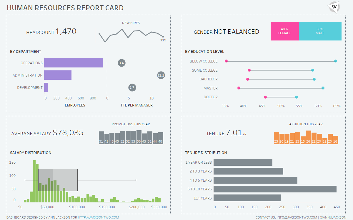
Blending Visualizations of Different Sizes
One of my favorite visualizations is the sparkline – I always appreciated how they are described by Edward Tufte “data-intense, design-simple, word-sized graphics.” Meaning the chart gets right to the point: conveying a high amount of information without sacrificing real estate. I’ve found this approach works really well when trying to convey different levels of…
-
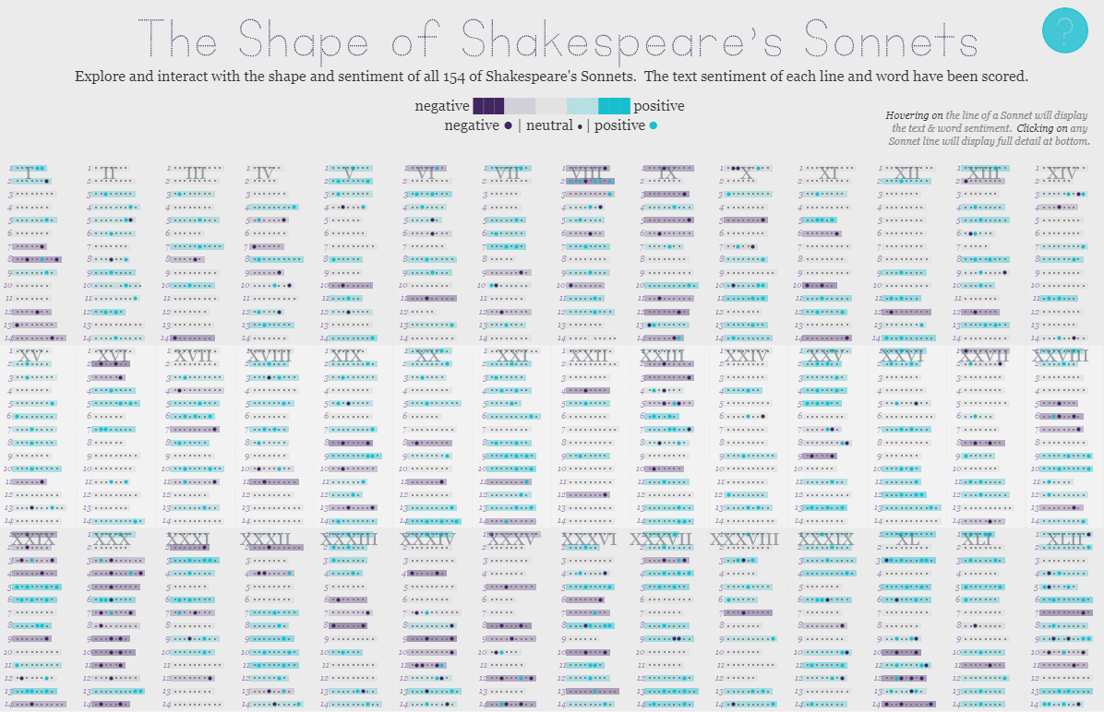
The Shape of Shakespeare’s Sonnets | #IronViz Books & Literature
Jump directly to the viz If it’s springtime that can only mean that it’s time to begin the feeder rounds for Tableau’s Iron Viz contest. The kick-off global theme for the first feeder is books & literature, a massive topic with lots of room for interpretation. So without further delay, I’m excited to share my…
-
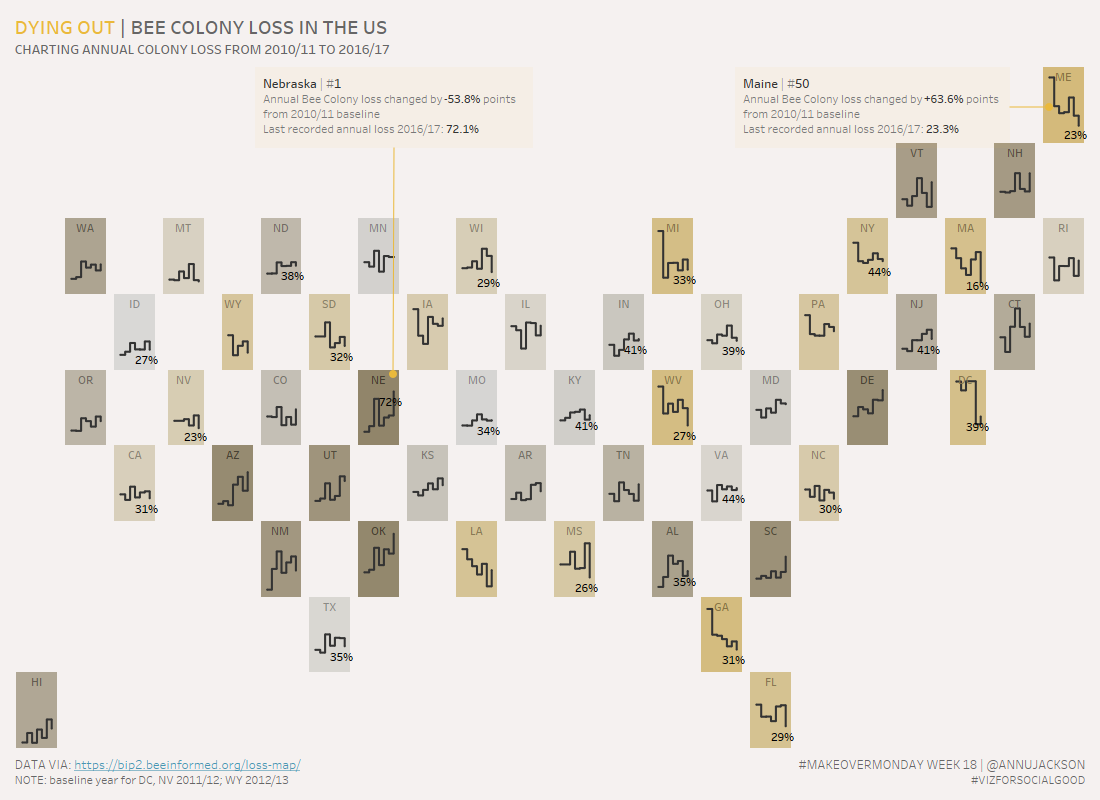
Dying Out, Bee Colony Loss in US | #MakeoverMonday Week 18
Week 18 of Makeover Monday tackles the issue of the declining bee population in the United States. Data was provided by BeeInformed and the re-visualization is in conjunction with Viz for Social Good. Unfamiliar with a few of the terms – check out their websites to learn what Makeover Monday and Viz for Social Good…
-
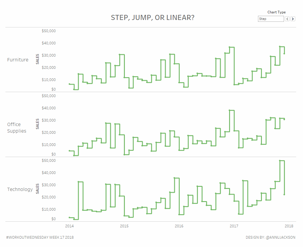
Workout Wednesday Week 17: Step, Jump, or Linear?
What better way to celebrate the release of step lines and jump lines in Tableau Desktop with a workout aimed at doing them the hard way? Using alternative line charts can be a great way to have more meaningful visual displays of not-so-continuous information. Or continuous information where it may not be best to display…
-
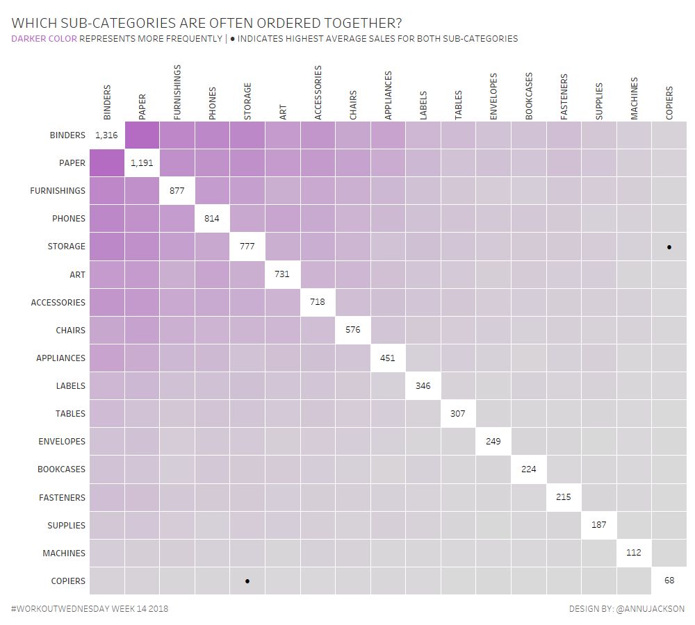
Workout Wednesday 14 | Guest Post | Frequency Matrix
Earlier in the month Luke Stanke asked if I would write a guest post and workout. As someone who completed all 52 workouts in 2017, the answer was obviously YES! This week I thought I’d take heavy influence from a neat little chart made to accompany Makeover Monday (w36y2017) – the Frequency Matrix. I call…
-
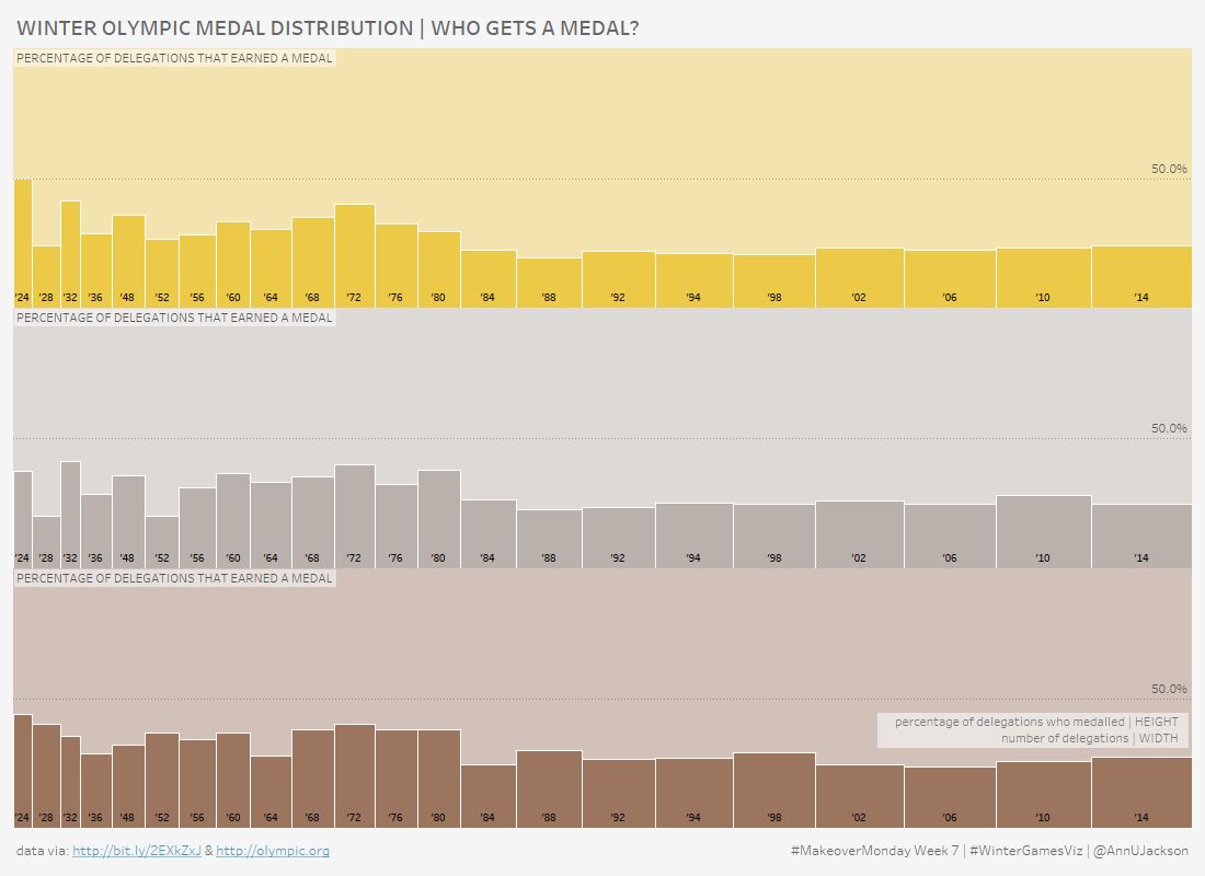
Who Gets an Olympic Medal | #MakeoverMonday Week 7
At the time of writing the 2018 Winter Olympic Games are in full force, so it seems only natural that the #MakeoverMonday topic for Week 7 of this year is record level results of Winter Games medal wins. I have to say that I was particularly excited to dive into this data set. Here’s what…
-
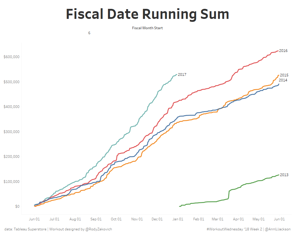
#Workout Wednesday – Fiscal Years + Running Sums
As a big advocate of #WorkoutWednesday I am excited to see that it is continuing on in 2018. I champion the initiative because it offers people a constructive way to problem solve, learn, and grow using Tableau. I was listening to this lecture yesterday and there was a great snippet “context is required to spark…
-
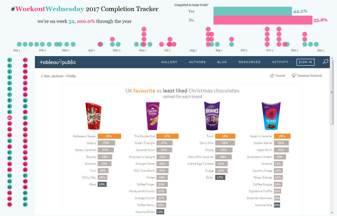
The Remaining 25 Weeks of #WorkoutWednesday
Back in July I wrote the first half of this blog post – it was about the first 27 weeks of #WorkoutWednesday. The important parts to remember (if the read is too long) are that I made a commitment to follow through and complete every #MakeoverMonday and #WorkoutWednesday in 2017. The reason was pretty straightforward…