I’m now back in full force from an amazing analytics experience at the Alteryx Inspire conference in Las Vegas. The week was packed with learning, inspiration, and community – things I adore and am honored to be a part of. Despite the awesome nature of the event, I have to admit I’m happy to be home and keeping up with my workout routine.
So here goes the “how” of this week’s Workout Wednesday week 23. Specifications and backstory can be found on Andy’s blog here.
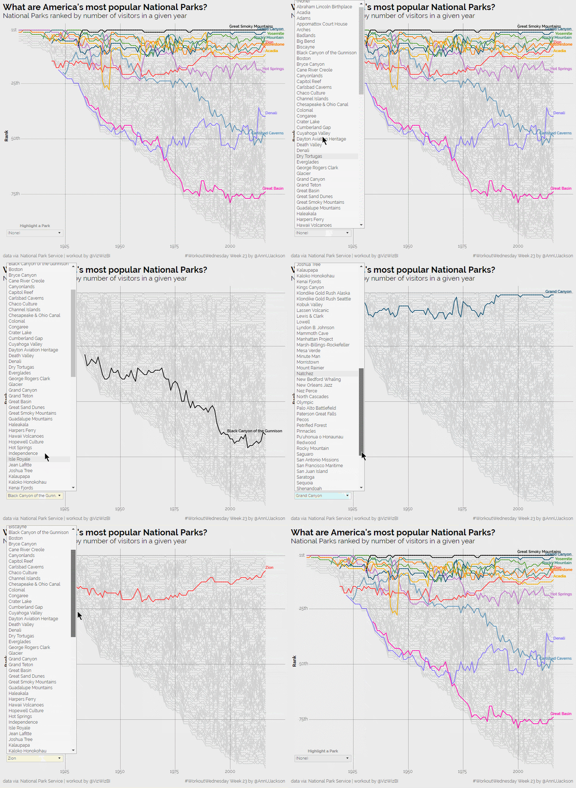
Here’s a picture of my final product and my general assessment of what would be required for approach:

Things you can see from the static image that will be required –
- Y axis grid lines are on specific demarcations with ordinal indicators
- X-axis also has specific years marked
- Colors are for specific parks
- Bump chart of parks is fairly straight forward, will require index() calculation
- Labels are only on colored lines – tricky
Now here’s the animated version showing how interactivity works

- Highlight box has specific actions
- When ‘none’ is selected, defaults to static image
- When park of specific color is selected, only that park has different coloration and it is labeled
- When park of unspecified color is selected, only that park has different coloration (black) and it is labeled
Getting started is the easy part here – building the bump chart. Based on the data set and instructions it’s important to recognize that this is limited to parks of type ‘National Historical Park’ and ‘National Park.’ Here’s the basic bump chart setup:

and the custom sort for the table calculation:
Describing this is pretty straight for – index (rank) each park by the descending sum of recreation visitors every year. Once you’ve got that setup, flipping the Y-axis to reversed will get you to the basic layout you’re trying to achieve.
Now – the grid lines and the y-axis header. Perhaps I’ve been at this game too long, but anytime I notice custom grid lines I immediately think of reference lines. Adding constant reference lines gives ultimate flexibility in what they’re labelled with and how they’re displayed. So each of the rank grid lines are reference lines. You can add the ‘Rank’ header to the axis by creating an ad-hoc calculation of a text string called ‘Rank.’ A quick note on this: if you add dimensions and measures to your sheet be prepared to double check and modify your table calculations. Sometimes dimensions get incorporated when it wasn’t intended.

Now on to the most challenging part of this visualization: the coloration and labels. I’ll start by saying there are probably several ways to complete this task and this represents my approach (not necessarily the most efficient one):
First up: making colors for specific parks called out:

(probably should have just used the Grouping functionality, but I’m a fast typer)
Then making a parameter to allow for highlighting:

(you’ll notice here that I had the right subset of parks, this is because I made the Park Type a data source filter and later an extract filter – thus removing them from the domain)
Once the parameter is made, build in functionality for that:
And then I set a calculation to dynamically flip between the two calculations depending on what the parameter was set to.

Looking back on this: I didn’t need the third calculation, it’s exactly the same functionality as the second one. In fact as I write this, I tested it using the second calculation only and it functions just fine. I think the over-build speaks to my thought process.
- First let’s isolate and color the specific parks
- Let’s make all the others a certain color
- Adding in the parameter functionality, I need the colors to be there if it is set to ‘(None)’
- Otherwise I need it to be black
- And just for kicks, let’s ensure that when the parameter is set to ‘(None)’ that I really want it to be the colors I’ve specified in the first calc
- Otherwise I want the functionality to follow calc 2
Here’s the last bit of logic to get the labels on the lines. Essentially I know we’re going to want to label the end point and because of functionality I’m going to have to require all labels to be visible and determine which ones actually have values for the label. PS: I’m really happy to use that match color functionality on this viz.

And the label setting:

That wraps up the build for this week’s workout with the last components being to add in additional components to the tooltip and to stylize. A great workout that demonstrates the compelling nature of interactive visualization and the always compelling bump chart.
Interact with the full visualization here on my Tableau Public.

Leave a Reply