After a bit of life prioritization, I’m back in full force on a mission to contribute to Makeover Monday. To that end, I’m super thrilled to share that I’ve completed my MBA. I’ve always been an individual destined not to settle for one higher education degree, so having that box checked has felt amazing.
Now on to the Makeover! This week’s data set was extra special because it was published on the Tableau blog – essentially more incentive to participate and contribute (there’s plenty of innate incentive IMO).
The data was courtesy of LinkedIn and represented 3 years worth of “top skills.” Here’s my best snapshot of the data: 
This almost perfectly describes the data set, without the added bonus of there being a ‘Global’ skills in the Country dimension as well. Mixing aggregations or concepts of what people believe can be aggregated, I sighed just a little bit. I also sighed at seeing some countries are missing 2014 skills and 2016 is truncated to 10 skills each.
So the limitations of the data set meant that there had to be some clever dealing to get around this. My approach was to take it from a 2016 perspective. And furthermore to “look back” to 2014 whenever there was any sort of comparison. I made the decision to eliminate “Global” and any countries without 2014 from the data set. I find that the data lends itself best to comparison within a given country (my perspective) – so eliminating countries was something I could rationalize.
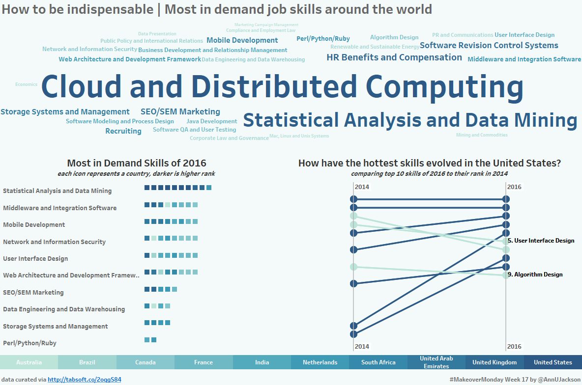
Probably the only visualization I really cared about was a slope chart. I thought this would be a good representation of how a skill has gotten hotter (or not). Here’s that:

Some things I did to jazz it up a bit. Added a simple boolean expression to color to denote if the rank has improved since 2014. Added on reference lines for the years to anchor the lines. I’ve done slope charts different ways, but this one somehow evolved into this approach. Here’s what the sheet looks like:

Walking through it, starting with the filter shelf. I’ve got an Action filter on country (based on action filter buttons elsewhere on the dashboard). Year has been added to context and 2015 eliminated. Datasource filtered out the countries without 2014 data & global. Skill is filtered to an LOD for 2016 Rank <> 0. This ensures I’m only using 2016 skills. The context filters keep everything looking pretty for the countries.

The year lines are reference lines – all headers are hidden. There’s a dual axis on rows to have line chart & circle chart. The second Year in columns is redundant and leftover from an abandoned labeling attempt (but adds nice dual labels automatically to my reference lines).
Just as a note – I made the 2016 LOD with a 2014 LOD to do some cute math for line size – I didn’t like it so abandoned.
Last steps were to add additional context to the “value” of 2016 skills. So a quick unit chart and word cloud. One thing I like to do on my word clouds these days is square the values on size. I find that this makes the visual indicator for size easier to understand. What’s great about this is that smaller rank is better, so instead of “^2” it became this:

Sometimes math just does you a real solid.
The kicker of this entire data set for me and gained knowledge: Statistical Analysis and Data Mining are hot! Super hot! Also really like that User Interface Design and Algorithm Design made it to the top 10 for the United States. I would tell anyone that a huge component of my job is designing analytical outputs for all types of users and that requires an amount of UX design. And coincidentally I’m making an algorithm to determine how to eliminate a backlog, all in Tableau. (basic linear equation)

Leave a Reply