Tag: makeover monday
-
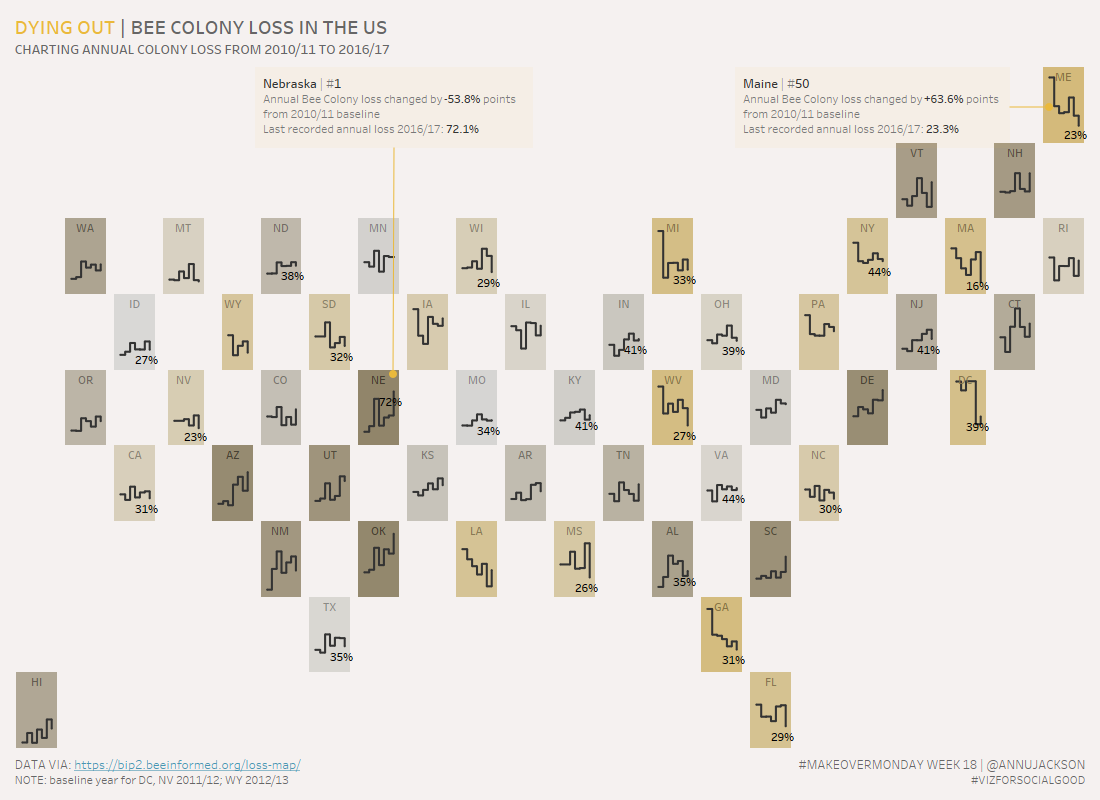
Dying Out, Bee Colony Loss in US | #MakeoverMonday Week 18
Week 18 of Makeover Monday tackles the issue of the declining bee population in the United States. Data was provided by BeeInformed and the re-visualization is in conjunction with Viz for Social Good. Unfamiliar with a few of the terms – check out their websites to learn what Makeover Monday and Viz for Social Good…
-
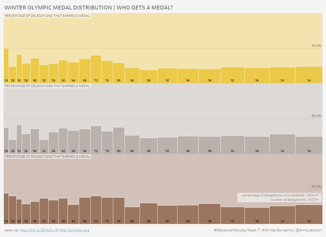
Who Gets an Olympic Medal | #MakeoverMonday Week 7
At the time of writing the 2018 Winter Olympic Games are in full force, so it seems only natural that the #MakeoverMonday topic for Week 7 of this year is record level results of Winter Games medal wins. I have to say that I was particularly excited to dive into this data set. Here’s what…
-
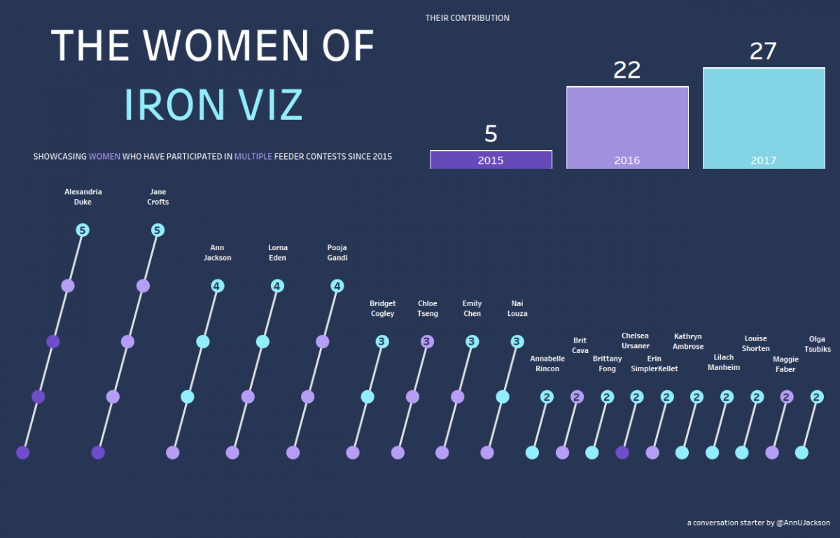
A follow up to The Women of #IronViz
It’s now 5 days removed from the Tableau Conference (#data17) and the topic of women in data visualization and the particularly pointed topic of women competing in Tableau’s #IronViz competition is still fresh on everyone’s mind. First – I think it’s important to recognize how awesome the community reception of this topic has been. Putting…
-

#data17 Recap – A quick top 5
Now that Tableau Conference 2017 has come to a close it’s time to reflect back on my favorite and most memorable moments. I’ll preface by saying that I had very lofty goals for this conference. It started after #data16 – immediately after the conference I did some significant thought work on what I wanted my…
-
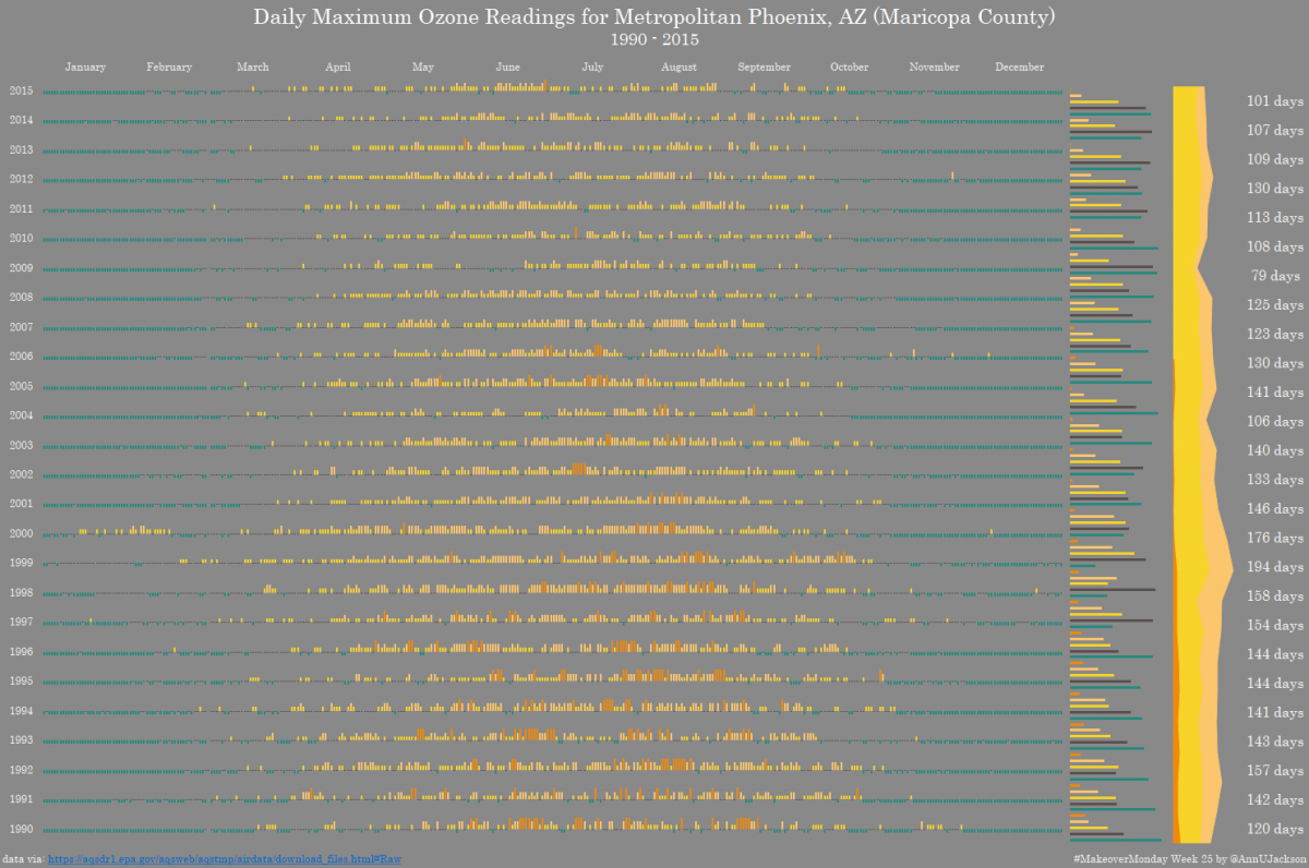
#MakeoverMonday Week 25 | Maricopa County Ozone Readings
We had another giant data set this week – 202 million records of EPA Ozone readings across the United States. The giant data set is generously hosted by Exasol. I encourage you to register here to gain access to the data. The heart of the data is pretty straight forward – PPM readings across several…
-
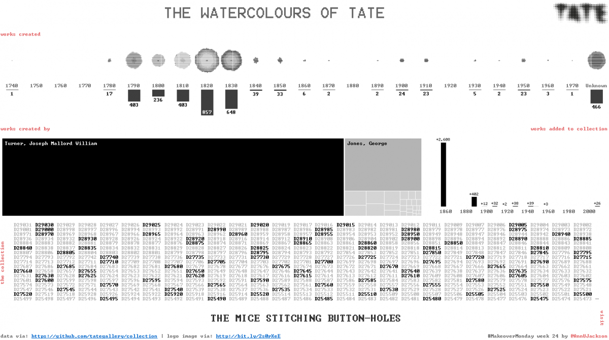
#MakeoverMonday Week 24 – The Watercolours of Tate
First – I apologize. I did a lot of web editing this week that has led to a series of system fails. The first was spelling the hashtag wrong. Next I decided to re-upload the workbook and ruin the bit link. What will be the next fail? Anyway – to rectify the series of fails…
-
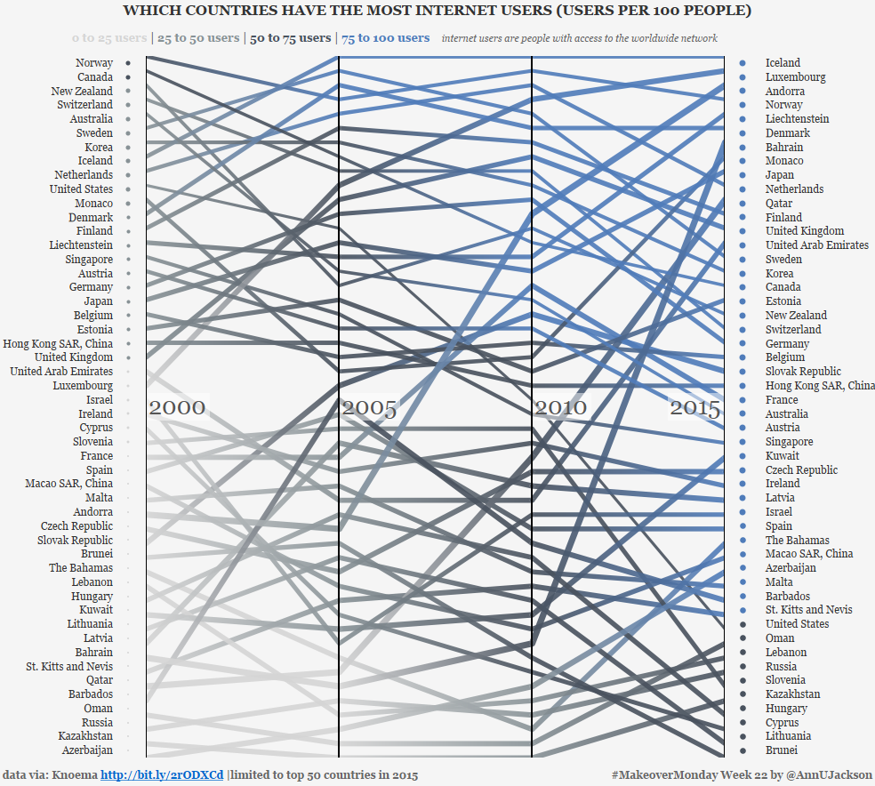
#MakeoverMonday Week 22 – Internet Usage by Country
This week’s data set demonstrates the number of users per 100 people by country spanning several years. The original data set and accompanying visualization starts as an interactive map with the ability to animate through the changing values year by year. Additionally, the interactor can click into a country to see percentage changes or the…
-

#MakeoverMonday Week 21 – Are Britons Drinking Less?
After some botched attempts at reestablishing routine, #MakeoverMonday week 21 got made within the time-boxed week! I have one pending makeover and an in-progress blog post to talk about Viz Club and the 4 developed during that special time. But for now, a quick recap of the how and why behind this week’s viz. This…
-
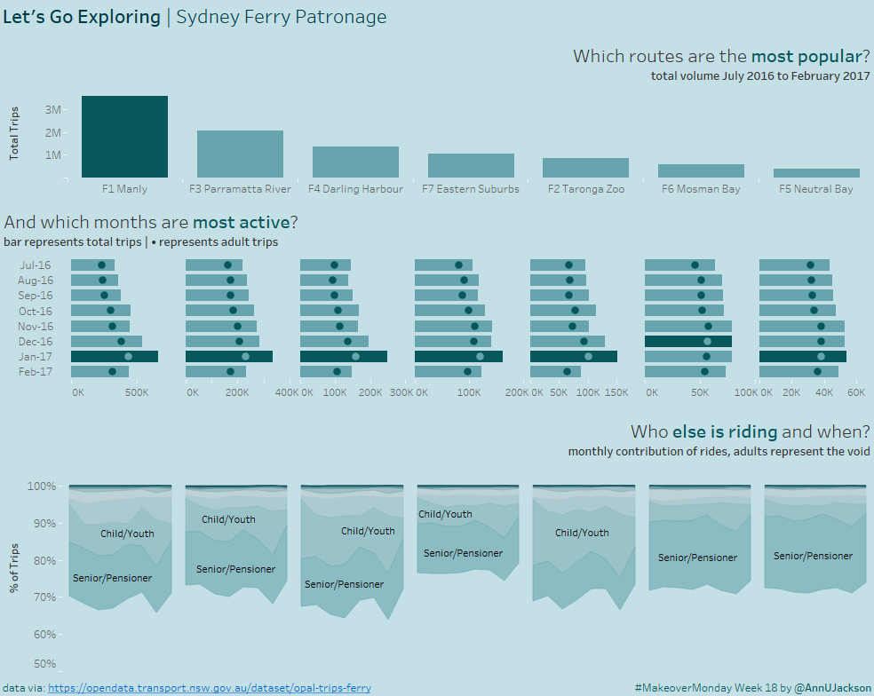
#MakeoverMonday Week 18
{witty intro} This week’s makeover challenge was to take Sydney ferry data for 7 ferry lines and 8 months. What’s even better is there was another dimension with a domain of 9 members. This is a dream data set. I say it’s a dream from the perspective of having two dimensions that can be manipulated…
-
#MakeoverMonday Week 17
After a bit of life prioritization, I’m back in full force on a mission to contribute to Makeover Monday. To that end, I’m super thrilled to share that I’ve completed my MBA. I’ve always been an individual destined not to settle for one higher education degree, so having that box checked has felt amazing. Now…