First – I apologize. I did a lot of web editing this week that has led to a series of system fails. The first was spelling the hashtag wrong. Next I decided to re-upload the workbook and ruin the bit link. What will be the next fail?
Anyway – to rectify the series of fails I decided that the best thing to do would be to create a blog post. Blog posts merit new tweets and new links!
So week 24’s data was the Tate Collection, which upon click through of this link indicates it is a decent approximation of artwork housed at Tate.
Looking at the underlying data set, here’s the columns we get:

And the records:

So I started off decently excited about the fact that there were 2 URLs to leverage in the data set. One with just a thumbnail image only and the other a full link to the asset. However, the Tate website can’t be accessed via HTTPS, so it doesn’t work for on dashboard URLs on Tableau Public. I guess Tableau wants us to be secure – and I respect that!
So my first idea of going the route of all float with an image in the background was out.
Now my next idea was to limit the data set. I had originally thought to do the “Castles of Tate” – check out the number of titles:

A solid number: 2,791 works of art. A great foundation for the underneath. Except of course for what we knew to be true of the data: Turner.

Sigh – this bummed me out. Apparently only Turner really likes to label works of art with “Castle.” Same was true for River and Mountain. Fortunately I was able to easily see that using the URL actions on Tableau Desktop (again can’t do that on Public because of security reasons):
Here is a classic Turner castle:

Now yes, it is artwork – but doesn’t necessarily evoke what I was looking to unearth in the Tate collection.
So I went another path, focusing on the medium. There was a decent collection of watercolour (intentional European spelling). And within that a few additional artist representations beyond our good friend Turner.
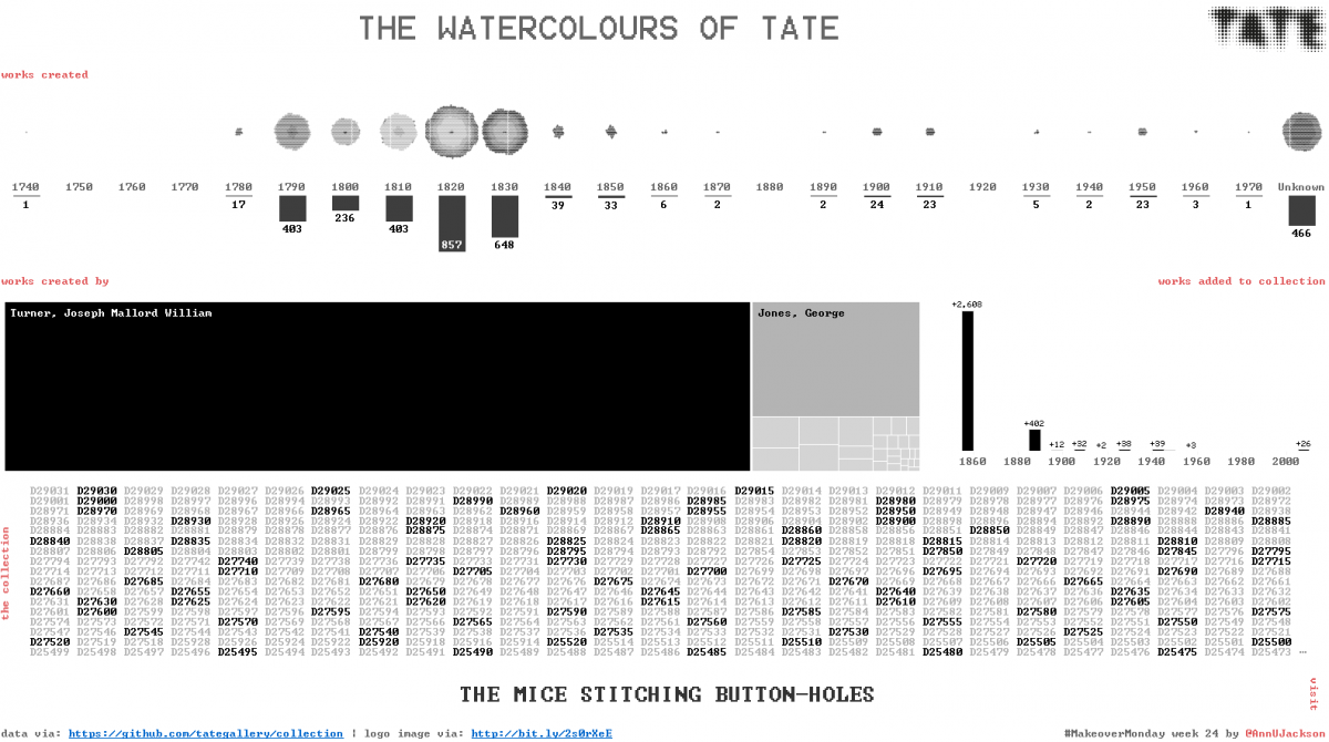
So this informed the rest of the visualization. Lucky for me there was a decent amount of distribution date wise, both from a creation and acquisition standpoint. This allowed me to do some really pretty things with binned time buckets. And inspired by the Tate logo: I took a very abstract approach to the visualization this week. The output is intentionally meant for data discovery. I am not deriving insights for you, I’m building a view for you to explore.
One of my most favorite elements is the small multiples bubble chart. This is not intended to aid in cognition, this is intended to be artwork of artwork. I think that pretty much describes the entire visualization if I’m being honest. Something that could stand alone as a picture perhaps or be drilled deep to the depths of going to each piece’s website and finding out more.
Some oddities with color I explored this week included: using an index and placing that on the color shelf with a diverging color palette (that’s what is coloring the bubble charts). And also using modulo on the individual asset names to spark some fun visual encoding. Better than all one color, I felt breaking up the values in a programmatic way would be fun and different.
Perhaps my most favorite of this is the top section with the bubble charts and bar charts below with the binned year ranges between. Pure data art blots.
Here’s the full visualization on Tableau Public – I promise not to tinker further with the URLs.

Leave a Reply