Let’s Break it Down: Tableau Server
Over the past month I’ve had the awesome pleasure of working on increasing my knowledge around Tableau Server. As part of the process of learning more and advancing my knowledge I set out a goal of taking the Tableau Server Qualified Associate exam. I’m really thrilled (and relieved!) to say that I’ve passed the test. […]
Azure + Tableau Server = Flex
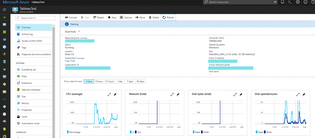
I’m affectionately calling this post Azure + Tableau Server = Flex for two reasons. First – are you a desktop user that has always wanted to extend your skills in Tableau as a platform? Or perhaps you’re someone who is just inherently curious and gains confidence by learning and doing (I fall into this camp). […]
27 Weeks of #WorkoutWednesday
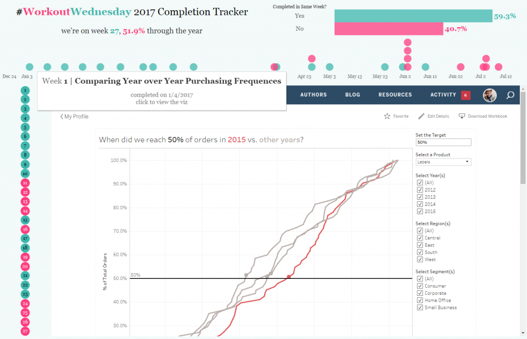
27 weeks into 2017 means 27 weeks of #WorkoutWednesday. So it is time to do some reminiscing on the experience and providing some commentary on the profound effect it has had on me. At the end of 2016 something was abundantly clear to me: I wasn’t as fluid as I could be and I didn’t […]
#IronViz – Let’s Go on a Pokémon Safari!
It’s that time again – Iron Viz! The second round of Iron Viz entered my world via an email with a very enticing “Iron Viz goes on Safari!” theme. My mind immediately got stuck on one thing: Pokémon Safari Zone. Growing up I was a huge gamer and Pokémon was (and still is) one of my favorites. […]
#WorkoutWednesday Week 24 – Math Musings
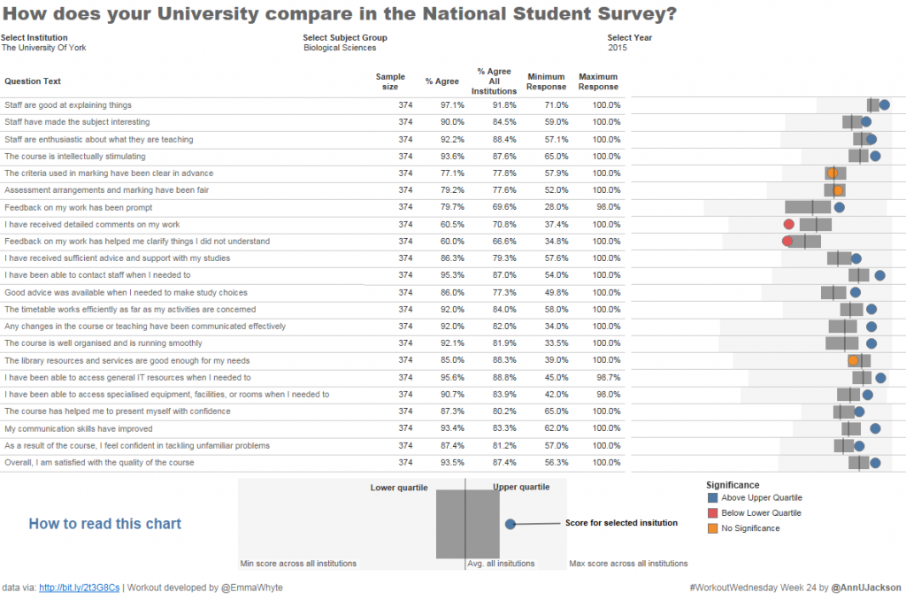
The Workout Wednesday for week 24 is a great way to represent where a result for a particular value falls with respect to a broader collection. I’ve used a spine chart recently on a project where most data was centered around certain points and I wanted to show the range. Propagating maximums, minimums, averages, quartiles, […]
#MakeoverMonday Week 25 | Maricopa County Ozone Readings
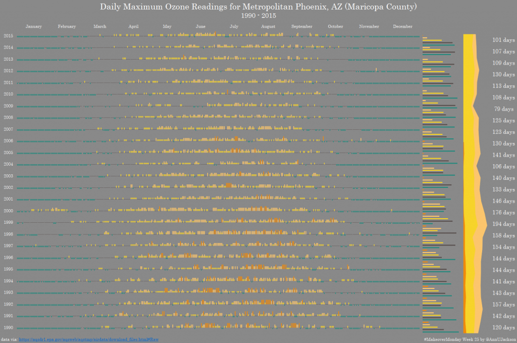
We had another giant data set this week – 202 million records of EPA Ozone readings across the United States. The giant data set is generously hosted by Exasol. I encourage you to register here to gain access to the data. The heart of the data is pretty straight forward – PPM readings across several […]
#MakeoverMonday Week 24 – The Watercolours of Tate
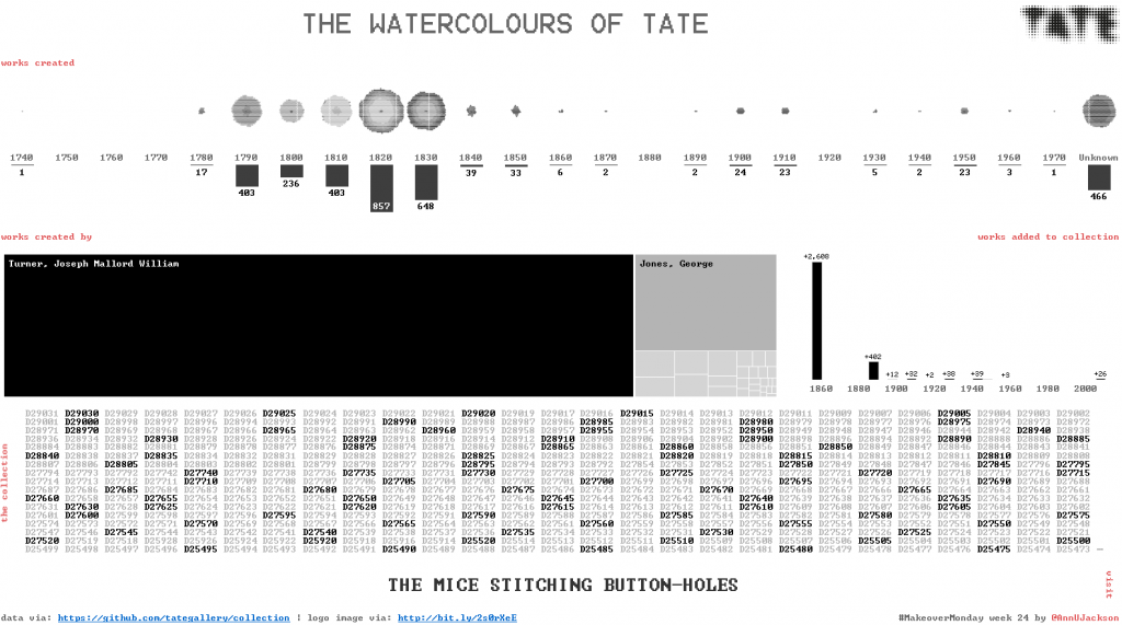
First – I apologize. I did a lot of web editing this week that has led to a series of system fails. The first was spelling the hashtag wrong. Next I decided to re-upload the workbook and ruin the bit link. What will be the next fail? Anyway – to rectify the series of fails […]
#WorkoutWednesday Week 23 – American National Parks
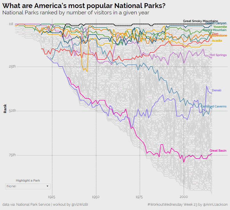
I’m now back in full force from an amazing analytics experience at the Alteryx Inspire conference in Las Vegas. The week was packed with learning, inspiration, and community – things I adore and am honored to be a part of. Despite the awesome nature of the event, I have to admit I’m happy to be […]
#MakeoverMonday Week 22 – Internet Usage by Country
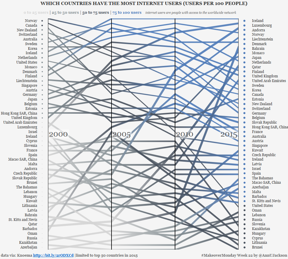
This week’s data set demonstrates the number of users per 100 people by country spanning several years. The original data set and accompanying visualization starts as an interactive map with the ability to animate through the changing values year by year. Additionally, the interactor can click into a country to see percentage changes or the […]
Workout Wednesday Week 21 – Part 1 (My approach to existing structure)
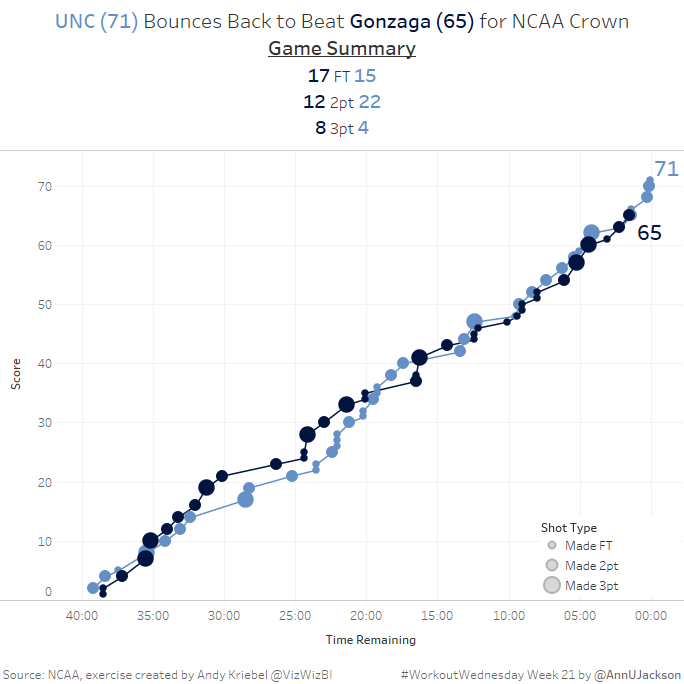
This week’s Workout Wednesday had us taking NCAA data and developing a single chart that showed the cumulative progression of a basketball game. More specifically a line chart where the X axis is countdown of time and the Y axis is current score. There’s some additional detail in the form of the size of each […]