Back in July I wrote the first half of this blog post – it was about the first 27 weeks of #WorkoutWednesday. The important parts to remember (if the read is too long) are that I made a commitment to follow through and complete every #MakeoverMonday and #WorkoutWednesday in 2017. The reason was pretty straightforward – I wanted a constructive way to challenge myself and tangible, realistic goals.
Now that we’re 3 days into 2018 – it’s the perfect opportunity to go through the same process of sharing the impact each workout (the remaining 25) has had on me.

Week 28 | Insights & Annotations
The focus on this workout was adding context/insights/summarization to existing visualizations. Something that is often asked of those creating dashboards or presenting data. I enjoyed this workout tremendously because it was a great example of using a feature within Tableau in a way I hadn’t thought about. The premise is pretty simple – allow users the ability to input insights/findings and customize the summary output. Very clever use that is a great way to provide a dashboard to someone who has little time or is skeptical of self-service analytics.

Week 29 | Who sits where at the Data School?
I hated this workout – because of donut charts. Donut charts in Tableau are the level one “look how cool I am” or “I think I’m pretty awesome with the tool” things that people make. Yes – they are cuter than pie charts (which I don’t mind) – but I strongly hate how these are implemented in Tableau. Pushing aside my dissatisfaction for donuts – I veered off requirements for this dashboard. I particularly changed from the original build results because of how seat favorites were computed – more specifically I ended up with more “No Favorite” than the original. The great points about this workout – the sophistication required to calculate several of the numbers shown.

Week 30 | Loads of LODs
As described this workout had a few LODs. The most distinct thing I remember about this build relates to the region filter. You need to decide early on how you’re going to implement this. I believe Emma used a parameter where I used a filter. The choice made here will have consequences on the visualizations and is a great way to start understanding the order of operations within Tableau.

Week 31 | The Timing of Baby Making
Ah – a favorite visualization of mine, the step chart/plot. The two major gotcha moments here are: implementing the step chart and the dropdowns/filters to set highlighting. This one is solvable in multiple ways and I went the Joe Mako route of unioning my data set. During the build this seemed like the easier solution to me, but it does have implications later on. I believe it’s worth the effort to go this route – you will learn a lot about how unioning your data on itself can be useful.

Week 32 | Continuous Dates are Tricky
This is classic Emma style – particularly down to the requirement of a dynamic title that would update based on newer data availability. The premise itself is pretty straightforward – how can you plot a continuous month line, but have years broken out. By definition that concept should break your brain a bit, because continuous means it’s the entire date, so how are you plotting different years on a continuous axis? And hence the challenge of the workout!

Week 33 | How Have Home Prices Changed?
Andy mentioned that this visualization was inspired by Curtis Harris. And as I write this – it is probably my top visualization in terms of design from the 2017 #WorkoutWednesday collection. Something about the strategic use of capitalization in conjunction to the color choices resonated with me and has left a lasting impact on my viz style. This is a stunningly beautiful example of making Tableau a very self-service analytics tool, having dense data, but still being deceptively simple and clean from a design perspective. Plus you’re practicing dynamic titles again – which I find to be a requirement for most serious builds.

Week 34 | Disney’s Domination
This workout was my first waffle chart. I’d successfully avoided the waffle (as a general rule I don’t like high carbohydrate visualizations) up to this point. More than the waffle – was the requirement to data blend. I’m not a big data blending fan because it is very easy for things to go sideways. However – the icky feeling you get from data blending is exactly why this is a great exercise to work through. And also because I believe I did this entire visualization (up to a point) using LODs and had to switch to table calculations. I learned how to make an LOD into a table calculation (probably the reverse practice for more tenured Tableau folks).

Week 35 | Average Latitude of Solar Eclipses by Century
This is another visualization with design that I find very pleasing – particularly the use of reference lines. I strongly remember learning so much about the Path shelf this week. Specifically how to use path to your advantage. You don’t often see people create something that would otherwise be a line chart, but instead has vertical bars/gantts/lines to focus the eye vertically and then across. A great exercise and thought-starter on additional visualizations to make.

Week 36 | Which UK Airport Should You Fly From?
This workout is the perfect hands-on exercise on taking continuous sizing on bar charts offered up as a new feature in the past year. Beyond knowing that you CAN do something, knowing HOW to build that something is the key (at least for me) to be able to iterate and ideate. This one is more complex than it seems at first glance.

Week 37 | Killings of Blacks by Whites Are Far More Likely to Be Ruled ‘Justifiable’
A viz I don’t want to remember – this one is 100% about formatting. It took me a considerable chunk of time to complete. And probably more maddening – this viz needs to be built in one session, otherwise you’ll forget all the intricate details required to make it look “just so.” I was cursing my PC the entire build – and worse than that I think I restarted it at a certain point because things weren’t lining up how I wanted. Only complete if you enjoy being tormented. The upside? Going through this workout will make you intimately aware of all the gaps and limitations Tableau has as it relates designing. Also – this was done before changing padding was a feature. Thanks guys.

Week 38 | (It Takes) All Sorts
This is another “looks simple” but has “some tricks” workout. I remember someone at our user group asking about this over the summer and if I knew how to build it. I didn’t have an answer readily available within 30 seconds, so I knew there was more going on. I highly encourage this build because it demonstrates how sorting works and how multiple sorts interact with each other. Also – I think whatever sorting I ended up was some sort of mathematical manipulation on my part.

Week 39 | Are the contributions of top sellers increasing throughout the year?
Another trellis chart! More than the trellis – check out what is being analyzed. This isn’t superficial or first-pass reading of data. This is second and third level thought on finding deeper insights and answers to questions within a data set. So naturally it requires more layers of calculations to resolve. And of course – the “just so” placement of the far right label. This is a perfect example of taking a question and turning it into a visualization that shows the answer.

Week 40 | All Sorts Part 2
As advertised and named – the second half of Emma’s sorting workout. This may actually have been the dashboard where I did some mathematical magic to require the first position to be first and retain any additional sorting. Also – the devil is in the details. When you change sort order, notice that the bottom visualization always changes to be the subcategory chosen. Sounds easy, but takes some thought to implement.

Week 41 | State to City Drill Down
As I look back on my tracker – I realize that I did 38 through 41 in the same day. And naturally I approach backlog in the fashion of oldest gets built first. So this was the 4th on a particular day – but I championed this guy hardcore. I will say it again – YOU NEED TO DO THIS WORKOUT. The concepts on execution here are next level. I know it sounds kind of trivial – but it will help unlock your mind to the possibilities of using filters and the art of the possible. Plus this is a question that ALWAYS gets asked. “Can I click a state and have it automatically change the view to cities.” This does that. Also – this build took me 30 minutes tops.

Week 42 | Market Basket Analysis
I won’t forget this workout anytime soon because it required the legacy JET connector and thinking about how data gets joined back on itself. This type of analysis is something people often want to have done – so knowing the steps on creation using an Excel data source (or other sources for that matter) makes this guy worth the build. Follow Emma’s advice closely.

Week 43 | The Seasonality of Superstore
A great viz once again demonstrating how powerful parameters can be – how you can use them in multiple places – and also things you can do to make visualizations more user/reader friendly. You’re definitely using a table calculation somewhere in here – and you definitely will get angry when trying to recreate the smoothing (particularly dealing with endpoints of the chosen time range).

Week 44 | Customer Cohorts
When dealing with cohort analysis you’re very likely to encounter LODs – that’s par for the course for this workout. But again – Emma is so clever at taking something that seems straightforward and challenging you to implement. If you look closely you’ll have to dynamically change the bottom visualization based on where a user clicks. I remember spending the majority of my time on the dynamic title.

Week 45 | Stock Portfolio
This is one sheet. Just remember that – everything is on one sheet. And more than that – think about how this is implemented from a numerical perspective – there’s some serious normalization going on to make things show up in context to one another. If you’re not a math lover – this will be a great way to play with numbers and have them bend to your advantage. Also – I remember being annoyed because one of the stocks had a maximum value greater than the recorded max (which is it’s own measure) – and that irritated me.

Week 46 | Top N Customers
Think of this as a different way of implementing sets. It has a lot of similar functionality between IN/OUT and showing members of a set. And also there are some key takeaways in terms of aggregating dimensions. Not super flashy on design, but very useful in terms of implementation.

Week 47 | Fun with Formatting
Another visualization where you’re required to do everything in a single sheet. This will put all that table calculation sweat to action. I really enjoyed this one. There is something very satisfying about ranking/indexing things multiple ways in one view. Also it uses the Caption guys.

Week 48 | Treemap Drilldown
Same concept as week 41, but executed as a treemap. I think I even opened up week 41 to use as influence on where to go. Same concepts are repeated, but in a different format. The automagic of this one doesn’t get old – also carefully look at how things are sorted.

Week 49 | Position of Letter Occurrences in Baby Names
When you say out loud what you’re trying to do – particularly “find the nth occurrence” of a specific letter (we can generalize as substring) in a specific string – it sounds really really hard. But guess what – there’s a built in function! The fact that it’s built in made this visualization super straightforward to complete. You should build this to introduce yourself to a function you’ve probably never used before.

Week 50 | Rocket ship Chart
I very much enjoy this type of chart from an analytical perspective. It’s a great way to normalize things that are bound to time. You see immediate inferred rank and results. Emma put in some requirements to ensure that as data changed this chart would stay accurate.

Week 51 | State by State Profit Ratio
If you want several of the lessons Andy built into multiple workouts all in one place – this workout is for you. It’s got so many classic Kriebel “gotcha” moments in it. As I was building this I really felt like it was a specially designed final to test what I’ve learned. Also this is probably my first tilemap (unless we made one in another workout). I don’t use them often – so it’s a great refresher on how to implement. And also – you get to use a join calculation.

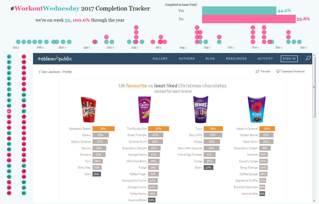
Week 52 | UK’s Favourite Christmas Chocolates
When I was building this one someone asked me why I was making it – specifically where was the challenge. I explained that it was all in one sheet opposed to 4 different sheets. A natural next question occurred which was “why would you want to do it in one sheet.” I though that was a very interesting question and one that I explained by saying that for me personally knowing multiple ways to do things is important. And more specifically as I know to be true of these types of builds – if you can do it in one sheet, it shows a level of mastery on making Tableau do exactly what you want (which is LOTS of things).
And that wraps up 2017 beautifully. Comparing the retrospective of this half of the year vs. the first half – there are stark differences from my perspective. I can honestly say that each build got easier as time went on. Once I got to the last few challenges – I was timing completion to be about 20 minutes. Contrast that with the first few weeks where I spent hours (over multiple sessions) making my way through each build.
Beyond building out my portfolio, having concrete examples of specific types of analysis, and fulfilling my own goals – #WorkoutWednesday has given me such depth of knowledge in Tableau that it’s ridiculous. You know how people say things like “that’s just funny Tableau behavior” – well I can (for the most part) now verbally articulate what and why that funny behavior is. And more than that – I know how to maximize the behavior which is really working as designed and use it to my own advantage.
The last part of this blog series is going to be a ranking of each workout – aimed to help those who are interesting in completing the challenges approach these without getting too discouraged or burnt out on some of the builds that are still (to this day) hard. Be on the lookout.
Leave a Reply