Week 10 postcards are finally here for the data postcard project Sarah Bartlett and I are working on. The topic for the week was our relationship with each other. How much do we communicate, how often, when, and so on. And the timing was fantastic – Sarah and I recorded a video feedback session for #IronQuest ala business dashboards. That meant in addition to our normal back and forth we were preparing for the recording (and as always monitoring the latest when it comes to the postcards).
I chose to approach the week by focusing on the time difference between us. Sarah and I use WhatsApp to text each other and after EVERY message there is a timestamp. So this got me very curious as to what the timestamp says on Sarah’s phone. I compiled all of our texts at the end of the week and jotted down their time (in my time) in a Google Sheet. Then I did the math to offset the time and began plotting.
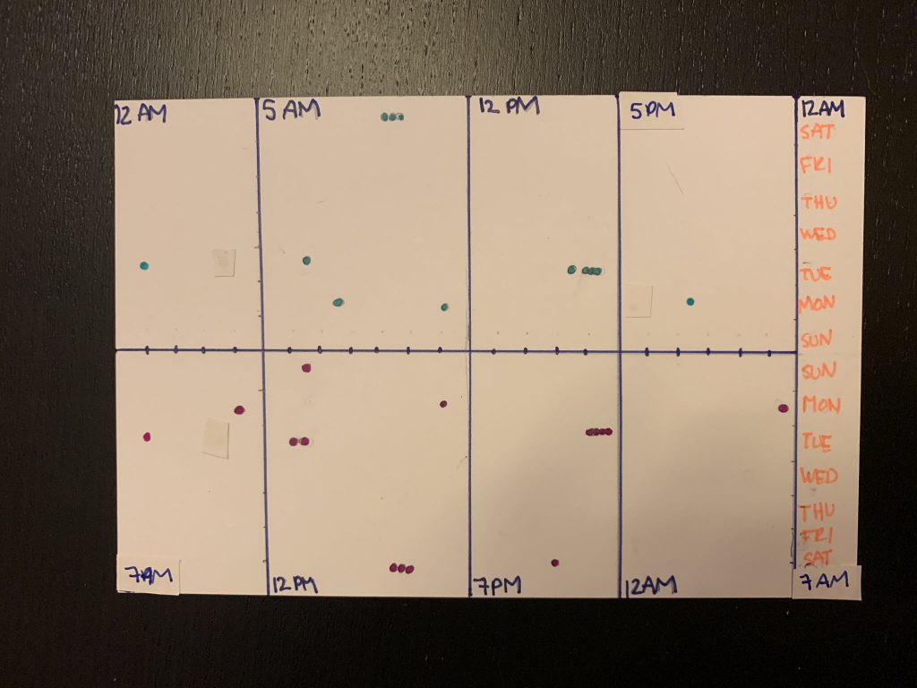
To demonstrate the difference in when we were talking to each other I chose to create two different time axes with the days of the week starting at the center line (Sunday) and moving outward toward Saturday. I was hoping to see a common pattern emerge around when we typically talk to each other. In reality it seems like independent of time of day we are both pretty responsive (Sarah did tell me to go to bed once). There’s one very small pattern that would probably emerge over more time – notice that Sarah messages me around noon and then I wake up in the morning and reply.
You’ll notice that the viz itself is full of corrections – I spent a ton of care crafting out a precise grid for hours and days – but fell short on labeling and that in turn influenced where I put a few data points. I also realized after I mailed it that there are times when it’s the next day for Sarah vs. me – so at best the labels for days of the week represent the days from my perspective.
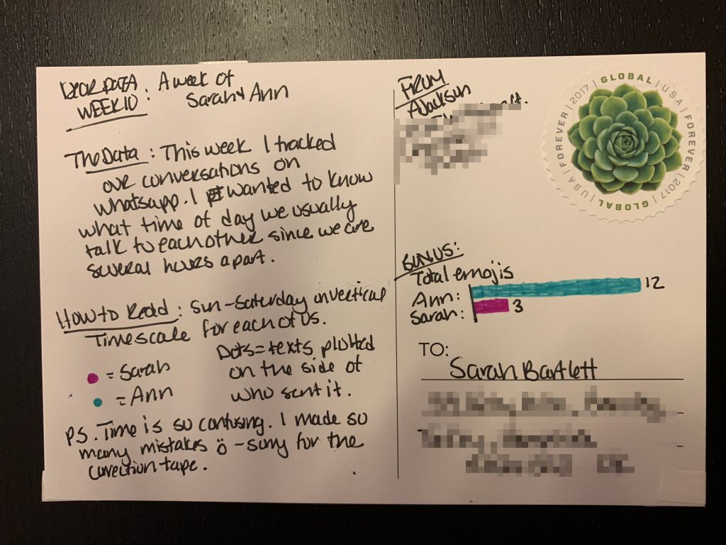
Ending on a high note I created a bonus viz of emojis. My original idea was to add them as flourish to the dots, but because plotting them correctly proved difficult, I left it to a simple bar chart. Maybe a ratio would have been more effective? Ann uses 4 emojis per every 1 emoji used by Sarah.
Here’s Sarah’s postcard:
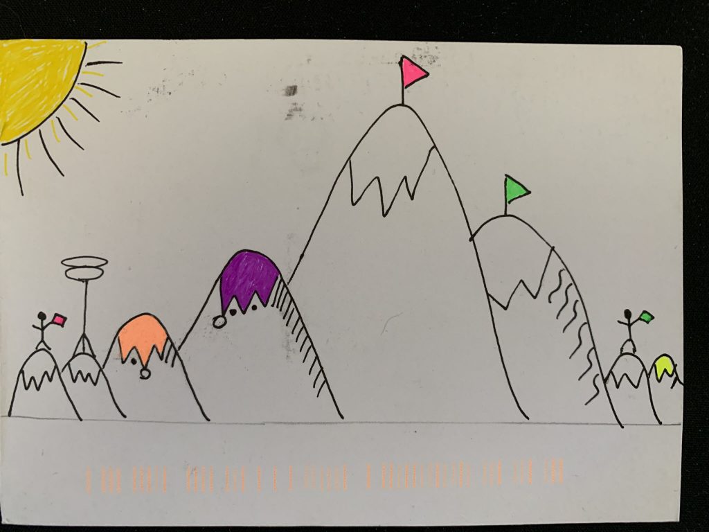
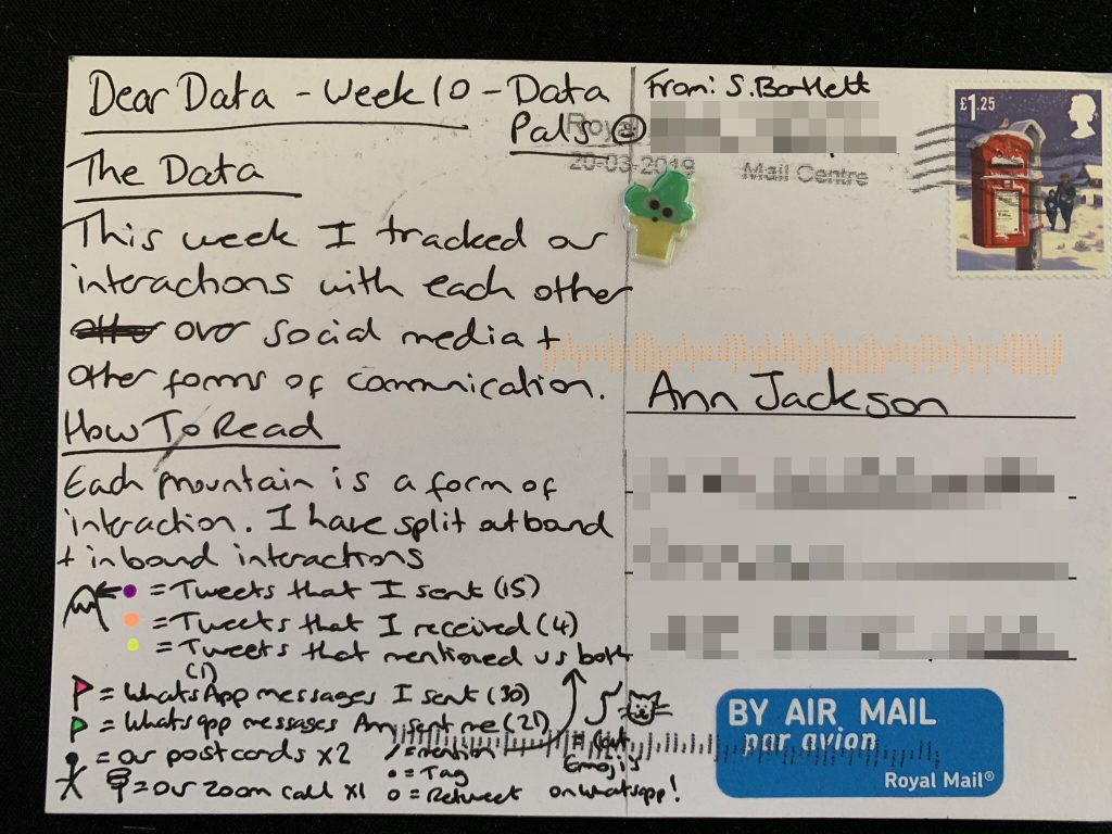
Once again Sarah delights! She’s clearly on a path of taking things to a new place of abstraction and using other objects as visual metaphors. Not only that, but she also captured MUCH more data about us – our interactions on Twitter, our postcards, and our #IronQuest feedback call. AND she included the number of cat emojis on WhatsApp. (!!) And amazingly enough – if you didn’t know it was data-driven – you’d assume it was just a sketch.
There’s more to come soon – so keep an eye out! And in the meantime make sure you check out Sarah’s take on the topic.