One of the more interesting aspects of data visualization is how new visualization methods are created. There are several substantial charts, graphs, and plots out there that visualization artists typically rely on.
As I’ve spent time reading more about data visualization, I started thinking about potential visualizations out there that could be added into the toolkit. Here’s the first one that I’ve come up with: The Float Plot.
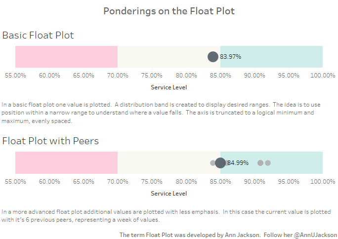
The idea behind the float plot is simple. Plot one value that has some sort of range of good/acceptable/bad values and use color banding to display where it falls. It works well with percentage values.
I’ve also made a version that incorporates peers. Peers could be previous time period values or they could be less important categories. The version with peers reminds me somewhat of a dot plot, but I particularly appreciate the difference in size to distinguish the important data point.
What’s also great about the Float Plot is that it doesn’t have to take up much space. It looks great scaled short vertically or narrow horizontally.
Enjoy the visualization on my Tableau public profile here.
Leave a Reply