Tag: data visualization
-
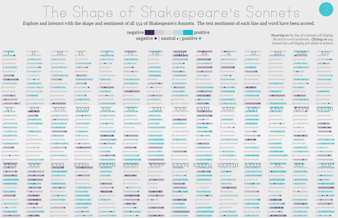
The Shape of Shakespeare’s Sonnets | #IronViz Books & Literature
Jump directly to the viz If it’s springtime that can only mean that it’s time to begin the feeder rounds for Tableau’s Iron Viz contest. The kick-off global theme for the first feeder is books & literature, a massive topic with lots of room for interpretation. So without further delay, I’m excited to share my…
-
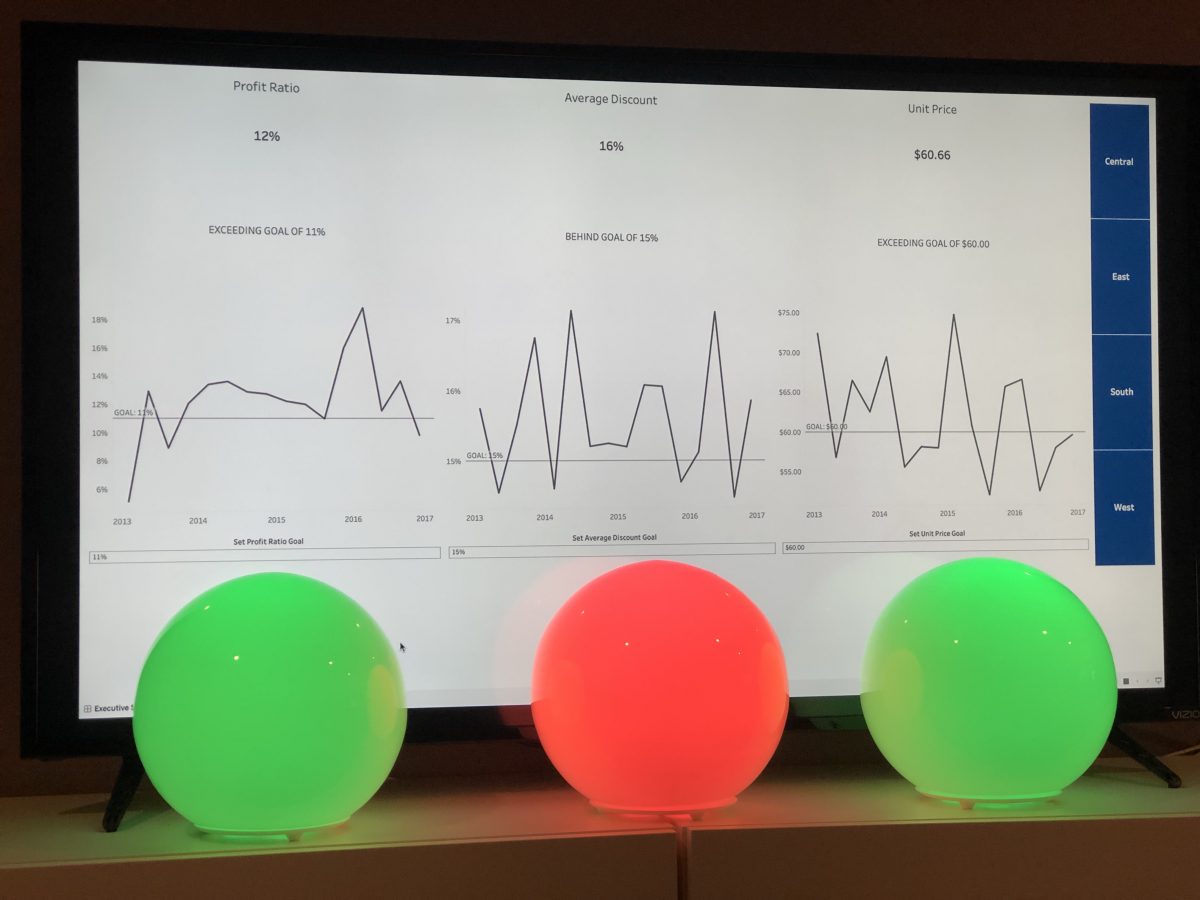
Tableau + Python + IoT
You’ve asked and it’s time to answer. About a week ago I posted a teaser video on Twitter that showed how I integrated my home automation system with a Tableau dashboard. The outcome of the video was dynamically changing three different lights in conjunction with KPI results. So beyond the “hey this is really cool”…
-
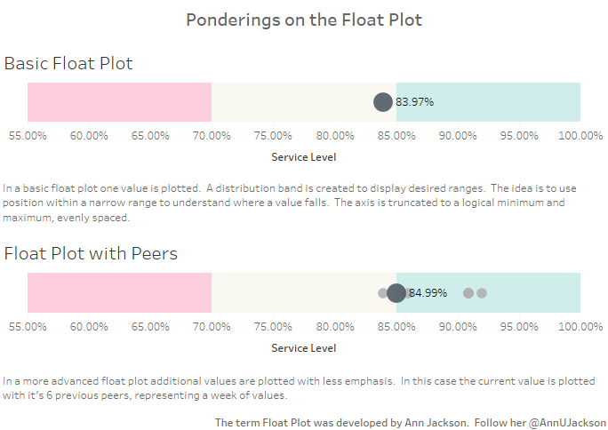
The Float Plot
One of the more interesting aspects of data visualization is how new visualization methods are created. There are several substantial charts, graphs, and plots out there that visualization artists typically rely on. As I’ve spent time reading more about data visualization, I started thinking about potential visualizations out there that could be added into the…