Category: Quantified Self
-
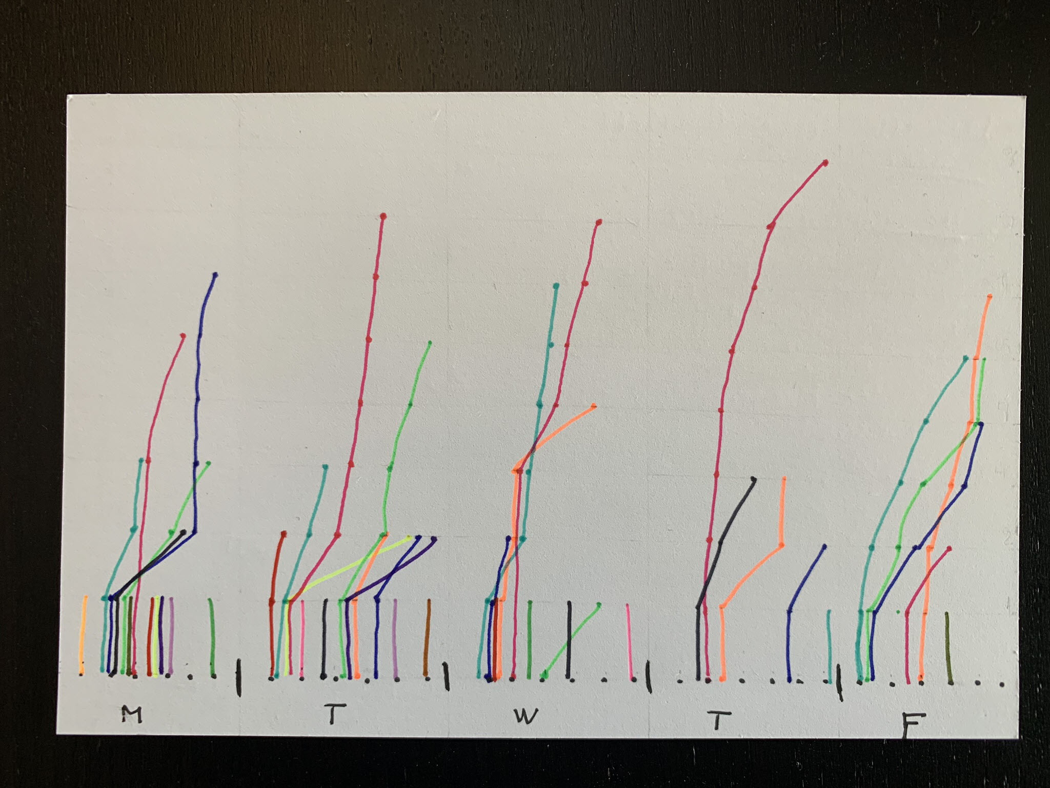
Dear Data 2019 – Week 8, Phone Addiction
After the terrible flurry of complaints, Sarah and I continued on with week 8 of the dear data postcard project we’re conducting. Week 8 was a welcome change, tracking how often we use our phones. I was excited to jump on this topic to know more insight into what I’m doing on my phone (although…
-
Dear Data – Week 7, Complaints
Week 7 postcards have long been delivered and this blog post is overdue. As if the subject for the cards had some influence, the theme of complaints seemed to have an extremely negative impact on having the desire to write the companion blog post. During this week I tried to track all of my verbal…
-
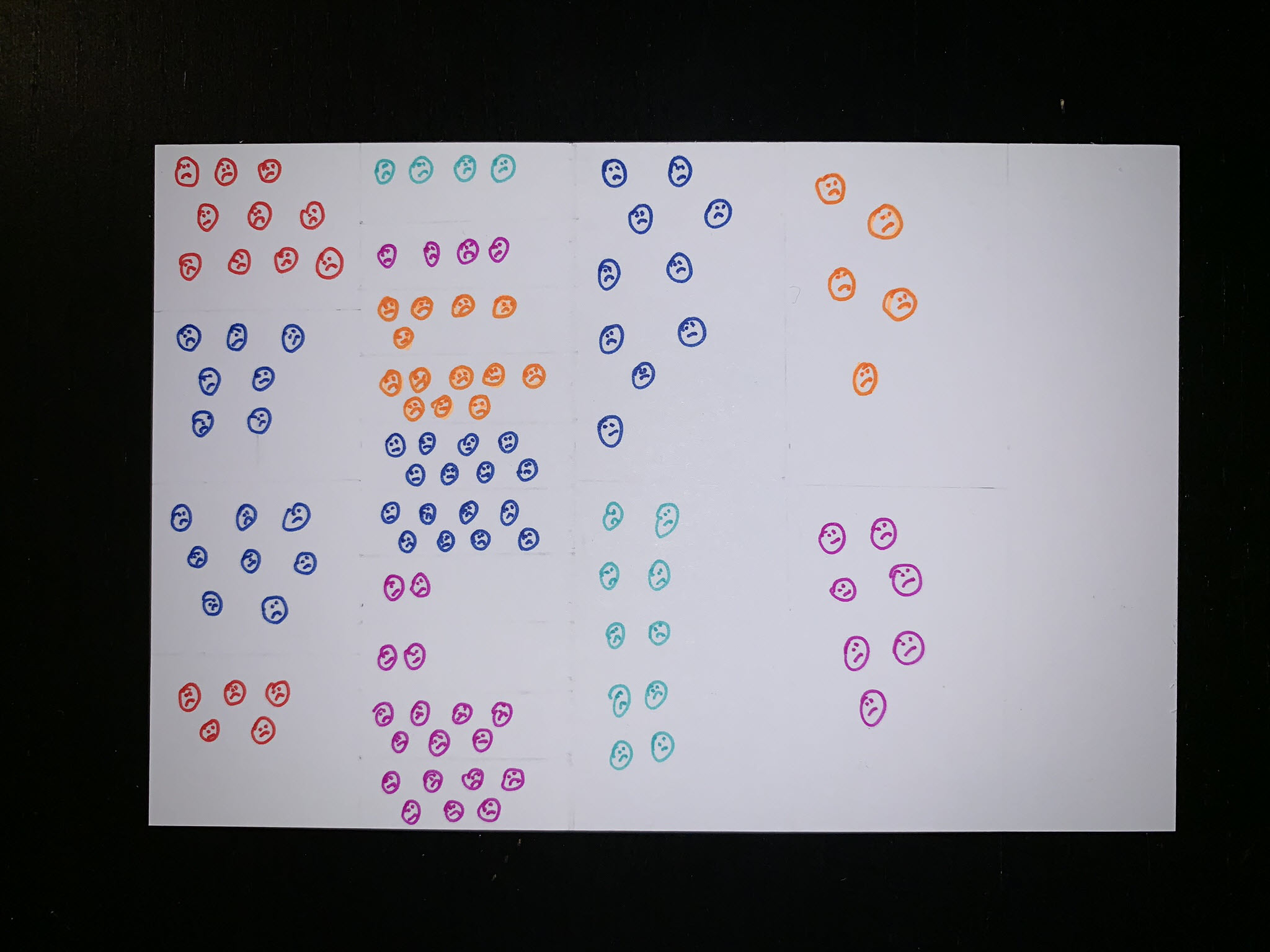
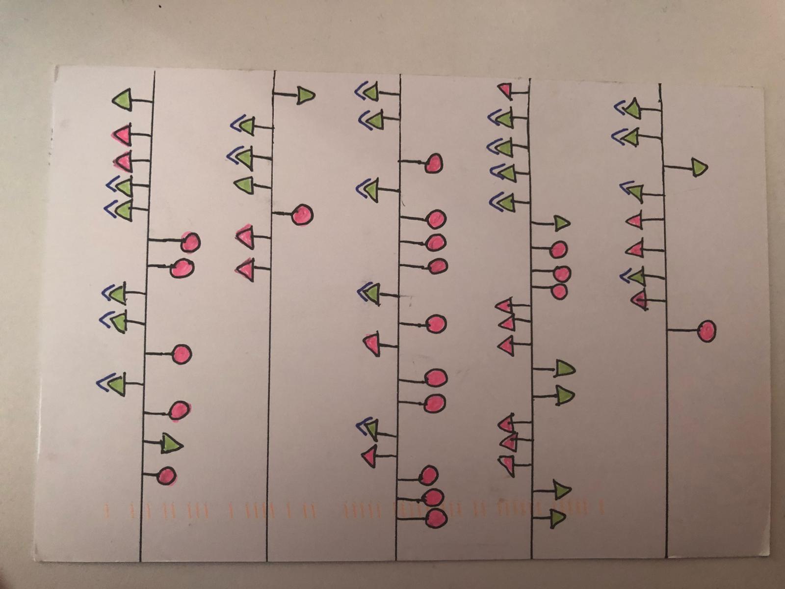
Dear Data 2019 – Week 6, Physical Contact
Week 6 postcards of the data project Sarah Bartlett and I are working on are here and I couldn’t be more excited. The theme of week 6 was physical contact. During the original project Giorgia and Stefanie tracked people they touched and who touched them, but I decided to switch things up and include my…
-
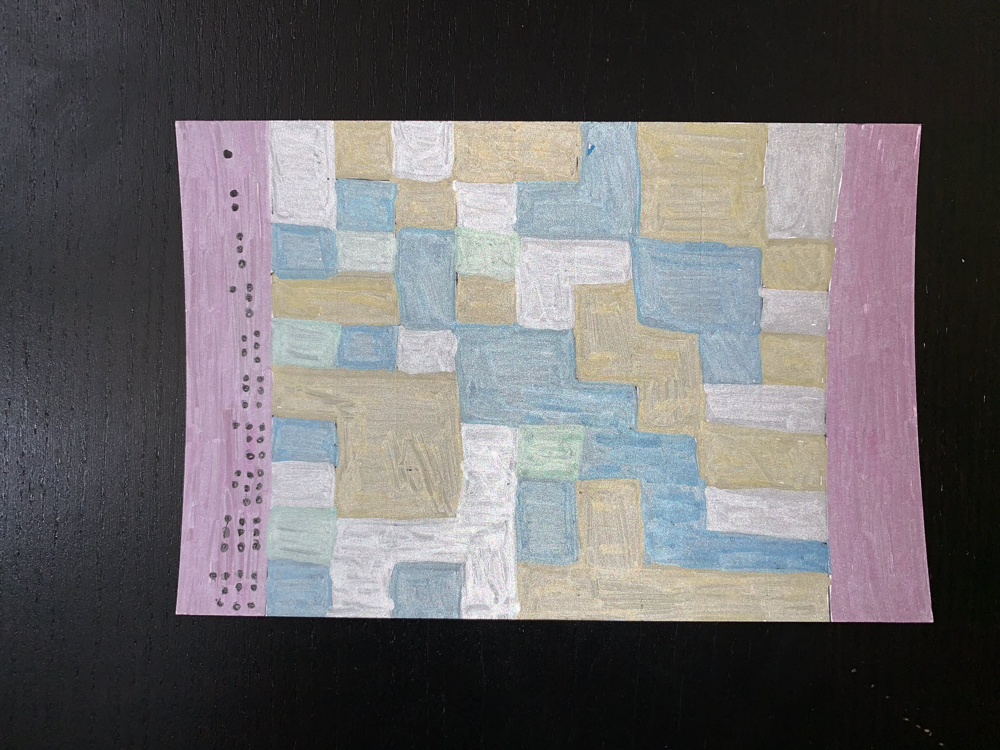
Dear Data 2019 – Week 4, Mirrors
Week 4 of the data postcard project Sarah Bartlett and I are working on this year is here. We still have yet to reach consistent timing for postcard arrival. Sarah usually receives mine 2 days or more before I receive hers, but this week we were only one day apart. Week 4’s topic was all…
-
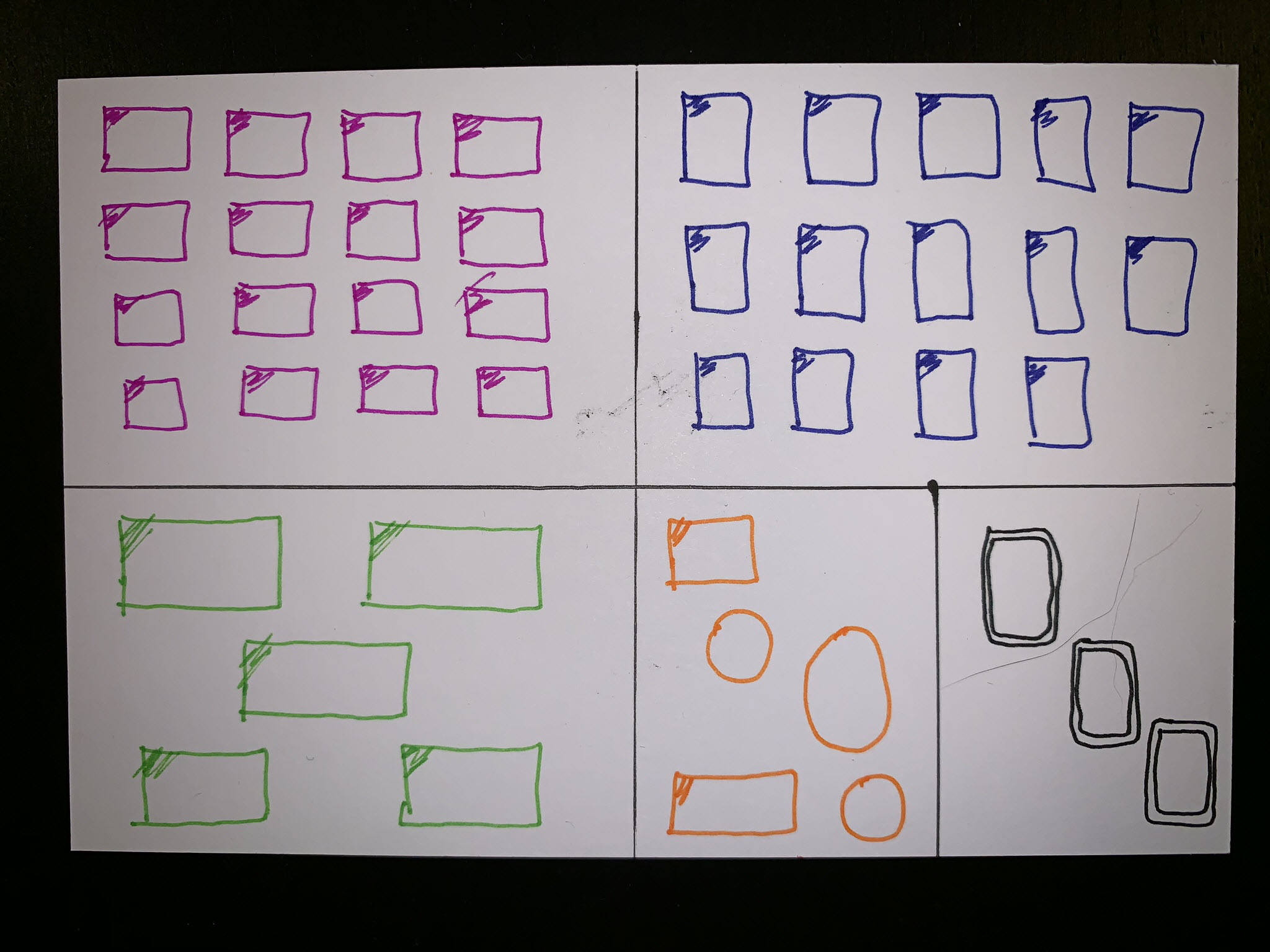
Dear Data 2019 – Week 3, Thank Yous
Week 3 postcards for the data project Sarah Bartlett and I are working on this year have finally reached their destinations. I think we both felt that the mail was slower than normal, perhaps due to the abnormally cold weather here in the US. Week 3’s topic was tracking how often we say “thank you.”…
-
Statistical Process Control Charts
I’ve had this idea for a while now – create a blog post and video tutorial discussing what Statistical Process Control is and how to use different Control Chart “tests” in Tableau. I’ve spent a significant portion of my professional career in business process improvement and always like it when I can integrate techniques learned…
-
Quick and easy – parameters to aggregate dates
(Now with video – video uses different data as an example) One of my favorite uses of parameters is to dynamically change date aggregations without the pesky drill symbol. Sometimes I want to just see week or month, quarters tend to be pretty worthless. Especially if I’m doing something discrete, I really don’t like the…