Week 3 postcards for the data project Sarah Bartlett and I are working on this year have finally reached their destinations. I think we both felt that the mail was slower than normal, perhaps due to the abnormally cold weather here in the US.
Week 3’s topic was tracking how often we say “thank you.” I knew going into this week that it wasn’t going to be an easy task. I say “thank you” a lot, so I decided to set up IFTTT buttons on my phone. They also show up on my Apple Watch to make it much easier to record the data as soon as it happens.
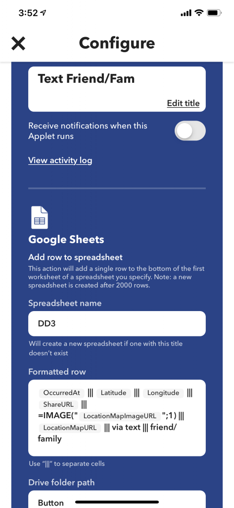
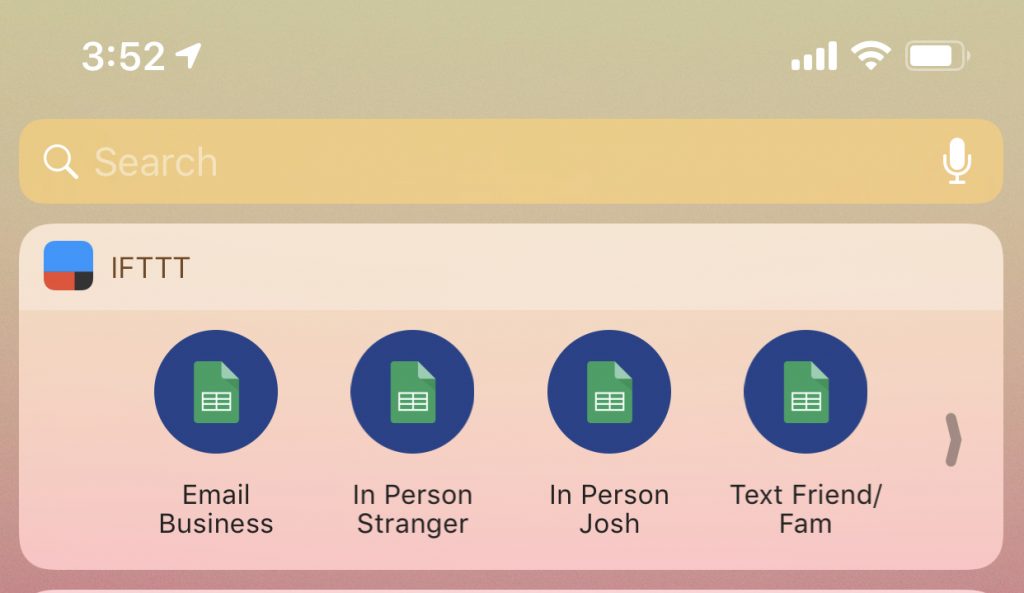
The recipe for each Applet is very simple. Once a button is pushed it will write a row to a spreadsheet called DD3 with the following columns of information. I customized the last 2 fields based on my desire to capture the medium (in person/virtual) and who the person was. Here are the final buttons, they reside in the widgets area of my phone. I put IFTTT at the very top to make sure they’d be easy to access.
Sarah and I also talked about how we were each going to track data this week and she also ended up using IFTTT. And after using the buttons over the course of the week, I will definitely be reusing this technique for future weeks.
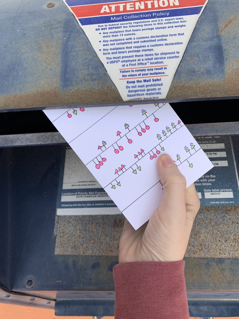
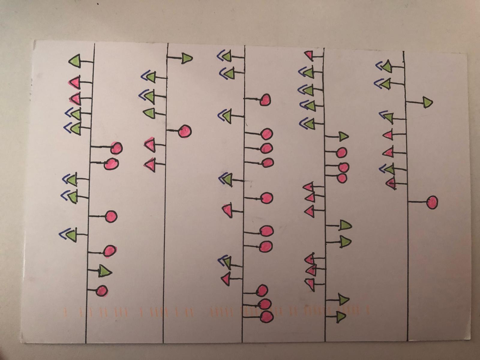
Now that the data collection backstory is out of the way, here’s my poscard:

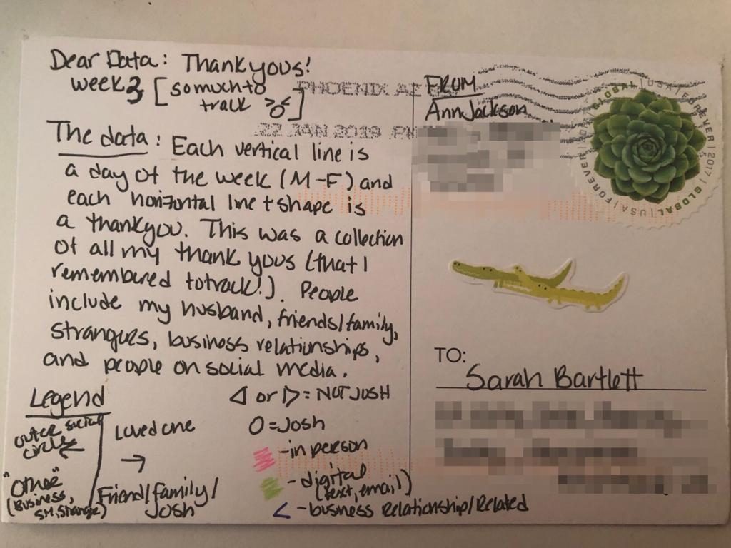
In this visualization each vertical line represents a day of the week (Monday to Friday). Each shape coming off the line is a thank you. Those on the left side are for people outside of my inner circle (business contacts, strangers, people on social media). Conversely those on the right represent my close friends, family, and my husband (Josh). I chose to use shapes to represent whether the thank you was for Josh or not, as seen by the triangles vs. circles.
The shapes are also plotted in sequential order throughout the day, with the top being the first thank you and the bottom being the last thank you. And the final two pieces are: pink or green to represent in person vs. digital and an additional < next to business related thank yous.
I also cheated a bit this week and mocked up the postcard in Tableau. I wanted to make sure the faint idea I had in my head would look okay on paper. You’ll notice very quickly that quite a bit of the detail was reduced for the postcard.
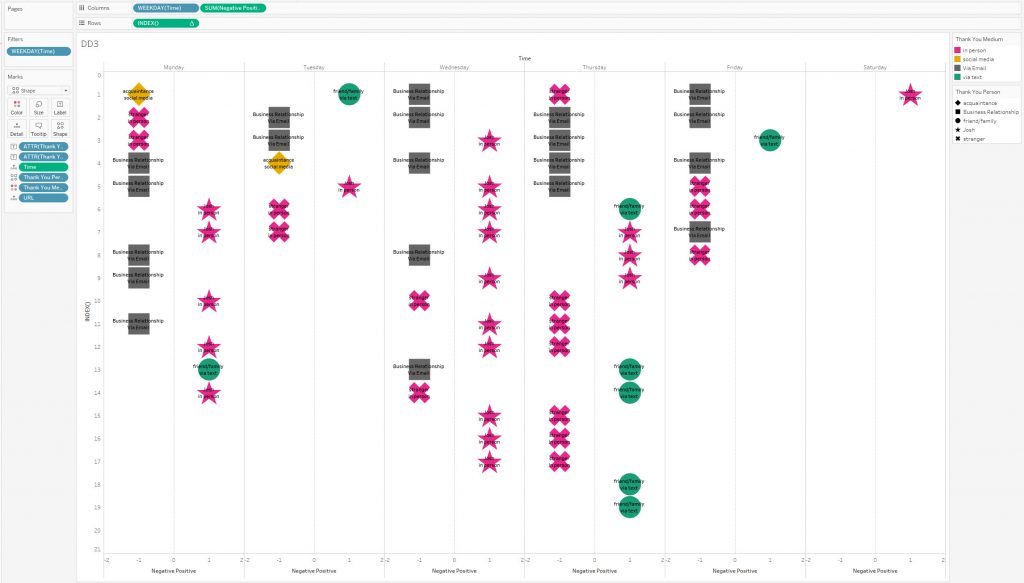
I really enjoyed the pattern that my data revealed this week. On most days I start my morning sending thank you emails and then as it builds, I end up leaving my house or talking to other people. The thank yous I dish out to Josh seem to be very dependent on what the focus of the day is.
In contrast, here’s Sarah’s week 3 postcard:
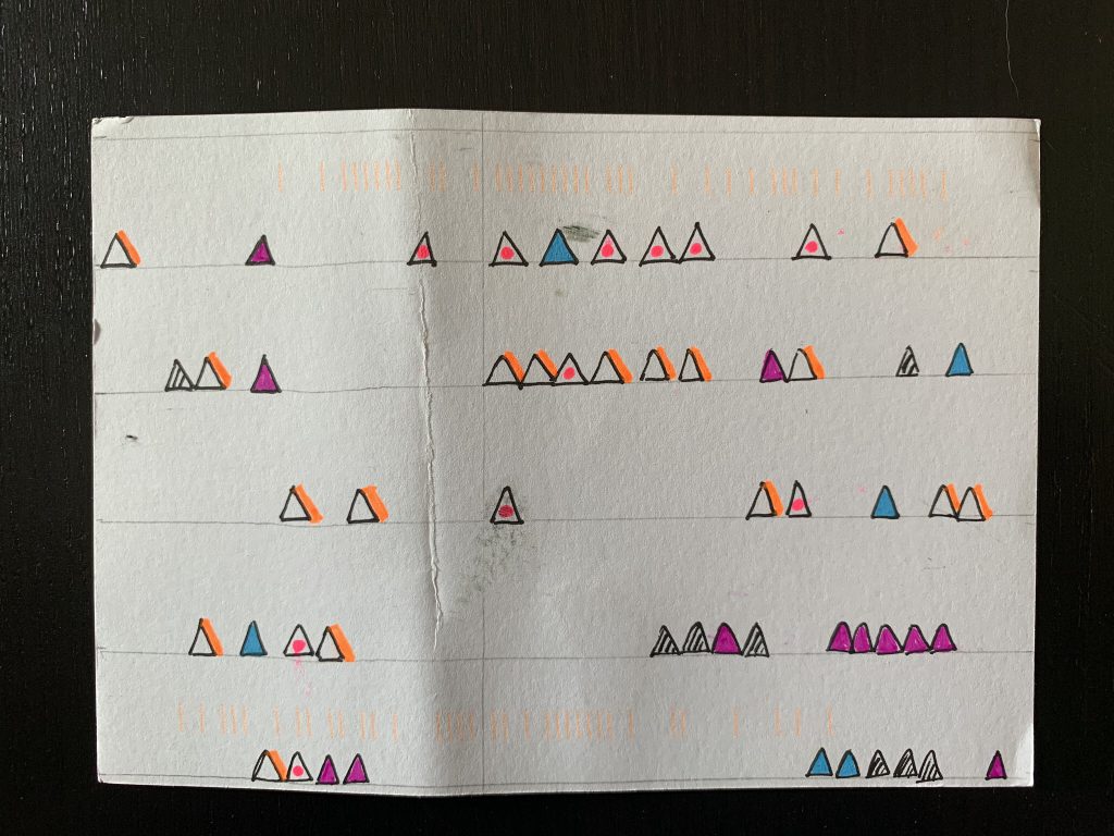
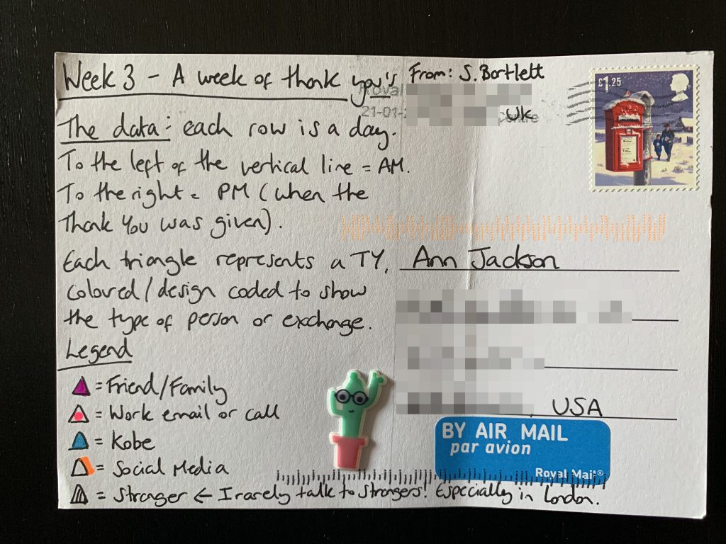
I say “in contrast” jokingly here, because I think we took a VERY similar approach. Not only superficially in the usage of lines for passage of time and the choice of triangles, but also in the choice of detail we decided to track. Her breakout of people is similar to mine, leaving a special place for her husband, and carving out social layers from friend/family, to work, social media, and finally strangers. One thing she did that I really like was include the vertical line for AM/PM. I think that adds a little more context to the flow of each day.
That’s a wrap for this week! Don’t forget to check out Sarah’s blog post and get her take on the week.
Leave a Reply