Tag: iron viz
-
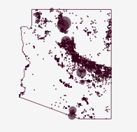
Without Water an Iron Viz feeder
Jump directly to the viz At the time of writing it is 100°F outside my window in Arizona and climbing. It’s also August and we’re right in the middle of feeder round 3 for Tableau Public’s Iron Viz contest. Appropriately timed, the theme for this round is water. So it’s only fitting that my submission…
-
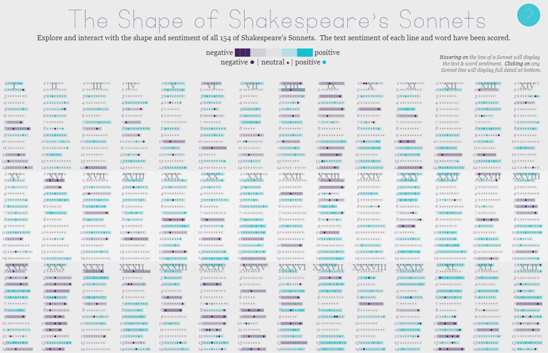
The Shape of Shakespeare’s Sonnets | #IronViz Books & Literature
Jump directly to the viz If it’s springtime that can only mean that it’s time to begin the feeder rounds for Tableau’s Iron Viz contest. The kick-off global theme for the first feeder is books & literature, a massive topic with lots of room for interpretation. So without further delay, I’m excited to share my…
-
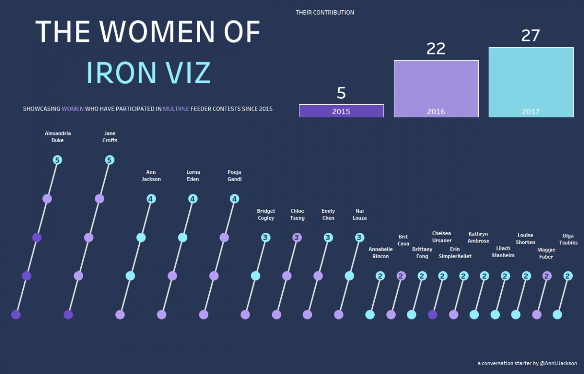
A follow up to The Women of #IronViz
It’s now 5 days removed from the Tableau Conference (#data17) and the topic of women in data visualization and the particularly pointed topic of women competing in Tableau’s #IronViz competition is still fresh on everyone’s mind. First – I think it’s important to recognize how awesome the community reception of this topic has been. Putting…
-

Star Trek The Next Generation: Every Episode (#IronViz 3)
It’s that time again – Iron Viz feeder contest! The third and final round for a chance to battle at conference in a chef coat is upon us. This round the focus was on anything ‘Silver Screen.’ With a limitless topic I was certain that I would find myself in a creative rut that would…
-
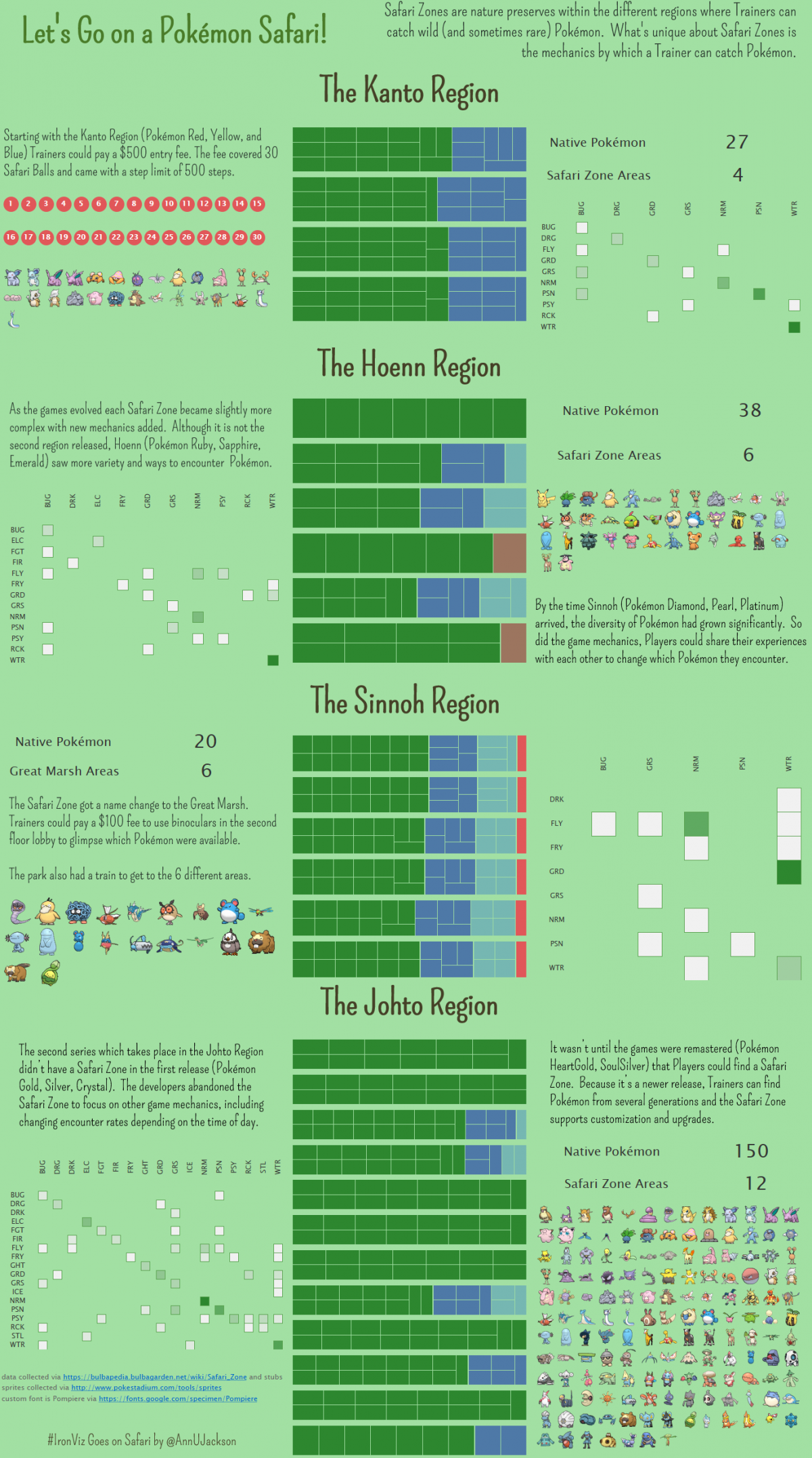
#IronViz – Let’s Go on a Pokémon Safari!
It’s that time again – Iron Viz! The second round of Iron Viz entered my world via an email with a very enticing “Iron Viz goes on Safari!” theme. My mind immediately got stuck on one thing: Pokémon Safari Zone. Growing up I was a huge gamer and Pokémon was (and still is) one of my favorites.…
-
#IronViz Entry – Mobile Design
Part of being involved in the Tableau community means publicly publishing visualizations to learn and grow. It’s also a great way to find inspiration. As I’ve pushed myself to be more active within the local Phoenix Tableau community and social (Twitter) community, I knew it was time to “step up” and make an Iron Viz.…