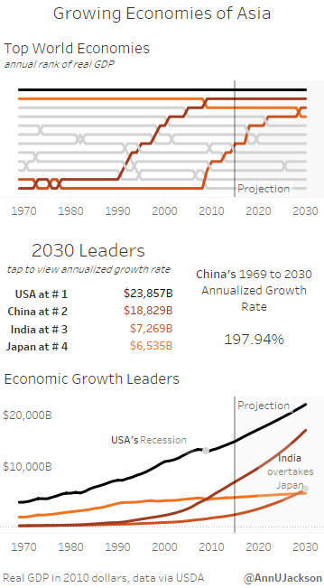
Part of being involved in the Tableau community means publicly publishing visualizations to learn and grow. It’s also a great way to find inspiration.
As I’ve pushed myself to be more active within the local Phoenix Tableau community and social (Twitter) community, I knew it was time to “step up” and make an Iron Viz.
My design aesthetic tends to be minimal, slightly formal, and geared toward (in my mind) elegance. I like to make dashboards and visualizations that highlight the data, but don’t jump to many conclusions. I’m very conclusion agnostic, so leading people too far down a path doesn’t always seem right.
All that being said – I wanted to make an Iron Viz entry, but it needed to be simple. The deadline is September 18 (today as I’m writing this). So I wanted to develop something relatively straightforward that got to the heart of mobile design.
The data inspiration for the viz actually came from an animated bar chart .gif showing the “Top 10 Economies” growth from 1969 to 2030 that I saw on Twitter. I thought it would make a nice bump chart or slope chart, and the conclusion of the data was already compelling.
First the data gathering process – relatively simple on this one. The .gif referenced the source, a quick Google search led me to the results. I’m going to loosely promise to publish the excel file at some point.
Next up was diving right in. I recently made a “micro viz” in Tableau 10, designing it exclusively for a very tiny space. I actually didn’t use the device designer for this one, instead opting to develop the whole thing with my intended sizing. With the sizing set, development was similar to what I’ve done in the past in v9.3 (version of Tableau I use at my job).
Transitioning to device specific design was different than I thought. Since I knew the final product (in my mind) would need to have more emphasis placed on the mobile view. It is after all a mobile design challenge!
Like I mentioned above, I had a pretty good idea of what I wanted the final viz to look like. I knew there needed to be a bump chart and I was going to call attention to China and India. What I didn’t realize is that the device designer is really geared toward creating a “master view” and then augmenting that master for the device. This makes sense to me as I rethink the way the feature was presented.
What this meant for the creative process? I wasn’t able to make visualizations (sheets) and quickly drop them on the mobile layout. For each new “potential viz” I had to first drop it on the overall dashboard and then bring it on to the mobile specific dash. It made the whole process kind of clunky.
I also struggled a bit with getting to formatting features quickly. I can’t double click on titles to adjust font sizes in device preview, gotta go back to the default layout. I’ll have to adjust my thought process next time and really think about starting from the default view and optimizing a mobile version.
I probably cheated the viz out of more depth that could have been added if I had truly started with the default dashboard and then made a mobile design. It is fair to say that the default dashboard has real estate for more data insight and data depth. I am still very pleased with the overall final results.

Leave a Reply