Earlier in the month Luke Stanke asked if I would write a guest post and workout. As someone who completed all 52 workouts in 2017, the answer was obviously YES!
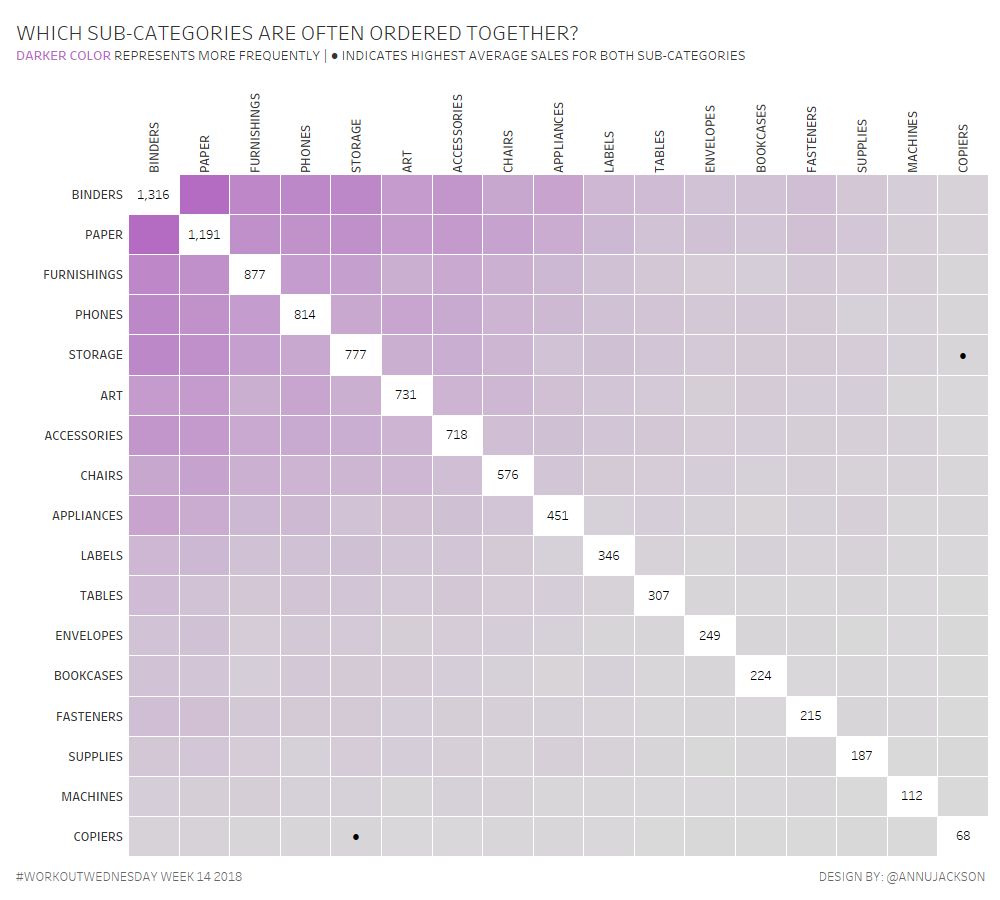
This week I thought I’d take heavy influence from a neat little chart made to accompany Makeover Monday (w36y2017) – the Frequency Matrix.
I call it a Frequency Matrix, you can call it what you will – the intention is this: use color to represent the frequency (intensity) of two things. So for this week you’ll be creating a Frequency Matrix showing the number of orders within pairs of sub-categories.

Primary question of the visualization: Which sub-categories are often ordered together?
Secondary question of the visualization: How much on average is spent per order for the sub-categories.
Tertiary question: Which sub-category combination causes the most average spend per order?
Requirements
- Use sub-categories
- Dashboard size is 1000 x 900; tiled; 1 sheet
- Distinctly count the number of orders that have purchases from both sub-categories
- Sort the categories from highest to lowest frequency
- White out when the sub-category matches and include the number of orders
- Calculate the average sales per order for each sub-category
- Identify in the tooltip the highest average spend per sub-category (see Phones & Tables)
- If it’s the highest average spend for both sub-categories, identify with a dot in the square
- Match formatting & tooltips – special emphasis on tooltip verbiage
This week uses the superstore dataset. You can get it here at data.world
After you finish your workout, share on Twitter using the hashtag #WorkoutWednesday and tag @AnnUJackson, @LukeStanke, and @RodyZakovich. (Tag @VizWizBI too – he would REALLY love to see your work!)
Also, don’t forget to track your progress using this Workout Wednesday form.
Hints & Detail
- You may not want to use the WDC
- Purple is from hue circle
- You’ll be using both LODs and Table Calculations
- I won’t be offended if you change the order of the sub-category labels in the tooltips
- Dot is ●
- Have fun!
Leave a Reply