Makeover Monday 2017 – Week 2
It’s time for Makeover Monday – Week 2. This week’s data set was the quarterly sales (by units) of Apple iPhones for the past 10ish years. The original article accompanying the data indicated that the golden years of Apple may be over. So let me start by saying – I broke the rules (or rather, […]
Makeover Monday 2017 – Week 1
It’s officially 2017 – the start of a new year. As such, this is a great time for anyone in the Tableau universe to make a fresh commitment to participate in the community challenge known as Makeover Monday. As I jump into this challenge, I’ve made the conscious decision to start with the things I […]
How do you add value through data analytics?
I recently read this article that really ignited a lot of thoughts that often swirl around in my mind. If you were to ask me what my drive is, it’s making data-informed, data-driven decisions. My mechanism for this is through data visualization. More broadly than that, it is communicating complex ideas in a visual manner. […]
The Float Plot
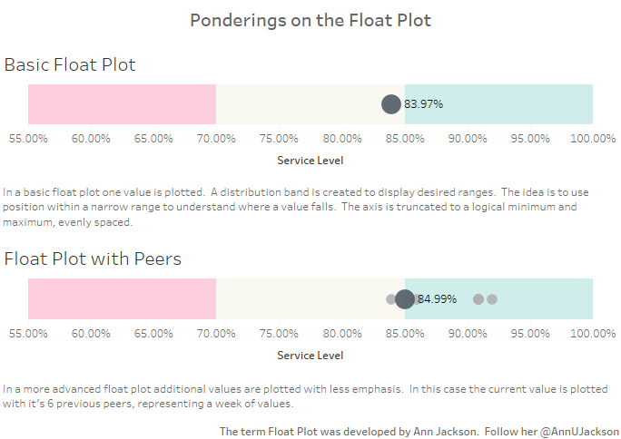
One of the more interesting aspects of data visualization is how new visualization methods are created. There are several substantial charts, graphs, and plots out there that visualization artists typically rely on. As I’ve spent time reading more about data visualization, I started thinking about potential visualizations out there that could be added into the […]