Week 7 postcards have long been delivered and this blog post is overdue. As if the subject for the cards had some influence, the theme of complaints seemed to have an extremely negative impact on having the desire to write the companion blog post.
During this week I tried to track all of my verbal complaints or times when I felt actively frustrated or annoyed. I genuinely try not to complain very often, so most of my tracked complaints represent high amounts of escalated annoyance or dissatisfaction.
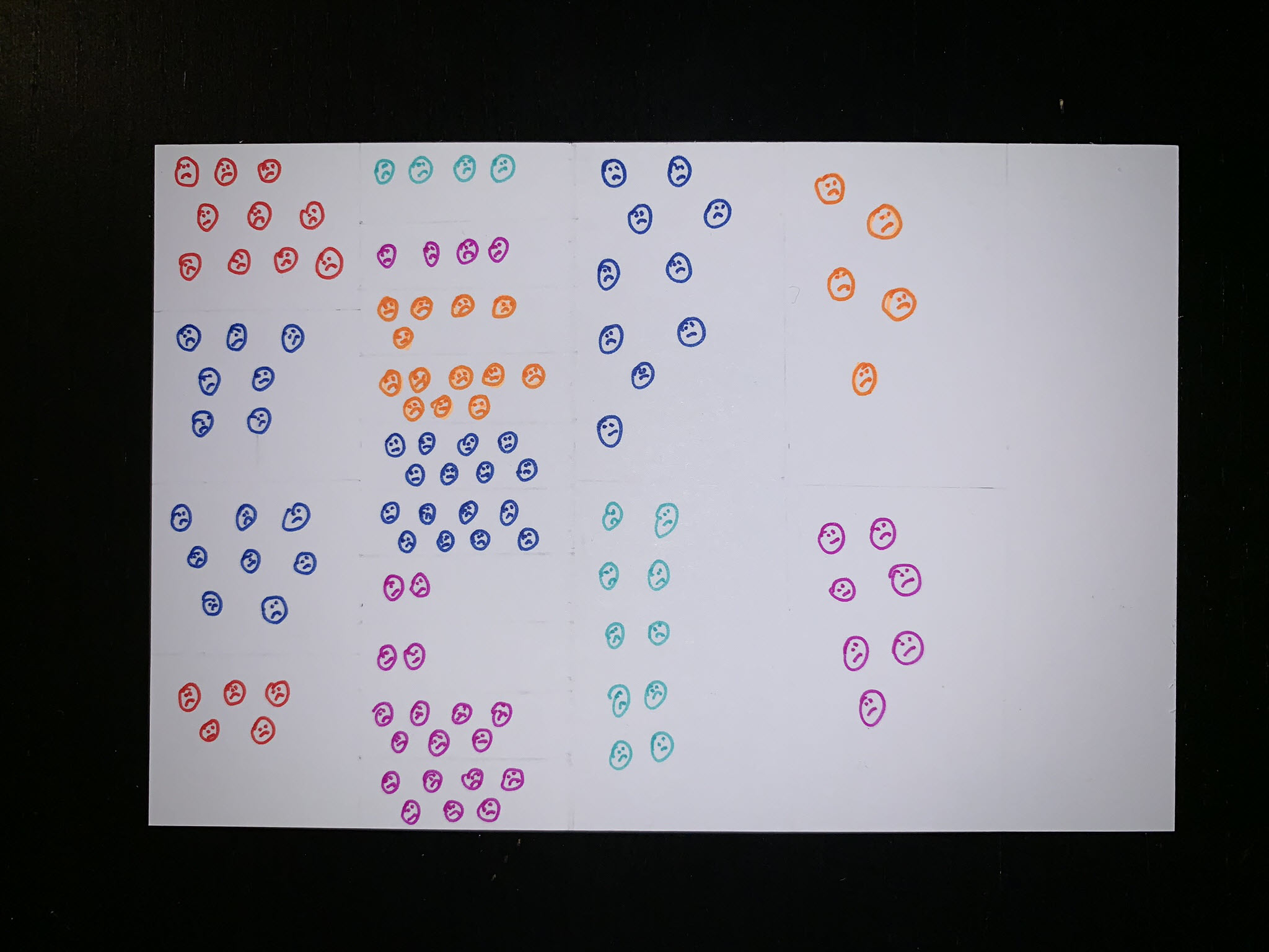
For data collecting I documented all of these moments on my phone, writing a small sentence that expressed the complaint to document the subject and frustration level. In retrospect I think capturing this data wasn’t very accurate and it seemed to me that the more complaints I tracked, the more grumpy I was about it.
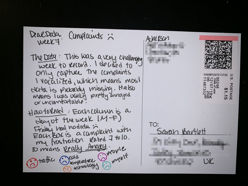
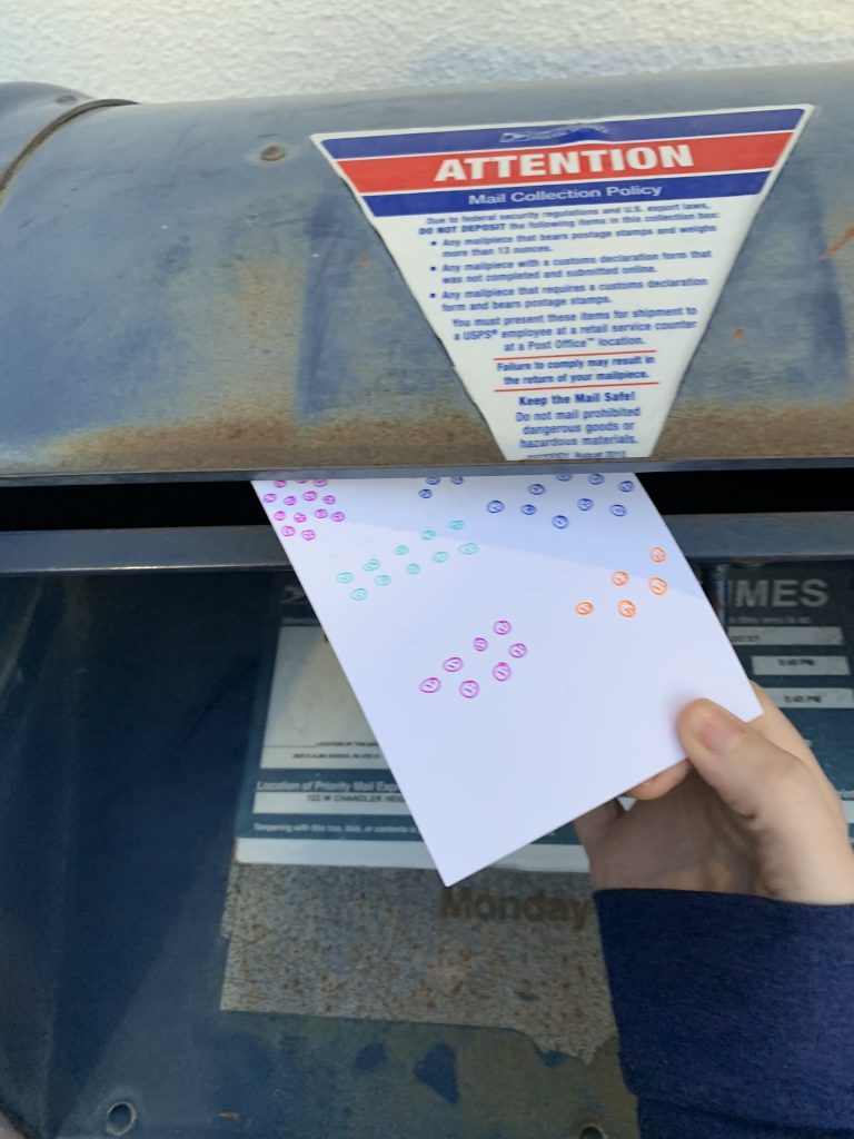
Here’s my postcard, which really clearly sums up how I felt in general about the topic:
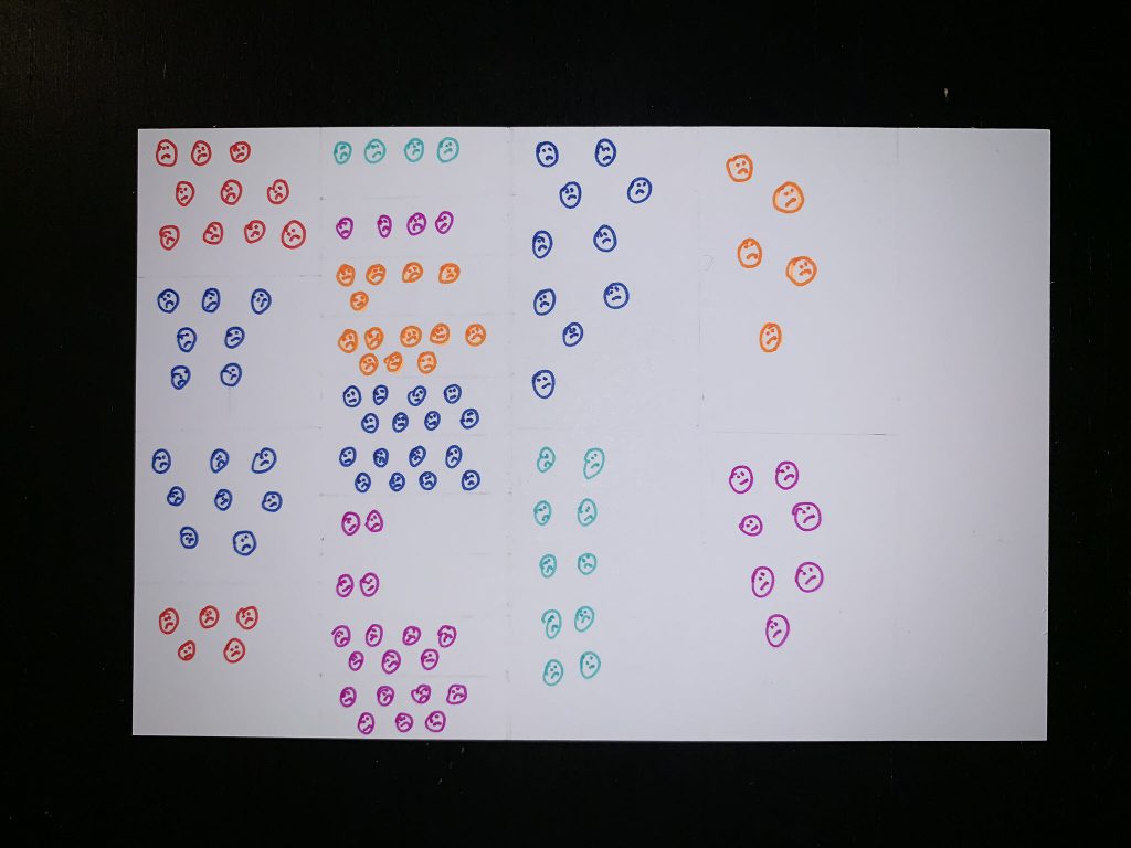
Each column represents a day of data (Monday to Friday) which are chunked into different sections based on the complaint. You can see that Tuesday was not a great day for me, I had 10 different things that I complained about. In contrast, Friday had no data which is more due to me being distracted by other things and less aware of my complaints.
Each complaint is categorized into a major topic: traffic, the temperature around me, technology, people, and myself. The most vivid complaints for me this week were around the cold. During this week it was extremely cold (comparatively for Phoenix, AZ) and I was in a very drafty building. There’s nothing worse than being cold and trying to work and that was very apparent throughout Monday, Tuesday, and Wednesday.
Here’s Sarah’s postcard for the week:
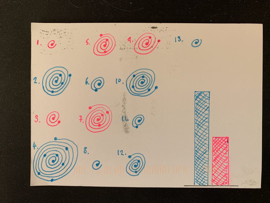
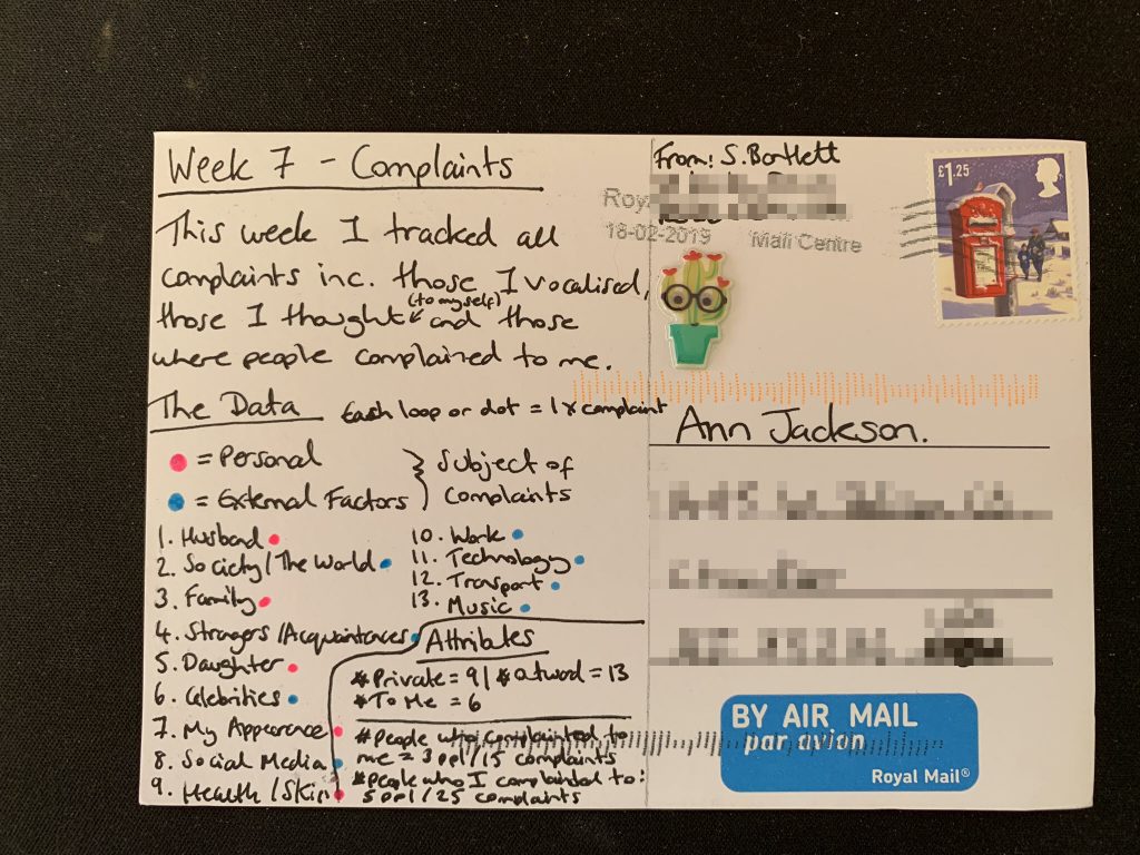
Once again Sarah has done a better job at capturing data detail throughout the week making her postcard more rich with information than mine! I like that she ended up separating out the different buckets into 2 large themes: personal vs. external. I think it probably helps retrospectively to know if the complaints were valid or within her control to change. And I also like the traditional use of a bar chart on the right side to offset the more abstract complaint loops on the left.
I’m glad to see there are some common themes among our complaints: people, technology, and transportation. We chatted about how cold I was that week afterward and Sarah reminded me kindly that 40 degrees F is not very cold.
And the best part of the week – mailing off the complaints and being done with data collection on the topic!
Don’t forget to check out Sarah’s take on the week!