Tag: arizona
-
Without Water an Iron Viz feeder
Jump directly to the viz At the time of writing it is 100°F outside my window in Arizona and climbing. It’s also August and we’re right in the middle of feeder round 3 for Tableau Public’s Iron Viz contest. Appropriately timed, the theme for this round is water. So it’s only fitting that my submission…
-
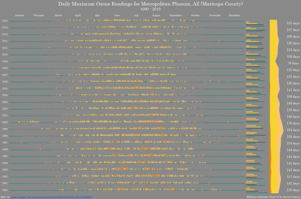
#MakeoverMonday Week 25 | Maricopa County Ozone Readings
We had another giant data set this week – 202 million records of EPA Ozone readings across the United States. The giant data set is generously hosted by Exasol. I encourage you to register here to gain access to the data. The heart of the data is pretty straight forward – PPM readings across several…