I’ll say this first – I don’t eat potatoes. Although potatoes are super tasty, I refuse to have them as part of my diet. So I was less than thrilled about approaching a week that was pure potato (especially coming off the joy of Valentine’s Day). Nonetheless – it presented itself with a perfect opportunity for growth and skill testing. Essentially, if I could make a viz I loved about a vegetable I hate – that would speak to my ability to interpret varying data sets and build out displays.
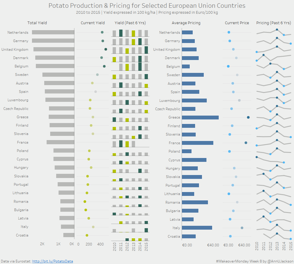
I’m very pleased with the end results. I think it has a very Stephen Few-esque approach. Several small multiples with high and low denoted, color playing throughout as a dual encoder. And there’s even visual interest in how the data was sorted for data shape.
So how did I arrive there? It started with the bar chart of annual yield. I had an idea on color scheme and knew that I wanted to make it more than gray.

This gave perfect opportunity to highlight the minimum and maximum yields. To see what years different countries production was affected by things like weather and climate. It’s actually very interesting to see that not too many of the dark bars (max value) are in more recent times. Seems like agricultural innovation is keeping pace with climate issues.
After that I was hooked on this idea of sets of 3. So I knew I wanted to replicate a small multiple in a different way using the same sort order. That’s where Total Yield came in. I’ve been pondering this one in the shower on the legitimacy of adding up annual ratios for an overall yield. My brain says it’s fine because the size of the country doesn’t change. But my vulnerable brain part says that someone may take issue with it. I’d love for a potato farming expert to come along and tell me if that’s a silly thing to add up. I see the value in doing a straight total comparison of the years. Because although there’s fluctuation in the yield annually, we have a normalized way to show how much each countries produces irrespective of total land size.
Next was the dot plot of the current year. This actually started out its life as a KPI indicator of up or down from previous, but it was too much for the visual. I felt the idea of the dot plot of current year would do more justice to “right now” understanding. Especially because you can do some additional visual comparison to its flanks and see more insight.
And then rinse/repeat for the right side. This is really where things get super interesting. The amount of variability in pricing for each country, both by average and current year. Also – 2013 was a great year for potatoes.

Leave a Reply