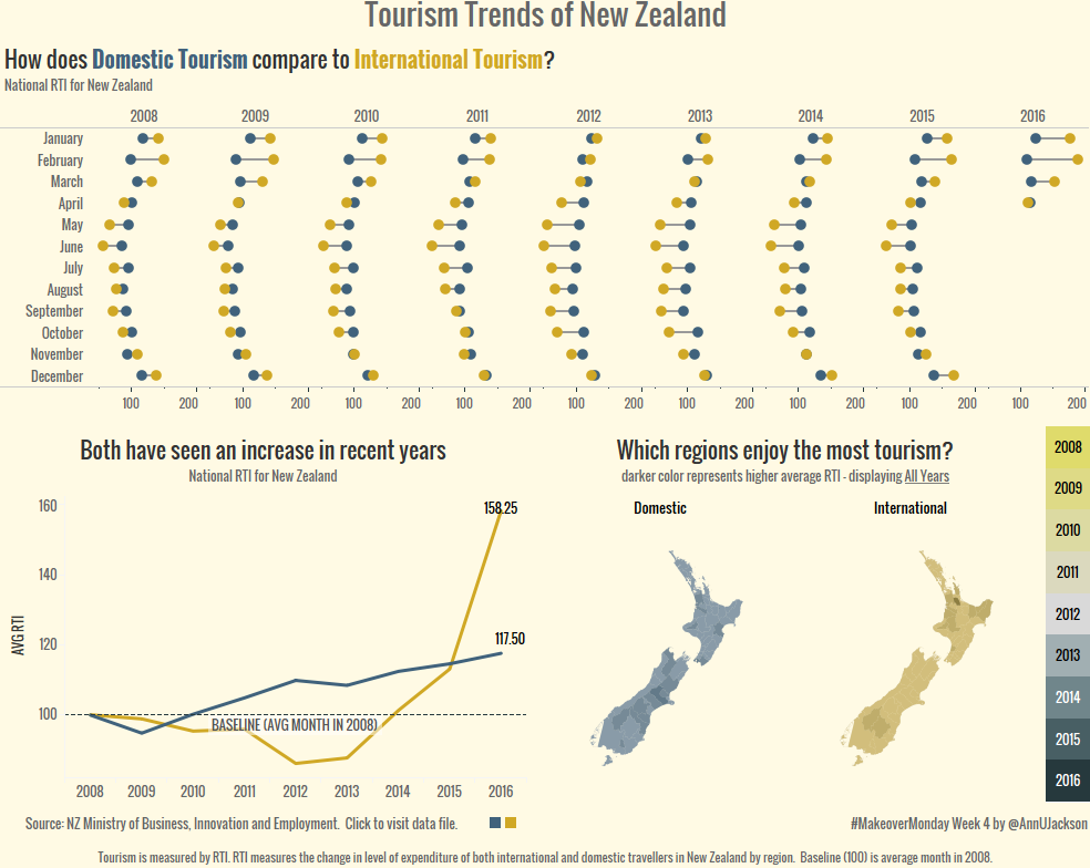
This week’s Makeover was addressing Domestic and International tourism trend in New Zealand. No commentary provided with the data set, the original was just 2 charts left to the user to interpret. See Eva’s tweet for the originals:
For #MakeoverMonday Wk 4 we look at the Regional Tourism Index in #NewZealand.
Data definitions included 😉https://t.co/r5VbFem6T2 pic.twitter.com/aom4OhnDG0— Eva Murray (@TriMyData) January 22, 2017
Going back to basics this week with what I like and dislike about it:
- Titles are clear, bar chart isn’t too busy (like)
- Not too many grid lines (like)
- It’s easy to see the shape of the data and seasonality (like)
- The scales are different between International & Domestic (dislike)
- 3 years for easy comparison (like)
- Eva chose this to promote her home country (like)
I think this was a good data set for week 4. No data story to rewrite, special attention was made by Eva to mitigate data misinterpretation, and she added on a bonus of geospatial data for New Zealand.
My process really began with the geospatial part. I haven’t yet had a chance to work with geospatial particulars developed and appended to data sets. My experience in this has been limited to using Tableau’s functionality to manually add in latitude and longitude for unclear/missing/invalid data points.
So as I got started, I had no idea how to use the data. There were a few fields that certainly pointed me in the right direction. The first was “Point Order.” Immediately I figured that needed to be used on “path” to determine where each data point fell. That got me to this really cute outlined version of NZ (which looks like an upside down boot):

So I knew something additional needed to be done to get to a filled map. That’s when I discovered the “PolygonNumber” field. Throwing that onto detail, changing my marks to polygon and voila – New Zealand. Here’s a Google image result for a comparison:

Eva did a great job trying to explain how NZ is broken up in terms of regions/territories/areas, but I have to admit I got a little lost. I think what’s clear from the two pictures is I took the most granular approach to dissecting the country.
I’m super thrilled that I got this hands on opportunity to implement. Geospatial is one of those areas of analytics that everyone wants to go and by including this – I feel much more equipped for challenges in the future.
Next up was the top viz: I’ve been wanting to try out a barbell/DNA chart for a long time. I’ve made them in the past, but nothing that’s landed in a final viz. I felt like there was an opportunity to try this out with the data set based on the original charts. I quickly threw that together (using Andy Kriebel’s video tutorial) and really enjoyed the pattern that emerged.
The shape of the data really is what kicked off the path that the final viz ended up taking on. I liked the stratification of domestic vs. international and wanted to carry that throughout. This is also where I chose a colors.
The bottom left chart started out it’s life as a slope chart. I originally did the first data point vs. the last data point (January 2008 vs. April 2016) for both of the types of tourism. It came out to be VERY misleading – international had plummeted. When I switched over to an annual aggregation, the story was much different.


Good lesson in making sure to holistically look at the data. Not to go super macro and get it wrong. Find the right level of aggregation that keeps the message intact.
The last viz was really taking the geospatial component and adding in the tourism part. I am on a small multiples kick and loved the novelty of having NZ on there more than once. Knowing that I could repeat the colors again by doing a dual axis map got me sold.
All that was left was to add in interactivity. Interactivity that originally was based on the barbell and line chart for the maps, but wasn’t quite clear. I HATE filter drop downs for something that is going to be a static presentation (Twitter picture), so I wanted to come up with a way to give the user a filter option for the maps (because the shading does change over time), but have it be less tied to the static companion vizzes. This is where I decided to make a nice filter sheet of the years and drop a nice diverging color gradient to add a little more beauty. I’m really pleased with how that turned out.

My last little cute moment is the data sourcing. The URLs are gigantic and cluttered the viz. So instead I made a basic sheet with URL actions to quickly get to both data sets.
![]()
A fun week and one that I topped off by spelling Tourism wrong in the initial Tweet (haha). Have to keep things fun and not super serious.

Leave a Reply