Tag: alteryx
-
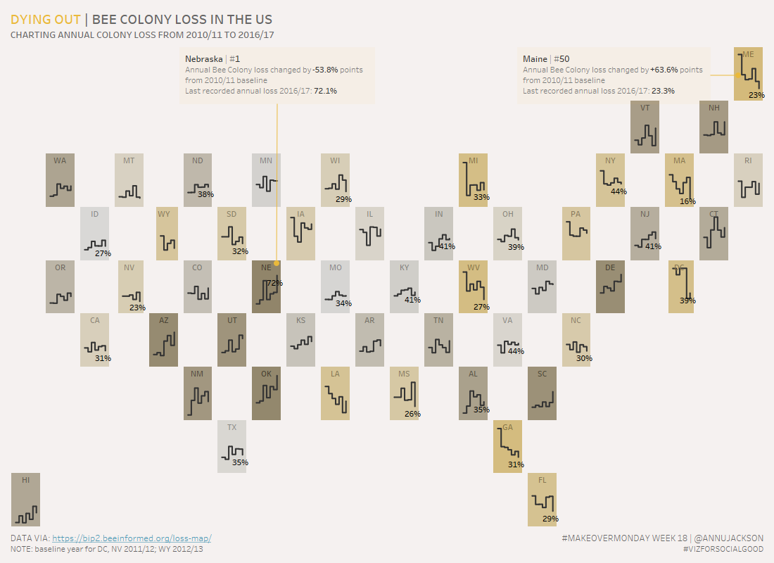
Dying Out, Bee Colony Loss in US | #MakeoverMonday Week 18
Week 18 of Makeover Monday tackles the issue of the declining bee population in the United States. Data was provided by BeeInformed and the re-visualization is in conjunction with Viz for Social Good. Unfamiliar with a few of the terms – check out their websites to learn what Makeover Monday and Viz for Social Good…
-
Alteryx Inspire – Day 1
When I went to the Tableau Conference last year, I felt it was important to spend some time documenting my experience. Anytime I go to a conference related to my professional aspirations I’m always taken by the wealth of knowledge that’s uncovered. The Alteryx Inspire conference is a pared down conference with about 2,000 attendees.…
-
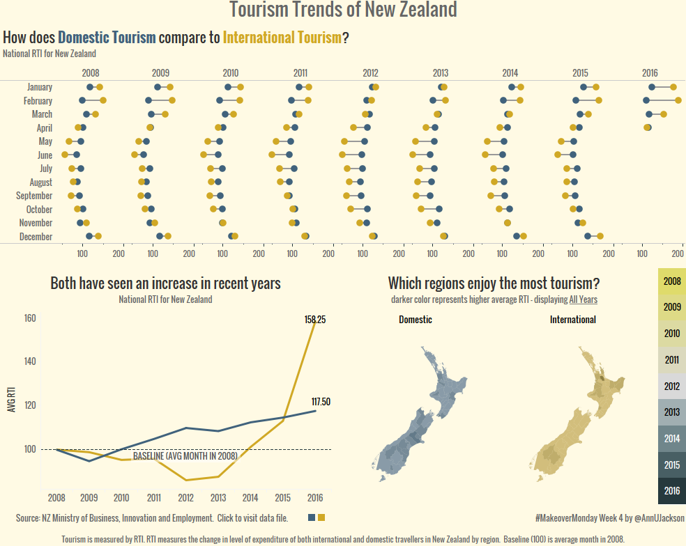
Makeover Monday 2017 – Week 4 New Zealand Tourism
This week’s Makeover was addressing Domestic and International tourism trend in New Zealand. No commentary provided with the data set, the original was just 2 charts left to the user to interpret. See Eva’s tweet for the originals: For #MakeoverMonday Wk 4 we look at the Regional Tourism Index in #NewZealand. Data definitions included 😉https://t.co/r5VbFem6T2…