Tag: executive dashboard
-
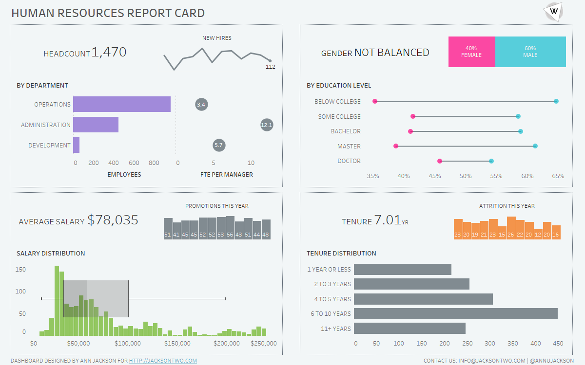
Blending Visualizations of Different Sizes
One of my favorite visualizations is the sparkline – I always appreciated how they are described by Edward Tufte “data-intense, design-simple, word-sized graphics.” Meaning the chart gets right to the point: conveying a high amount of information without sacrificing real estate. I’ve found this approach works really well when trying to convey different levels of…