Tag: dear data
-
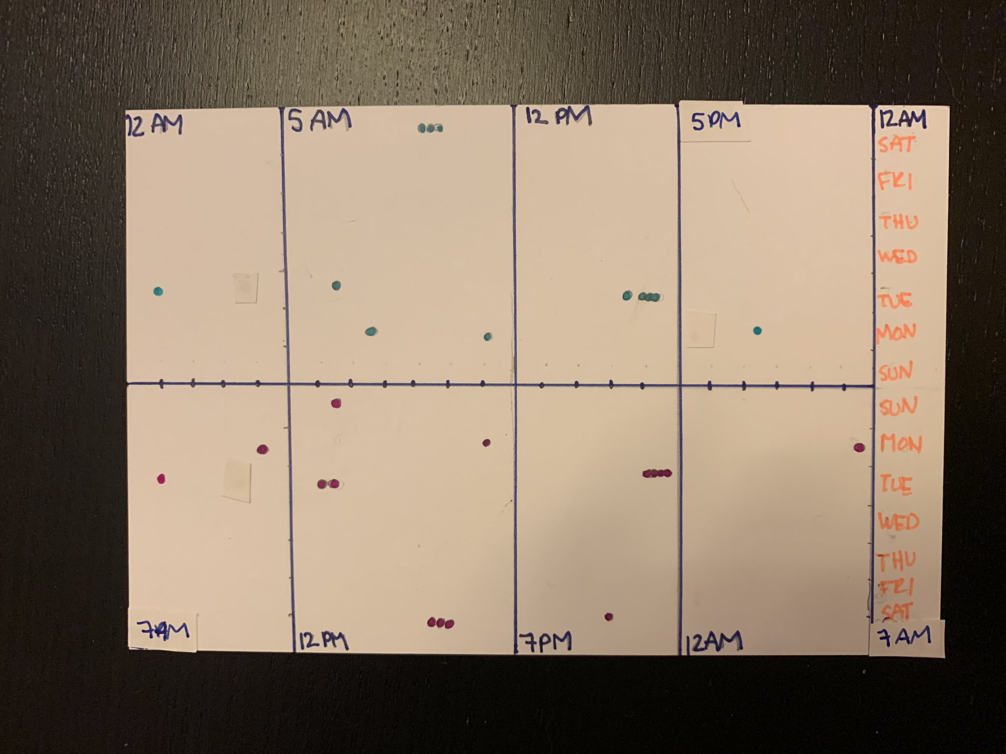
Dear Data 2019 – Week 10, Data Pals
Week 10 postcards are finally here for the data postcard project Sarah Bartlett and I are working on. The topic for the week was our relationship with each other. How much do we communicate, how often, when, and so on. And the timing was fantastic – Sarah and I recorded a video feedback session for…
-
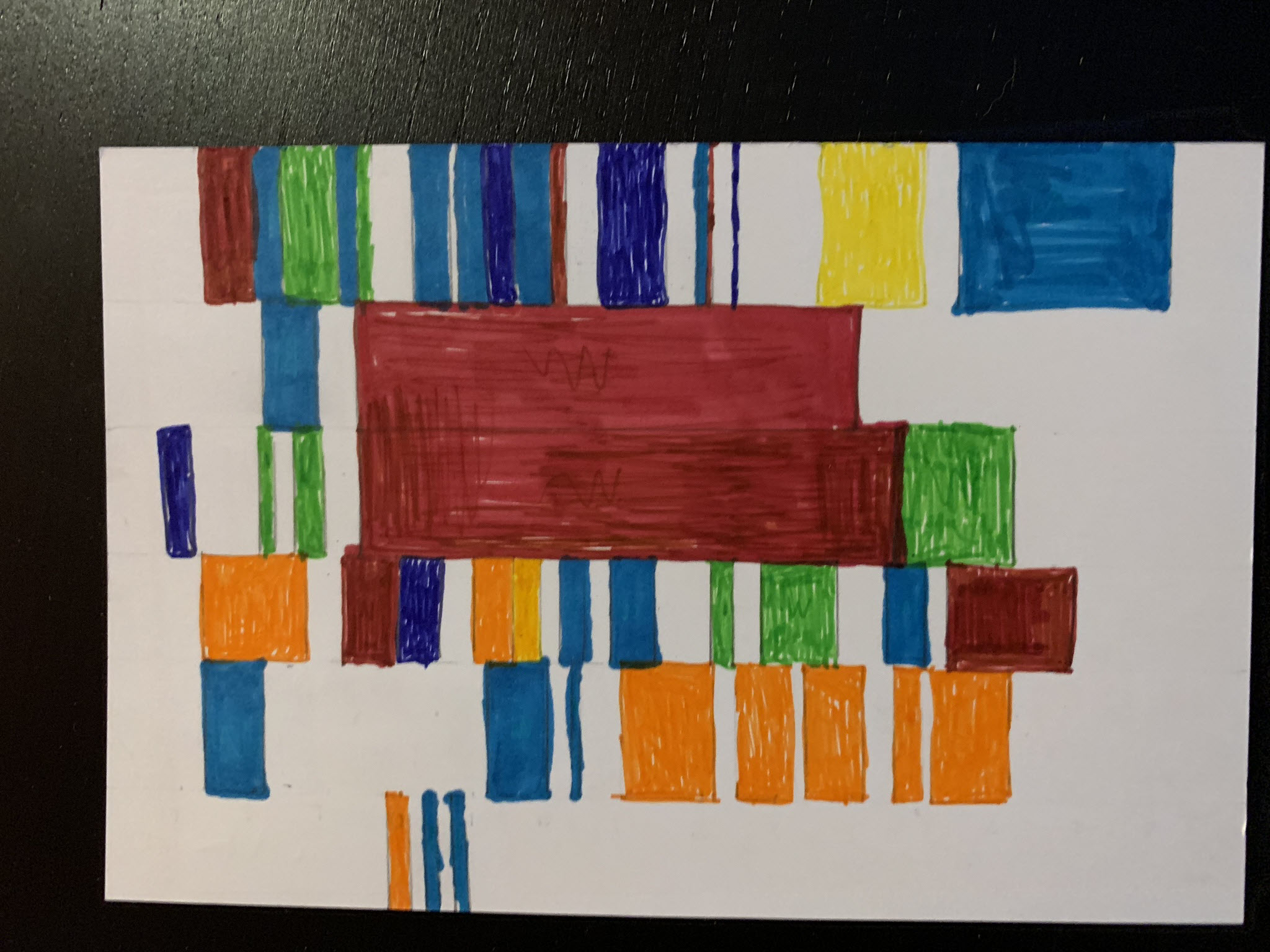
Dear Data 2019 – Week 9, To Do Lists
Week 9 of the data postcard project Sarah Bartlett and I are working on have arrived. The topic of the week was To Do Lists. I don’t actively keep good lists of tasks – they make me sad – especially when I have tasks that continue to go undone. I also think they miss describing/capturing…
-
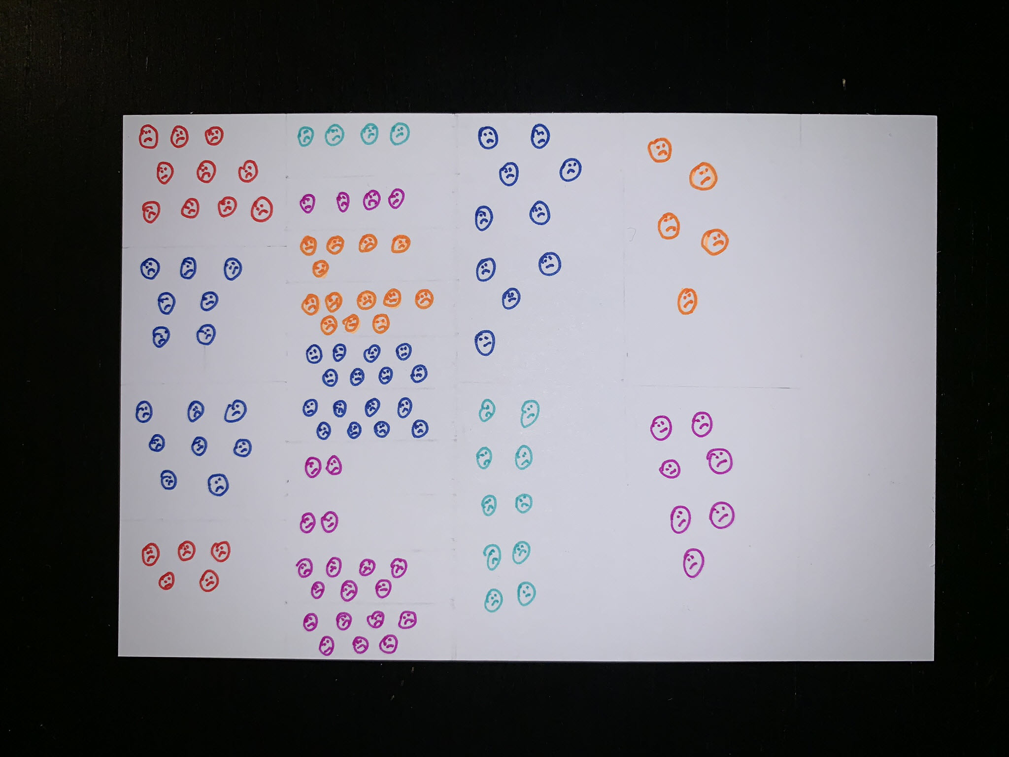
Dear Data – Week 7, Complaints
Week 7 postcards have long been delivered and this blog post is overdue. As if the subject for the cards had some influence, the theme of complaints seemed to have an extremely negative impact on having the desire to write the companion blog post. During this week I tried to track all of my verbal…