Over the past month I’ve had the awesome pleasure of working on increasing my knowledge around Tableau Server. As part of the process of learning more and advancing my knowledge I set out a goal of taking the Tableau Server Qualified Associate exam. I’m really thrilled (and relieved!) to say that I’ve passed the test. More than the cool credentials that come along with the certification is the vast amount of best practices knowledge and detail that I’ve gained along the way.
To aid in retention and sharing with the community – I figured it would be worthwhile to share some of the knowledge I curated along the way. The certification itself is broken down into 5 components, so keeping with the theme – I figured I’d break apart my knowledge in the same way.
Preparation – 20%
Preparation is perhaps one of my favorite things to do in life. I really like to dig into details and plan for what is going to happen. It’s not uncommon for me to vocalize and visualize how I want something to work out. It helps me to anticipate obstacles and roadblocks and formulate strategies on how to mitigate them. So the fact that a huge chunk of sharing Tableau to the rest of an organization by way of Server focuses on the getting ready part is admirable.
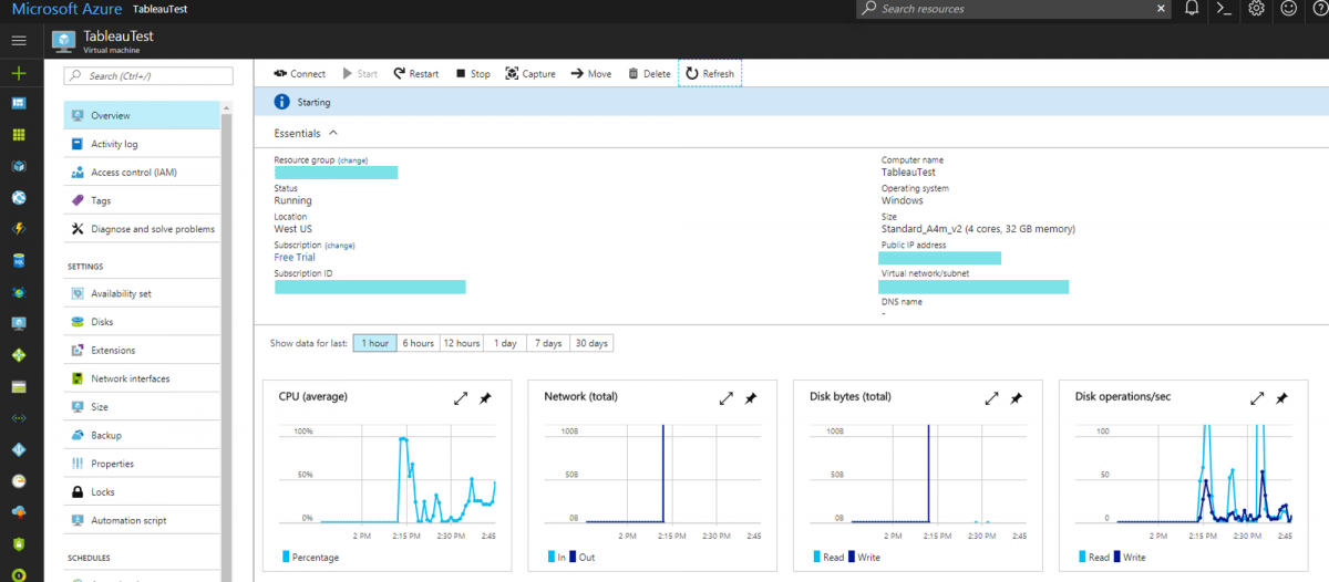
My preparation began with Tableau Server: Everybody’s Install Guide. Reading through this gives all skill levels an “in” on the different Server Administrative components at just the right level. It’s also what I used to guide me through a single machine install on Azure. Reading through this gives you a glimpse into the more detailed components that go into Server administration and starts to develop the relationships and understanding between those components.
Along the way you’ll learn about some of the most important things that go into preparation, namely the licensing model, authentication, and hardware requirements. As quotes – here are my takeaways for each:
When it comes to licensing, what type of deployment are you planning? Do you want to start or manage a set number of users or allow for a potentially unlimited number of users? Do you anticipate needing to use the Guest account – a way to allow users to interact with visualizations without the need to log-in to the server?
When it comes to authentication – you need to get this right in the beginning. Changing this once your server is deployed can get messy. Do you want to use existing Active Directory and leverage those credentials or local authentication? Local authentication may allow you to have more control over authentication, but it comes at the expense of more time administrating.
When it comes to hardware requirements – know what you’re getting yourself into. There’s a huge difference between minimum requirements for a pilot server and recommended requirements. You’ll also want to know how scalability and changing to a distributed environment are impacted.
Lastly one of my absolute favorite resources during this process is this article on Primary Server Installation Defaults. It describes the process configurations and helps to dissect the way the server functions. Marry that up with this article on Server Processes – the knowledge article that defines each process and helps you articulate each component’s function.
Some more anticipatory work should be done on data sources and the server machine itself. You’ll want to ensure that your Run As User account has the right level of access to data sources and can perform all the necessary functions on the box. As someone thinking about deploying Server and giving data to the masses (in a controlled, positive way) you’ll have to think through that component.
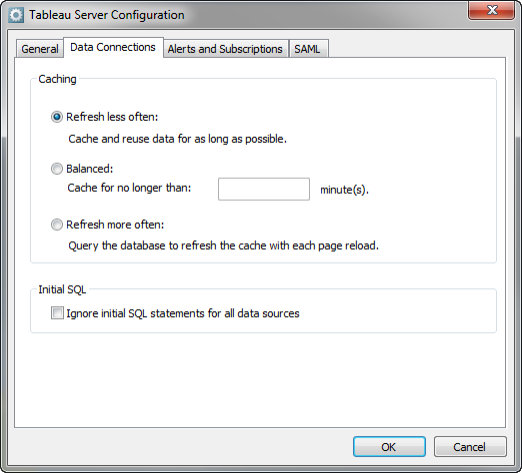
It can also lead into future-forward questions about what type of server you’ll want to tune toward. The three choices in terms of Caching become a good topic of conversation and help to identify the path you may want to choose for your deployment.
Once you get past the enjoyment of preparation come the exciting moment of installation and configuration.
Install & Configuration 30%
This part is the moment of truth. You’re about to embark on the server journey and you truly are downloading the software and deploying it. As you get started, hopefully some of the preparation tips you learned along the way can minimize any hiccups.
As you are greeted with the Server Configuration section you’ll want to access this article on how to configure SMTP setup. The component that will allow you as an administrator to receive alert and failure emails. It’s also the component that will allow end consumers to receive data-driven alerts and subscribe to views. More visualization to the masses!
This is also where things start to bleed into the role of Site Administrator. Being the server administrator means you’re the guy that sets up initial permissions for subsequent users. You’ll need to put on your site administrator hat and ensure you understand the different levels of permissions and how content is managed.
You’re also bound to get a few questions about security here. Both from the perspective of authentication and SSL and what those more on the business and data management side care about: access to data. Read up on ways to limit data in a view from the desktop perspective here.
I also think it is really important to know and explore what a Site is. The importance of this concept presents itself again when you think about how you’ll successfully implement Tableau Server so that the right people have access to the most relevant content.
You can even add a little flare during this initial configuration phase. Customize the look and feel of Tableau Server by reading the Change the Name or Logo article. I think you’re likely to get some street cred by personalizing the experience in the beginning of deployment.
Next up is…
Administration – 30%
After going through initial deployment comes the fun of full on administration. I like this part a lot because it folds in the additional tools outside of the configuration window like tabadmin. Tabadmin is one of those tools that will become your BFF as you begin to do things like check the server status, manually stop and start the server, and do more maintenance oriented tasks like backups and cleanups.
Other important components of hardcore administration at this point will be diving into the world of schedules. At this point we should all know that Tableau Server has the capability to update data extracts, execute email subscriptions of views, and data-driven alerts. The key here is that there is a certain amount of depth to developing, maintaining, and managing these schedules. This knowledge stub starting with Extract Refresh Schedules breaks it all down.
And as you start thinking about potential performance concerns – consider how different scheduling scenarios and scheduling modifications could positively (or negatively) impact what your end users are experiencing.
There’s also Administrative Views built into the Server to help analyze what’s going on. I really like the “Stats for Space Usage” view because it can be a springboard to a conversation on data governance. A tangent: but I’ve seen the value of using this place to recognize you’ve got 6 copies of the same table embedded into workbooks on the server. Time to try out a published data source perhaps? You can also manage Desktop License Reporting as a server admin to answer questions like “does a specific user use their license?”
Really driving home the special powers that a Tableau server administrator has are the last two sections:
Troubleshooting – 13%
We all know that having the power of server administrator comes with the power of knowing why something is broken and aiding in resolution. It can mean optimizing for traffic vs. optimizing for extracts. And it can also mean super important things like knowing how to reset or add a Tableau Server administrator account. In most of these circumstances there may be more than one way to go about doing the task – so take inventory of potential ways to do things.
Migration & Upgrade – 7%
Having Tableau Server is really cool and special – having the latest version that doesn’t break is even better. And knowing how to get yourself out of the number one pickle the preparation step was trying to get you to avoid: Changing Authentication. I also like this part because you get to see the list of new features and fixes that come with each new version. Who doesn’t love a good set of what’s new and what’s changed.
Going through this process has helped cement in my mind some of the most important best practices when it comes to Tableau Server – I hope the same holds true for you!