Recently I was on a project that involved working with data centered around one value. You can imagine the type: something where there is an intended value, or a maximum expected value. A good example from the Superstore data set may be something like “days between order date and ship date.”
Typically you’ll come in to a data set of this type and the first thing to do is try to survey it. Describe it in a visual format to set the foundation for your data story audience. Traditionally you’d probably want to go for something like a histogram, but a histogram is going to look really pointless. I’m sure you can imagine it now, 95-99% of data centered on one INTEGER value, the rest potentially obscuring the scene due to poor data entry or capture. Not the best way to start your story.
What’s potentially worse than the density around a given number is the notion that you’re looking for something within the confines of a narrow range that may be worth investigating further. So in this world, an ugly histogram isn’t going to drive you down the path of further enlightenment or relevant question asking and answering.
To combat the curse of this type of data, I went on a mission to make some alternative visualizations. Those beyond the histogram and boxplot- my self admitted favorite tools to quickly understand data sets.
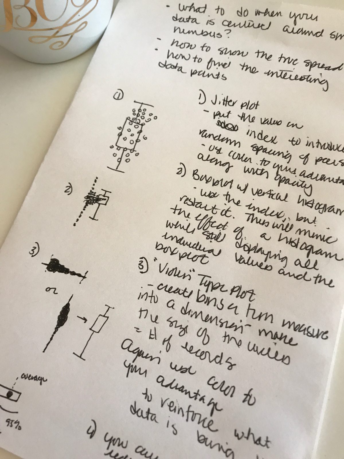
My first choice was to add jitter. Jittering is a great tool that helps to showcase the density of data. You’re breaking up a traditional box or dot plot where values are plotted at the same point and adding a position dimension to the open axis. It can be really helpful for opening conversations with those seeing their data for the first time. And even more powerful when you add on a dimension to show small multiples of the same measurement and how the numeric outputs are influenced by the segmentation of your chosen dimension.
After attempting jittering, I noticed that because of the nature of my data – the natural indexing that was applied got skewed by the unique key I was indexing on. Essentially there was an opportunity for an unintended inference from the jitter. This led me to do restart the index for every value, making a histogram next to a box plot. The dots were stacked on each other, mimicking bars. This was pretty effective. The centered nature of the data could be easily felt.
Last move was to make something even more abstract – what you may think of as a violin plot. How I attempted this was from the perspective of a dot plot on an X axis. However each dot is the binned result of the data values, with the number of data points within that bin representing the dot’s size. I added on some transparency for additional visual aid – I think this can either be done from a reinforce the size of the dot perspective, or if your X axis has a natural good vs. bad association. Harping back on the example of turn around time, you could envision that if you went from in control to out of control how powerful it could be. I also added on different percentile lines to help affix the data spread.
Consider this post a draft in progress that will be updated with visuals.

Leave a Reply