Tag: design

  • Building Out Your Analytics Brand

    Building Out Your Analytics Brand

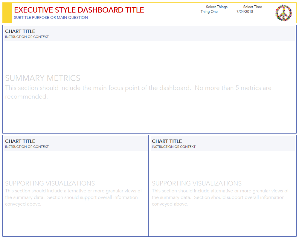
    We all know the value of having a brand, whether it’s your personal brand or your organization’s brand, it’s the differentiator that distinguishes you from others.  It’s what makes us trust certain companies, emulate celebrities, and visit trendy places.  A great brand encompasses a wide array of important components – style, voice, preferences, value systems, and more.  So it’s likely not surprising that analytics within an organization or department should also have a brand.

    Having a brand for your analytics and specifically your analytical displays (yes, I mean dashboards) can have a significant impact on your audience.  Oftentimes when I work with clients it’s one of the first things I look for.  Is there a voice to what has been developed?  Is it cohesive?  More often than not, I find that the idea of branding gets deprioritized as other more pressing matters take center stage (I’m blaming you data gathering).  That lack of focus and emphasis also tends to leech out into other areas of analytics – likely there’s a struggle to answer questions or display the “right” data.  People just aren’t satisfied with what you give them.

    The upside?  Having these issues means there’s a wealth of opportunity and one that can begin with a conscious effort to develop a brand.  And an easy way to do this is to tackle the most superficial component: design and presentation.  As I use the word superficial here, don’t worry, I don’t mean the shallowest component from a value perspective, I purely mean it in the sense that it’s the outermost layer and easiest to see.

    Additional bonus of focusing on design?  You’ll start getting entrenched in the audience and naturally become more empathetic to their needs and desires.  And my favorite by-product: your audience starts to get empathetic toward you.  They start to understand constraints in a positive way and contribute in a more productive way.

    To get started, ask this one question:

    “HOW WILL YOU BE LOOKING AT THIS?”

    This question instigates every project I’m on where something is being developed.  How and where this is going to be consumed is a huge priority – knowing something is going to be put into a quarterly PDF report vs. consumed on a phone is going to result in widely different design and style choices.  You should ask this question first – and if nobody has the answer, offer guidance.  Ferreting out the answer to this question will undoubtedly build in some natural constraints.

    Let’s take a relatively easy scenario and assume that we’re building out self-service, interactive dashboards that will be consumed via web browser on a computer.  From that simple statement, we can derive a universe that would best fit the scenario.

    • View on computer browser: decent amount of real estate, can figure out optimum resolution
    • Self-service: people are expecting filters, flexibility in the data display
    • Interactive: not all the answers are immediately summarized, there’s an opportunity for supporting detail
    • Content repository: if everything’s in one place, we can leverage repetition and create continuity to drive the displays

    Given the bullet points, here’s a simple template you can start a conversation with:

    a simple dashboard template

    On it’s own it may not look like much, but it can easily become the focal point of a conversation.  It can even be handed out for folks to print out and manually sketch in their data elements.

    Here are some basics that the template helps to express:

    As you’re viewing do you find yourself visualizing different charts and information in each of the areas?  I know I am.  There’s something very settling about removing the requirement of thinking through a visual layout and instead filling in the empty boxes.

    Now let’s make an alternative version of the template:

    same template, different layout and purpose

    With a few simple adjustments, we’ve change the purpose of the dashboard.  Instead of summary and aggregated metrics, the purpose has become exploration.  And without adding in any charts or data elements, the audience can immediately get a sense of where majority focus should go.

    And beyond changing the purpose, we’ve kept the trust built up from the first template.  Title placement is expected, the amount of filters and their “where” is already imprinted on you.  Glancing back, you probably bypassed the header all together and went straight to the data section.  That’s the benefit of consistency.

    Let’s now do one final step and place the two templates side by side:


    Seeing the pair of dashboards next to each other gives you a sense of possibility.  You can start to imagine a whole portfolio of dashboards – one that evokes organized, thoughtful, clear, purposeful.  It’s established the brand and voice we were chasing.  It’s also given us a strong sense of what belongs and what doesn’t.

    If you find yourself struggling with adoption, stakeholder value, or direction – take a step back and focus on building a brand through design and presentation.  The time invested in this exercise is sure to yield positive results and necessary constraints – it will even help to sharpen existing analytical displays you may have already developed.

  • Building an Interactive Visual Resume using Tableau

    Building an Interactive Visual Resume using Tableau

    click to interact on Tableau Public

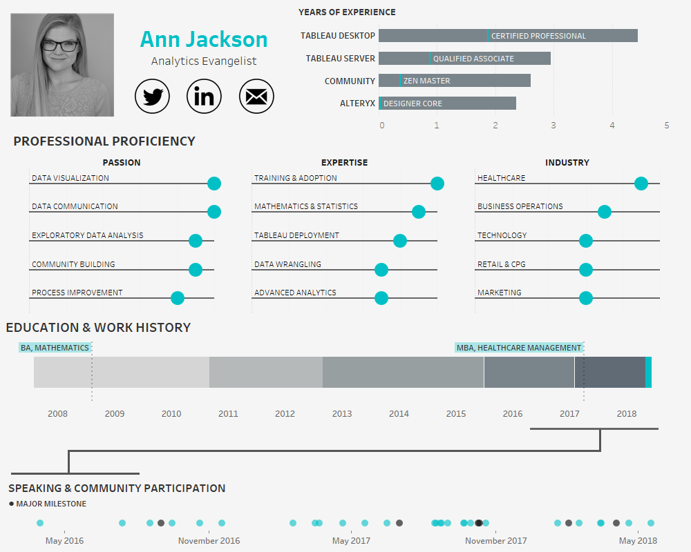
    In the age of the connected professional world it’s important to distinguish and differentiate yourself.  When it comes to the visual analytics space, a great way to do that is an interactive resume.  Building out a resume in Tableau and posting it on Tableau Public allows prospective employers to get firsthand insight into your skills and style – it also provides an opportunity for you to share your professional experience in a public format.

    Making an interactive resume in Tableau is relatively simple – what turns out to be more complex is how you decide to organize your design.  With so many skills, achievements, and facts competing for attention, it’s important for you to decide what’s most important.  How do you want your resume to be received?

    In making my own resume, my focus was on my professional proficiency across larger analytics domains, strength in specific analytics skills, and experience in different in industries.  I limited each of these components to my personal top 5, so that it is clear to the audience what areas hold the most interest for me (and I’m most skilled in).

    Additionally, I also wanted to spend a significant amount of real estate highlighting my community participation.  After plotting a gantt chart of my education and work experience, I realized that the last two years are jam packed with speaking engagements and activities that would be dwarfed on a traditional timeline.  To compensate for this, I decided to explode the last two years into its own timeline in the bottom dot plot.  This allowed for color encoding of significant milestones and additional detail on each event.

    The other two components of the resume serve importance as well.  I’ve chosen to demonstrate experience in terms of years (a traditional metric to demonstrate expertise) with the highest level of certification or professional attainment denoted along each bar.  And finally, including a traditional timeline of my education and work experience.  The “where” of my work experience is less important than the “what,” so significant detail was spent adding role responsibilities and accomplishments.

    Once you’ve decided how you want to draw attention to your resume, it’s time to build out the right data structure to support it.  To build out a gantt chart of different professional roles a simple table with the type of record, name of the role, start date, end date, company, flag for if it’s current role, and a few sentences of detail should suffice.

    This table structure also works well for the years of experience and community involvement sections.

    You may also want to make a separate table for the different skills or proficiencies that you want to highlight.  I chose to make a rigid structured table with dimensions for the rank of each result, ensuring I wouldn’t have to sort the data over each category (passion, expertise, industry) once I was in Tableau.

    Here’s the table:

    That’s it for data structure, leaving style (including chart choices) as the last piece of the puzzle.  Remember, this is going to be a representation of you in the digital domain, how do you want to be portrayed?  I am known for my clean, minimalist style, so I chose to keep the design in this voice.  Typical to my style, I purposely bubble up the most important information and display it in a visual format with supporting detail (often text) in the tooltip.  Each word and label is chosen with great care.  It’s not by mistake that the audience is seeing the name of my education (and not the institution) and the labels of each proficiency.  In a world where impressions must happen instantaneously, it’s critical to know what things should have a lasting impact.

    I also chose colors in a very specific manner, the bright teal is my default highlight color, drawing the eyes in to certain areas.  However, I’ve also chosen to use a much darker gray (near black) as an opposite highlight in the bottom section.  My goal with the dark “major milestones” is to entice the audience to interact and find out what major means.

    The final product from my perspective represents a polished, intentional design, where the data-ink ratio has been maximized and the heart of my professional ambitions and goals are most prominent.

    Now that you’ve got the tools – go forth and build a resume.  I’m curious to know what choices you will make to focus attention and how you’ll present yourself from a styling perspective.  Will it be colorful and less serious, will you focus on your employment history or skills?  Much like other visualizations whatever choices you make, ensure they are intentional.