Tag: viz for social good
-
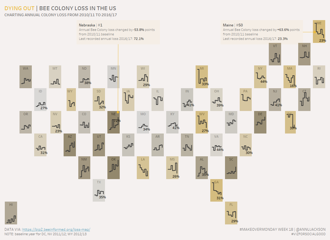
Dying Out, Bee Colony Loss in US | #MakeoverMonday Week 18
Week 18 of Makeover Monday tackles the issue of the declining bee population in the United States. Data was provided by BeeInformed and the re-visualization is in conjunction with Viz for Social Good. Unfamiliar with a few of the terms – check out their websites to learn what Makeover Monday and Viz for Social Good…