Tag: statistics
-
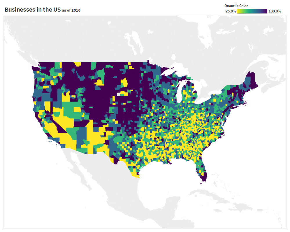
Dynamic Quantile Map Coloring in Tableau Desktop
Last week at Tableau’s customer conference (TC18) in New Orleans I had the pleasure of speaking in three different sessions, all extremely hands on in Tableau Desktop. Two of the sessions were focused exclusively on tips and tricks (to make you smarter and faster), so I wanted to take the time to slow down and…
-
Statistical Process Control Charts
I’ve had this idea for a while now – create a blog post and video tutorial discussing what Statistical Process Control is and how to use different Control Chart “tests” in Tableau. I’ve spent a significant portion of my professional career in business process improvement and always like it when I can integrate techniques learned…
-
Funnel Plots
As I continue to read through Stephen Few’s “Signal: Understanding What Matters in a World of Noise” there have been some new charts or techniques I’ve come across. In an attempt to understand their purpose on a deeper level (and implement them in my professional life), I’m on a mission to recreate them in Tableau.…