
In the age of the connected professional world it’s important to distinguish and differentiate yourself. When it comes to the visual analytics space, a great way to do that is an interactive resume. Building out a resume in Tableau and posting it on Tableau Public allows prospective employers to get firsthand insight into your skills and style – it also provides an opportunity for you to share your professional experience in a public format.
Making an interactive resume in Tableau is relatively simple – what turns out to be more complex is how you decide to organize your design. With so many skills, achievements, and facts competing for attention, it’s important for you to decide what’s most important. How do you want your resume to be received?
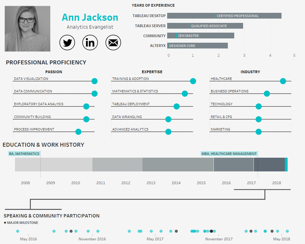
In making my own resume, my focus was on my professional proficiency across larger analytics domains, strength in specific analytics skills, and experience in different in industries. I limited each of these components to my personal top 5, so that it is clear to the audience what areas hold the most interest for me (and I’m most skilled in).

Additionally, I also wanted to spend a significant amount of real estate highlighting my community participation. After plotting a gantt chart of my education and work experience, I realized that the last two years are jam packed with speaking engagements and activities that would be dwarfed on a traditional timeline. To compensate for this, I decided to explode the last two years into its own timeline in the bottom dot plot. This allowed for color encoding of significant milestones and additional detail on each event.

The other two components of the resume serve importance as well. I’ve chosen to demonstrate experience in terms of years (a traditional metric to demonstrate expertise) with the highest level of certification or professional attainment denoted along each bar. And finally, including a traditional timeline of my education and work experience. The “where” of my work experience is less important than the “what,” so significant detail was spent adding role responsibilities and accomplishments.

Once you’ve decided how you want to draw attention to your resume, it’s time to build out the right data structure to support it. To build out a gantt chart of different professional roles a simple table with the type of record, name of the role, start date, end date, company, flag for if it’s current role, and a few sentences of detail should suffice.

This table structure also works well for the years of experience and community involvement sections.
You may also want to make a separate table for the different skills or proficiencies that you want to highlight. I chose to make a rigid structured table with dimensions for the rank of each result, ensuring I wouldn’t have to sort the data over each category (passion, expertise, industry) once I was in Tableau.
Here’s the table:

That’s it for data structure, leaving style (including chart choices) as the last piece of the puzzle. Remember, this is going to be a representation of you in the digital domain, how do you want to be portrayed? I am known for my clean, minimalist style, so I chose to keep the design in this voice. Typical to my style, I purposely bubble up the most important information and display it in a visual format with supporting detail (often text) in the tooltip. Each word and label is chosen with great care. It’s not by mistake that the audience is seeing the name of my education (and not the institution) and the labels of each proficiency. In a world where impressions must happen instantaneously, it’s critical to know what things should have a lasting impact.
I also chose colors in a very specific manner, the bright teal is my default highlight color, drawing the eyes in to certain areas. However, I’ve also chosen to use a much darker gray (near black) as an opposite highlight in the bottom section. My goal with the dark “major milestones” is to entice the audience to interact and find out what major means.
The final product from my perspective represents a polished, intentional design, where the data-ink ratio has been maximized and the heart of my professional ambitions and goals are most prominent.
Now that you’ve got the tools – go forth and build a resume. I’m curious to know what choices you will make to focus attention and how you’ll present yourself from a styling perspective. Will it be colorful and less serious, will you focus on your employment history or skills? Much like other visualizations whatever choices you make, ensure they are intentional.