At the time of writing the 2018 Winter Olympic Games are in full force, so it seems only natural that the #MakeoverMonday topic for Week 7 of this year is record level results of Winter Games medal wins.
I have to say that I was particularly excited to dive into this data set. Here’s what a few rows of data look like:
I always find with this level of data there are so many interesting things that can be done that it gets really hard to focus. The trouble is that all of the rows are interesting, so as a creator I’m immediately drawn to organizing “all the data” and want put to it ALL on display. And that’s where the first 20 minutes of my development were headed.
I’d started with a concept of showing all the medals and more specifically showing the addition of new sports over time. As I was building, the result was quite clearly going to be a giant poster form viz. Not what I was going for.
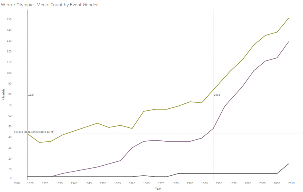
To move past that my mind shifted to female sports at the Winter Olympics. And if you look through the data set you’ll see there are some interesting points. Specifically that it took about 60 years for women to get to a similar number of events/medals as men. (yellow = men, purple = women, gray = mixed)
I spent some time stuck on this – thinking through how I could segment by different sports and to extract out some of the noise of the different years and come up with a slope chart. Ultimately I found myself disappointed with all of these pursuits – so my thoughts shifted.
So I switched gears and stumbled on this chart:
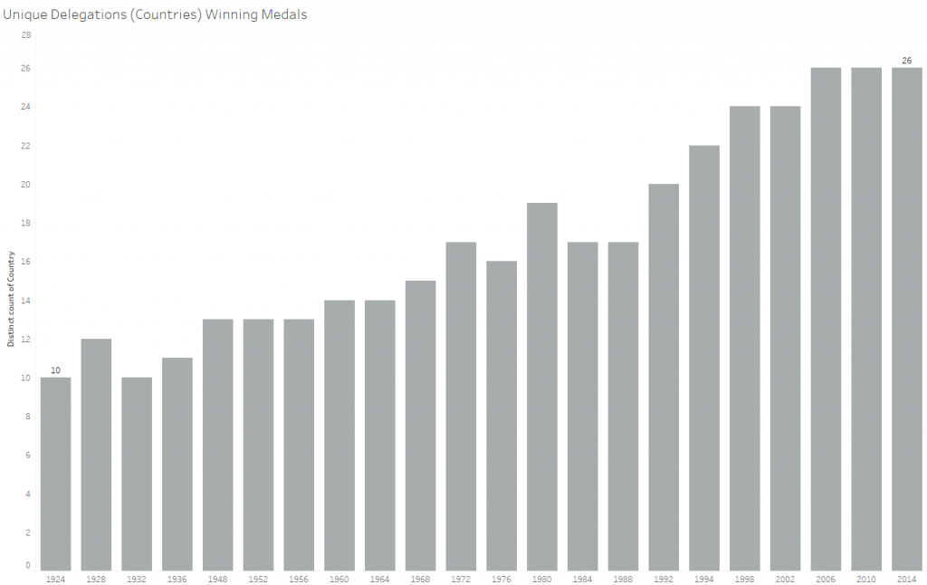
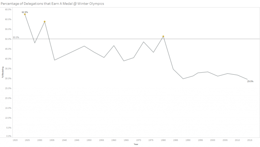
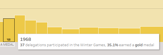
Which as you look through it is REALLY interesting. I had just watched the Opening Ceremonies and knew there were 91 delegations (countries) represented in 2018. To know that in 2014 the number was probably similar, yet only 26 reached a podium seemed to be a sticking point in my mind.
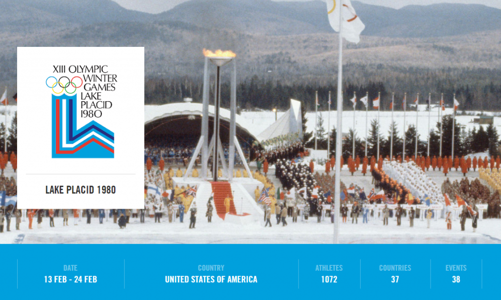
So – that led to a quick adventure over to http://www.olympic.org to add context to the number of countries represented at the games over the years. They actually have really nice summary pages for each set of games that made gathering data simple. Here’s a snapshot of 1980 – Lake Placid:
Using the ribbon of information at the bottom I went about collecting and enriching the data set. Because what was missing from our original #MakeoverMonday data was the NULLs.
Sufficiently enriched I was able to come up with a calculation for the percentage of delegations medalling at each set of games. Of course I suspected that this would not be close to 100%, only by virtue of knowing that we’ve got 91 delegations in 2018. Here’s the chart:
So – now the story is unfolding, but I wanted to take it a few steps further. My main beef: I want to also see how many additional delegations are bringing athletes to the games. Specifically at the first data point I’d think that it was a small number of countries because the game were new. Essentially the opportunity for medalling would perhaps be greater. Hence settling on what ended up being my final submission for the week:
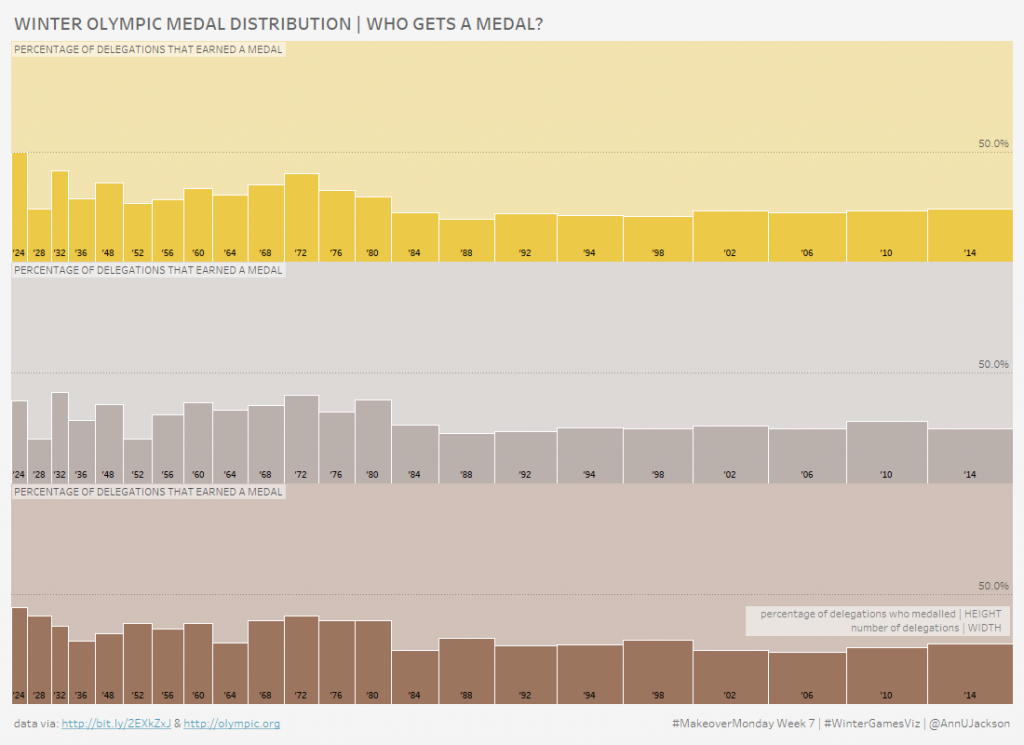
What are you looking at? Medals are clearly parsed out into Gold, Silver, and Bronze. Each bar represents a Winter Games. The width of the bar is the # of countries/delegations, the height of the bar is the % of countries who medalled in that respective color. I concede in this that eliminating the dimensionality of medals may have made for a more consolidated view, but I selfishly wanted to use the different colors.
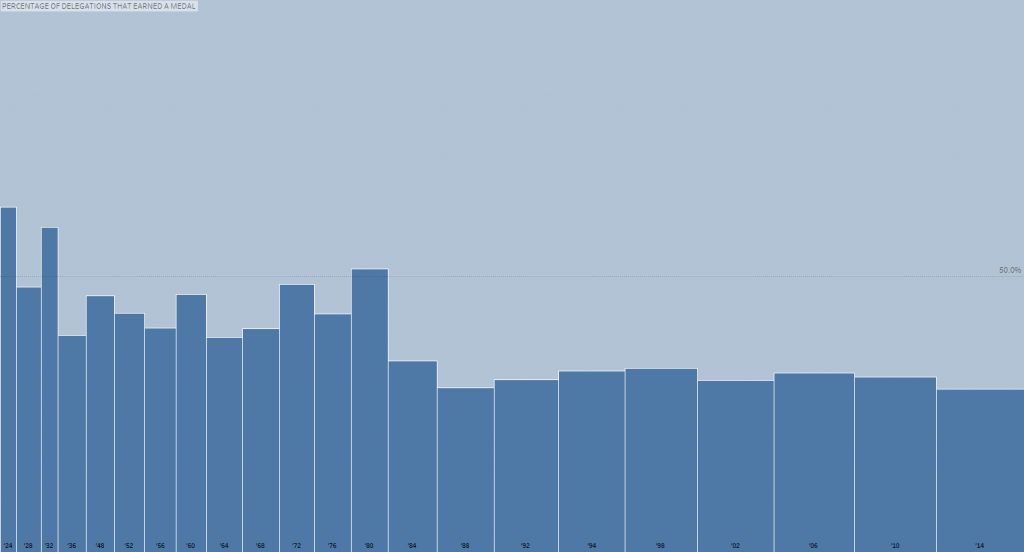
Here’s the non-medalled version:
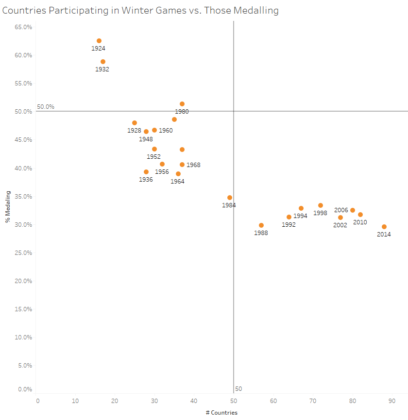
Less abstracted, more analytically presented:
Ultimately for the sake of the exercise I went with continuous bar sizing representing the number of delegations at each Winter Games. And my “why” is because this isn’t often seen and within the confines of this visualization it would be a great usage. Explaining this aloud should facilitate easy cognition. The wider bars means more countries participating (reinforced by our general knowledge of the games). And then the height of the bars can cleanly represent the percentage of those getting medals. Plus – per usual – the tooltip divulges all this in well articulated detail. (++ bars allow for chronology of time)
I’m quite pleased with this one. Maybe because I am the designer, but I was delighted with the final representation both from a visual perspective and an analytical presentation perspective. There is a certain amount of salience in having both the bars gets larger over time (and repeating that 3 times) and the colors of the medals being represented within a single worksheet.