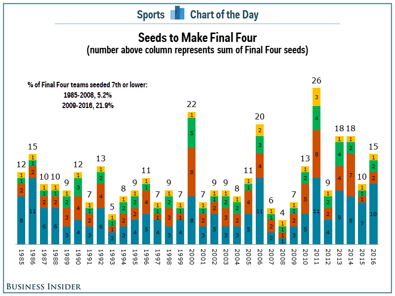
This week’s Makeover Monday topic was based on an article attempting to provide analysis into why it is harder for people to correctly pick their March Madness brackets. The original visualization is this guy:
With most Makeover Monday approaches I like to review the inspiration and visualization and let that somewhat decide the direction of my analysis. In this case I found that completely impossible. For my own sake I’m going to try and digest what it is I’m seeing/interpreting.
- Title indicates that we’re looking at the seeds making the final 4
- Each year is represented as a discrete value
- I should be able to infer that “number above column represents sum of Final Four seeds” by the title
- In the article it says in 2008 that all the seeds which made it to the final 4 were #1 – validates my logical assumption
- Tracking this down further, I am now thinking each color represents a region – no idea which colors mean what – I take that back, I think they are ranked by the seed value (it looks like the first instance of the best seed rank is always yellow)
- And then there’s an annotation tacked on % of Final Four teams seeded 7th or lower for two different time periods
- Does 5.2% from 1985 to 2008 equal: count the blue bars (plus one red bar) with values >=7 – that’s 5 out of (24 * 4) = 5/96 = 5.2%
- Same logic for the second statistic: 7 out of (8 * 4) = 21.9%
And then there’s the final distraction of the sum of the seed values above each bar. What does this accomplish? Am I going to use it to quickly try and calculate an “average seed value” for each year? Because my math degree didn’t teach me to compute ratios at the speed of thought – it taught me to solve problems by using a combination of algorithms and creative thinking. It also doesn’t help me with understanding interesting years – the height of the stacked bars does this just fine.
So to me this seems like an article where they’ve decided to take up more real estate and beef up the analysis with a visual display. It’s not working and I’m sad that it is a “Chart of the Day.”
Now on to what I did and why. I’ll add a little preface and say that I was VERY compelled to do a repeat of my Big Game Battle visualization, because I really like the idea of using small multiples to represent sports and team flux. Here’s that display again:
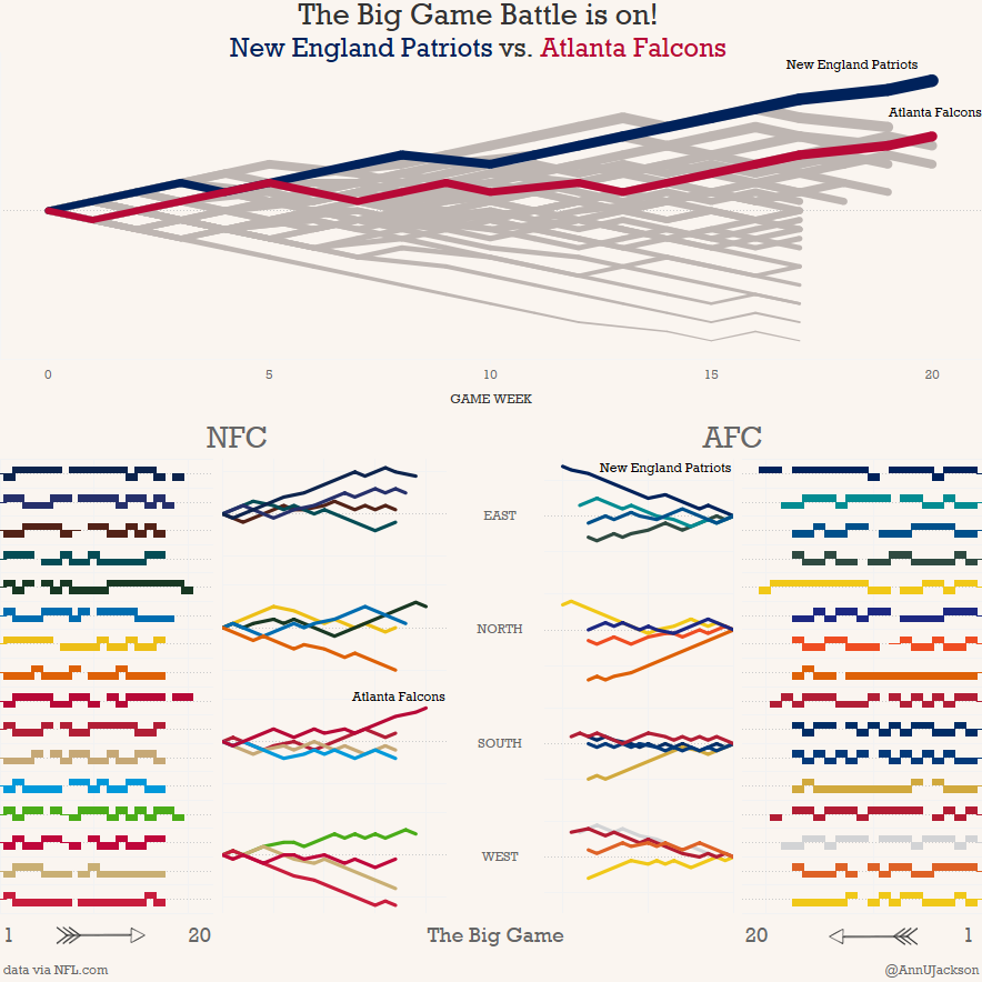
Yes – you have to interact to understand, but once you do it is very clear. Each line represents a win/loss result for the teams. They are then bundled together by their regions to see how they progressed into the Superbowl. In the line chart it is a running sum. So you can quickly see that the Patriots and Falcons both had very strong seasons. The 49ers were awful.
So that was my original inspiration, but I didn’t want to do the same thing and I had less time. So I went a super distilled route of cutting down the idea behind the original article further. Let’s just focus on seed rank of those in the championship. To an extent I don’t really think there’s a dramatic story in the final 4 rankings – the “worst” seed that made it there was 11th. We don’t even know if that team made it further.
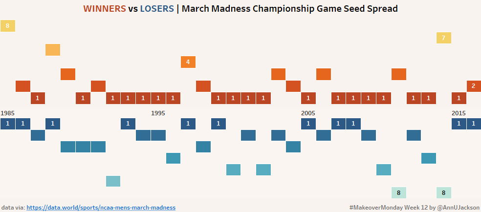
In my world I’ve got championship winners vs. losers with position indicating their seed rank. Color represents the result for the team for the year and for overall visual appeal I’ve made the color ramp. To help orient the reader, I’ve added min/max ranks (I screwed this up and did pane for winner, should have been table like it is for loser, but it looks nice anyway). I’ve also added on strategic years to help demonstrate that it’s a timeline. If you were to interact, you’d see the name of the team and a few more specifics about what it is you’re looking at.
The reality of my takeaway here – a #1 seed usually wins. Consistently wins, wins in streaks. And there’s even a fair amount of #1 losers. If I had to make a recommendation based on 32 years of championships: pick the #1 seeds and stick with them. Using the original math from the article: 19 out of 32 winners were seed #1 (60%) and 11 out of 32 losers were seed #1 (34%). Odds of a 1 being in the final 2 across all the years? 47% – And yes, that is said very tongue in cheek.