This week’s Workout Wednesday had us taking NCAA data and developing a single chart that showed the cumulative progression of a basketball game. More specifically a line chart where the X axis is countdown of time and the Y axis is current score. There’s some additional detail in the form of the size of each dot representing 1, 2, or 3 points. (see cover photo)
Here’s what the underlying data set looks like:
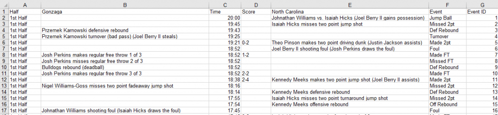
Comparing the data structure to the image and what needs to be produced my brain started to hurt. Some things I noticed right away:
- Teams are in separate columns
- Score is consolidated into one column and only displayed when it changes
- Time amount is in 20 minute increments and resets each half
- Flavor text (detail) is in separate columns (the team columns)
- Event ID restarts each half, seriously.
My mind doesn’t like that there’s a team dimension that’s not in the same column. It doesn’t like the restarting time either. It really doesn’t like the way the score is done. These aren’t numbers I can aggregate together, they are raw outputs that are in a string format.
Nonetheless, my goal for the Workout was to take what I had in that structure and see if I could make the viz. What I don’t know is this: did Andy do it the same way?
My approach:
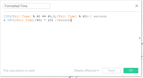
First I needed to get the X axis working. I’ve done a good bit of work with time so I knew a few things needed to happen. The first part was to convert what was in MM:SS to seconds. I did this in my mind to change the data to a continuous axis that I could format into MM:SS format. Here’s the calculation:
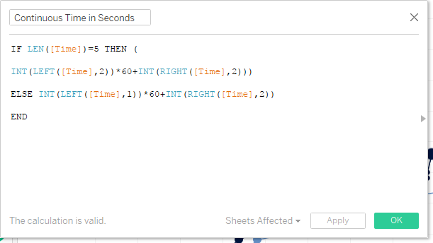
I cheated and didn’t write my calculated field for longevity. I saw that there was a dropped digit in the data and compensated by breaking it up into two parts. Probably a more holistic way to do this would be to say if it is of length 4 then append a 0 to the string and then go about the same process. Here’s the described results showing the domain:
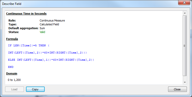
Validation check: the time goes from 0 to 20 minutes (0 to 20*60 seconds aka 1200 seconds). We’re good.
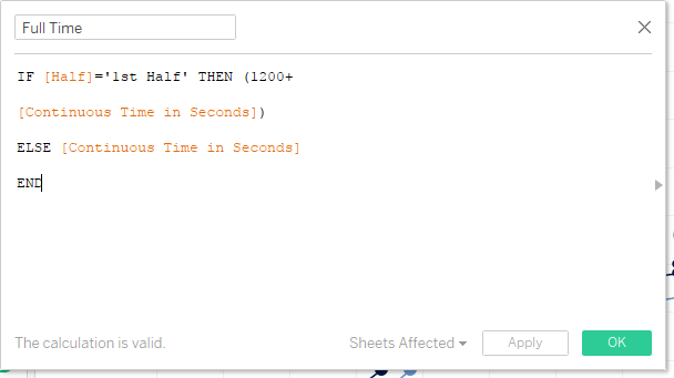
Next I needed to format that time into MM:SS continuous format. I took that calculation from Jonathan Drummey. I’ve used this more than once, so my google search is appropriately ‘Jonathan Drummey time formatting.’ So the resultant time ‘measure’ was almost there, but I wasn’t taking into consideration the +20 minutes for the first half and that the time axis was full game duration. So here’s the two calculations that I made (first is +20 mins, then the formatting):
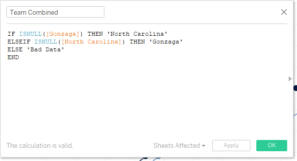
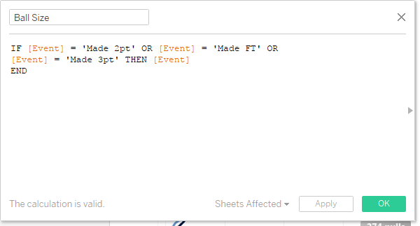
At this point I felt like I was kind of getting somewhere – almost to the point of making the line chart, but I needed to break apart the teams. For that bit I leveraged the fact that the individual team fields only have details in them when that team scores. Here’s the calc:
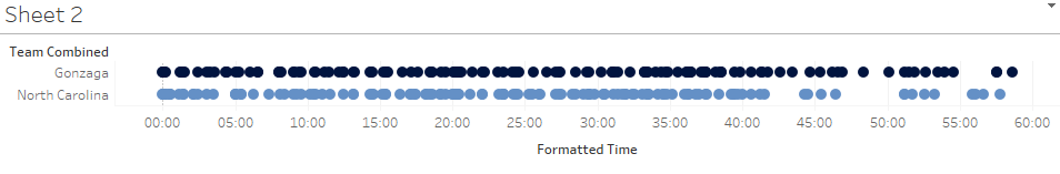
I still don’t have a lot going on – at best I have a dot plot where I can draw out the event ID and start plotting the individual points.
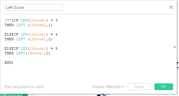
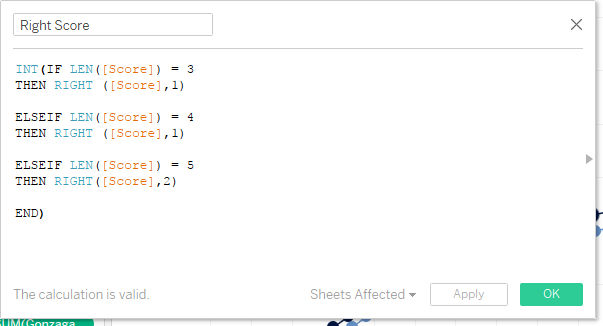
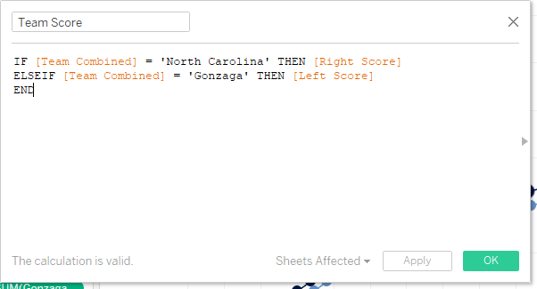
So to get the score was relatively easy. I also did this in a custom to the data set kind of way with 3 calculations – find the left score, find the right score, then tag the scores to the teams.
Throwing that on rows, here’s the viz:
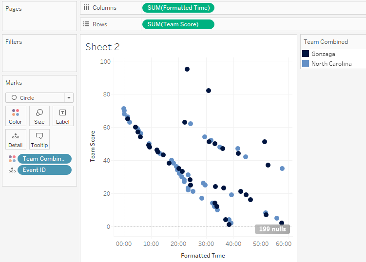
All the events are out of order and this is really difficult to understand. To get closer to the view I did a few things all at once:
- Reverse the time axis
- Add Sum of the Team Score to the path
- Put a combined half + event field on detail (since event restarts per half)
Also – I tried Event & Half separately and my lines weren’t connected (broken at half time; so creating a derived combined field proved useful at connecting the line for me)
Here’s that viz:
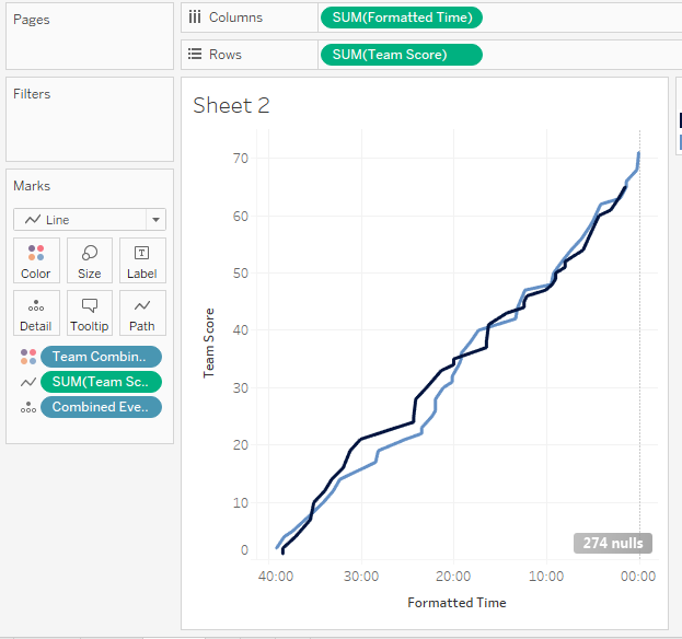
It’s looking really good. Next steps are to get the dots to represent the ball sizes.
One of my last calculations:
That got dropped on size on a duplicated and synchronized “Team Score.” To get the pesky null to not display from the legend was a simple right click and ‘hide.’ I also had to sort the Ball Size dimensions to align with the perceived sizing. Also the line size was made super skinny.
Now some cool things happened because of how I did this: I could leverage the right and left scores for tooltips. I could also leverage them in the titling of the overall scores UNC = {MAX([LeftScore]}.
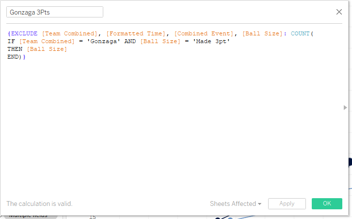
Probably the last component was counting the number of baskets (within the scope of making it a single returned value in a title per the specs of the ask). Those were repeated LODs:
And thankfully the final component of the over sized scores on the last marks could be accomplished by the ‘Always Show’ option.
Now I profess this may not be the most efficient way to develop the result, heck here’s what my final sheet looks like:
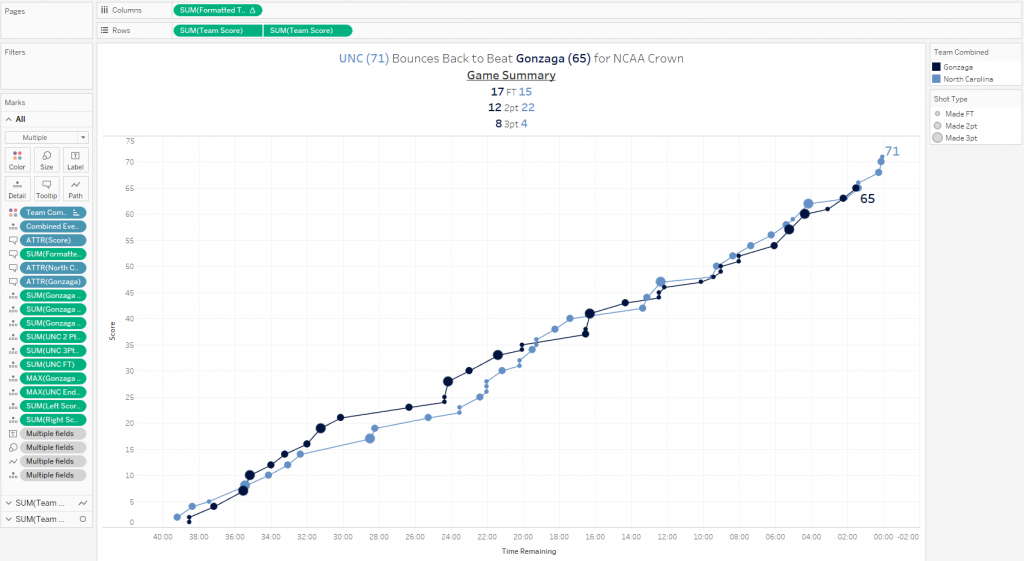
All that being said: I definitely accomplished the task.
In Part 2 of this series, I’ll be dissecting how Andy approached it. We obviously did something different because it seems like he may have used the Attribute function (saw some * in tooltips). My final viz has all data points and no asterisks ex: 22:03 remaining UNC. Looking at that part, mine has each individual point and the score at each instantaneous spot, his drops the score. Could it be that he tiptoed around the data structure in a very different way?
I encourage you to download the workbook and review what I did via Tableau Public.
Hi,
I am unable to get the formatted time in minutes and seconds. The formatted time is displayed as numbers in my chart as opposed to minutes and seconds in yours. Would you know why?
Thanks,
Deepa
The last step to getting the time formatted correctly is to adjust the Number Format display. You’ll want to change it to custom and then type “00:00” in the free text field box. This should add the colons to your number format.