We had another giant data set this week – 202 million records of EPA Ozone readings across the United States. The giant data set is generously hosted by Exasol. I encourage you to register here to gain access to the data.
The heart of the data is pretty straight forward – PPM readings across several sites around the nation for the past 25+ years. As I went through and browsed the data set, it’s easy to see that there are multiple readings per site per day. Here’s the basic data model:
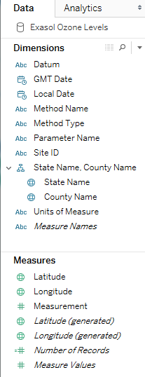
Parameter Name only has Ozone, Units of Measure only has Parts per million. There is one little tweak to this data set – the Datum field. Now this wasn’t a familiar term for me, so I described the domain to see what it had.
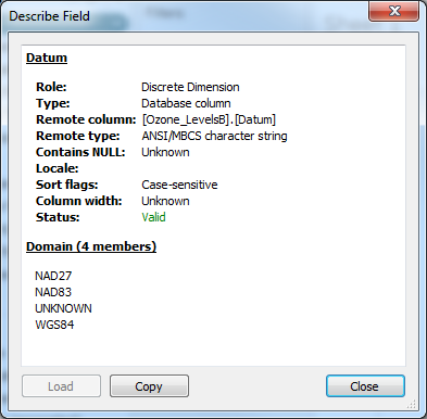
I know exactly what one of these 4 things means (beyond Unknown) – that’s WGS84. I was literally at the Alteryx Inspire conference two weeks ago and in a Spatial Analytics session where people were talking about different standards for coordinate systems on Earth. The facilitators mentioned that WGS84 was a main standard. For fun I decided to plot the number of records for each Datum per year to see how the Lat/Lon have potentially changed in measurement over time. Since 2012 it seems like WGS84 has dominated as the preferred standard.
So armed with that knowledge I sort of kept it in my back pocket of something I may need to be mindful of if I enter the world of mapping.
Beyond that, I had to start my focus on preparing something for Tableau Public. 202 million records unfortunately won’t sit on Public and I have to extract the data. Naturally I did what every human would do and zeroed in on my city: Phoenix Metropolitan area aka Maricopa County.
So going through the data set there are multiple sites that are taking measurements. And more than that, these sites are taking measurements multiple times per day. I really wanted to express that somehow in my final visualization. Here’s all the site averages plotted each day for the past 30 years – thanks Exasol!
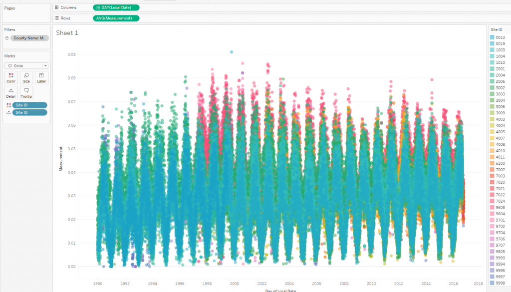
So this is averaged per day per site – and you can see how much variation there is. Some are reporting very low numbers, even zeros. Some are very high.
If I take off the site ID, here’s what I get for the daily averages:
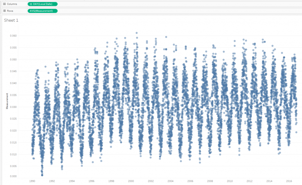
Notice the Y-axis – much less dramatic. Now the EPA has the AQI measurements and it doesn’t even get into the “bad” range until 0.071 PPM (Unhealthy for Sensitive Groups). So there’s less of a story to some extent when we take the averages. This COULD be because of the sites in Maricopa county (maybe there are low or faulty numbers dragging down the average) or it could be because when you do the average you’re getting better precision of truth.
I’m going down this path because at this point I decided to make a decision: I wanted to look at the maximum daily measurement. Given that these are instantaneous measurements, I felt that knowing the maximum measurement in a given day would also provide insight and value into how Ozone levels are faring. And more specifically, knowing my region a little bit – the measurement sites could be outside of well populated areas and may naturally have lower occurring measurements.
So that was step one for me: move to the world of MAX. This let me leverage all the site data and get going. (Also originally I wanted to jitter and display all the sites because I thought that would be interesting – I distilled the data down further because I wasn’t getting what I wanted in terms of presentation in the end result).
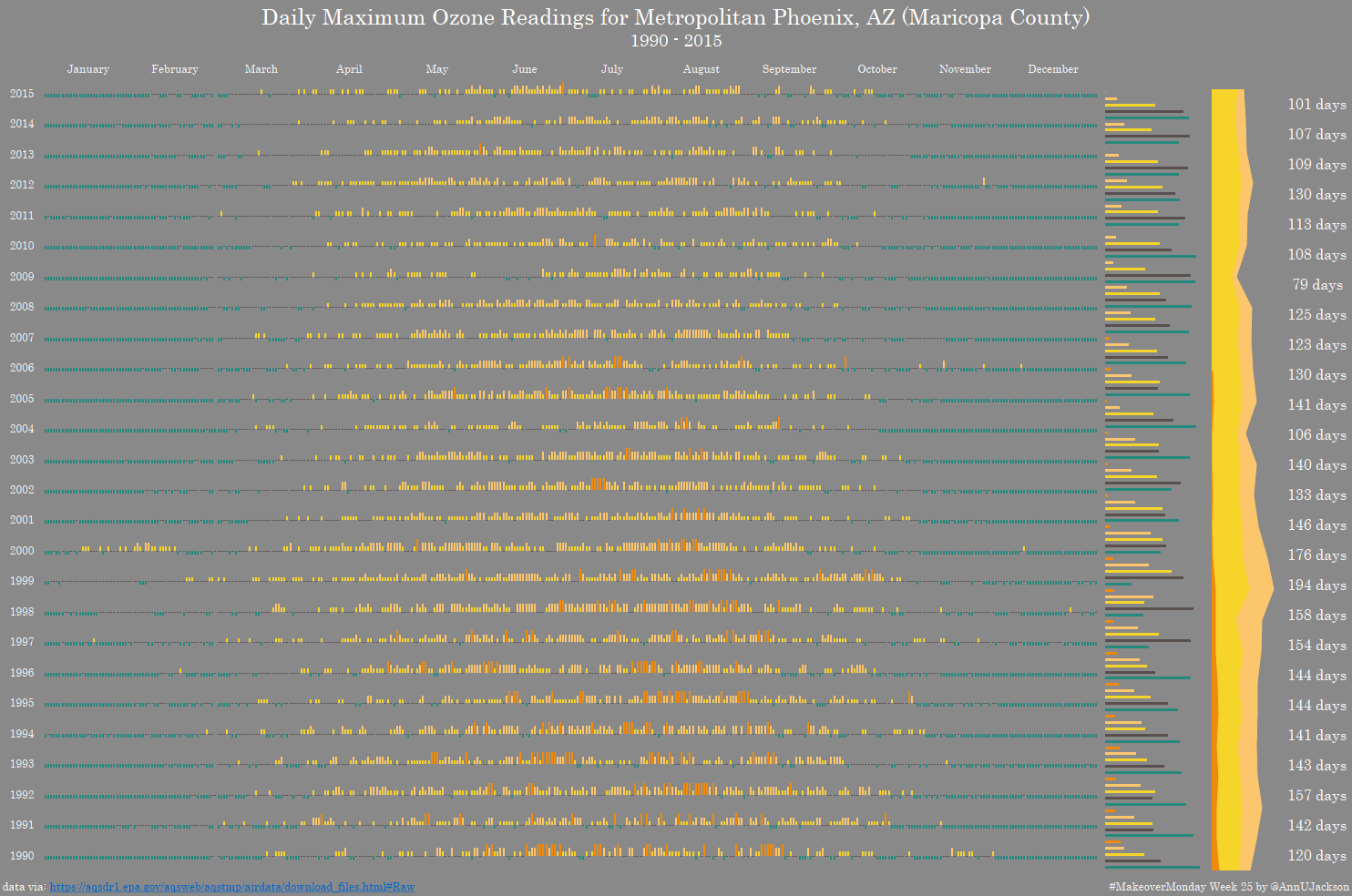
Okay – next up was plotting the data. I wanted to do a single page very dense data display that had all the years and the months and allowed for easy comparisons. I had thought a cycle plot may be appropriate, but after trying a few combinations I didn’t see anything special about day of the week additions and noticed that the measurement really is about time of year (the month). Secondary comparison being each year.
Now that I’ve covered that part – next up was how to plot. Again, this originally started out its life as dots that were going to be color encoded using the AQI scale with PPM on the Y-axis. And I almost published it that way. But to be honest with you, I don’t know if the minutia of the PPM really matters that much. I think that dimension defined on top of the measurement is easier for an end user to understand. Hence my final development fork: turn the categorical result into a unit measure (1, 2, 3, 4 etc.) as a byproduct to represent height of a bar chart. And that’s where I got really inspired. I made “Good” -1 and “Moderate” 0. That way anything positive on the Y-axis is a bad day. To me this will allow you to see the streaks of bad throughout the time periods.
Close up of 2015 – I love this. Look at those moderates just continuing the axis. Look how clear the not so good to very bad is. This resonates with me.

Okay – so final steps here were going to be to have a map of all the measurements at each site (again the max for each site based on the user clicking a day). It was actually quite cute showing Phoenix more close up. And then I was going to have national readings (max for each site upon clicking a day) as a comparison. This would have been super awesome – here’s the picture:
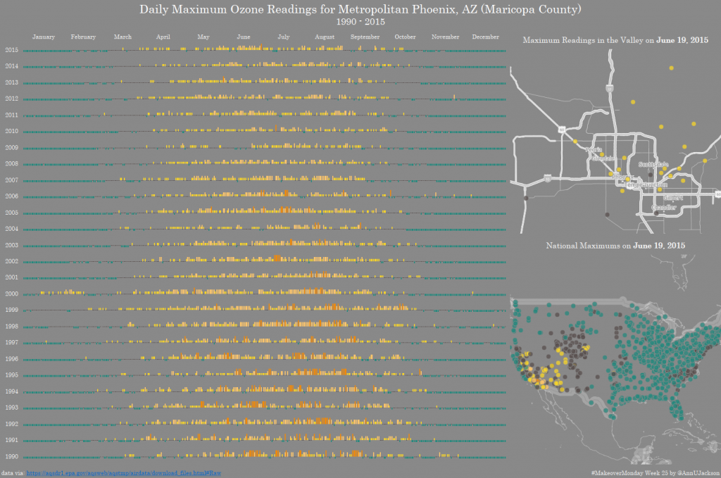
So good. And perhaps I could have kept this, but knowing I have to go to Tableau Public – it just isn’t going to handle the national data well. So I sat on this for an evening and while I was driving to work I decided to do a marginal chart that showed the breakdown of number of days of each type. The “why” was because it looks like things are getting better – more attention needs to be drawn to that!
So last steps ended up being to add on the marginal bar charts and then go one step further to isolate the “bad days” per year and have them be the final distilled metric at the far far right. My thought process: scan each year, get an idea of performance, see it aggregated to the bar chart, then see the bad as a single number. For sheer visual pleasure I decided to distill the “bad” further into one more chart. I had a stacked bar chart to start, but didn’t like it. I figured for the sake of artistry I could get away with the area chart and I really like the effect it brings. You can see that the “very bad” days have become less prominent in recent years.

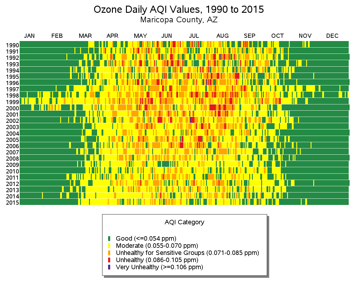
So that pretty much sums up the development process. Here’s the full viz again and a comparison to the original output for Maricopa County, which echos the sentiment of my maximums – Ozone measurements are going down.