This week’s data set demonstrates the number of users per 100 people by country spanning several years. The original data set and accompanying visualization starts as an interactive map with the ability to animate through the changing values year by year. Additionally, the interactor can click into a country to see percentage changes or the comparative changes with multiple countries.
Channeling my inner Hans Rosling – I was drawn to play through the animation of the change by year, starting with 1960. What sort of narrative could I see play out?
Perhaps it was the developer inside of me, but I couldn’t get over the color legend. For the first 30 years (1960 to 1989) there’s only a few data points, all signifying zero. Why? Does this mean that those few countries actually measured this value in those years, or is it just bad data? Moving past the first 30 years, my mind was starting to try and resolve the rest of usage changes. However – here again my mind was hurt by the coloration. The color legend shifts from year to year. There’s always a green, greenish yellow, yellow, orange, and red. How am I to ascertain growth or change when I must constantly refer to the legend? Sure there’s something to say about comparing country to country, but it loses alignment once you start paginating through the years.
Moving past my general take on the visualization – there were certain things I picked up on and wanted to carry forward on my makeover. The first was the value out of 100 people. Because I noticed that the color legend was increasing year to year, this meant that overall number of users was increasing. Similarly, when thinking about comparing the countries, coloration changed, meaning ranks were changing.
I’ll tell you – my mind was originally drawn to the idea of 3 slope charts sitting next to each other. One representing the first 5 years, then next 5 years, and so on. Each country as a line. Well that wasn’t really possible because the data has 1990 to 2000 as the first set of years – so I went down the path of the first 10 years. It doesn’t tell me much other than something somewhat obvious: internet usage exploded from 1990 to 2000.
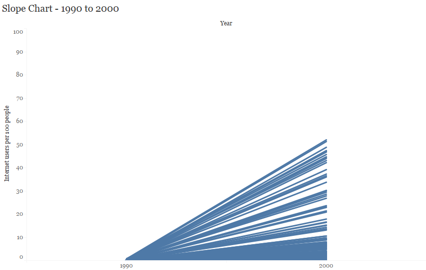
Here’s how the full set would have maybe played out:
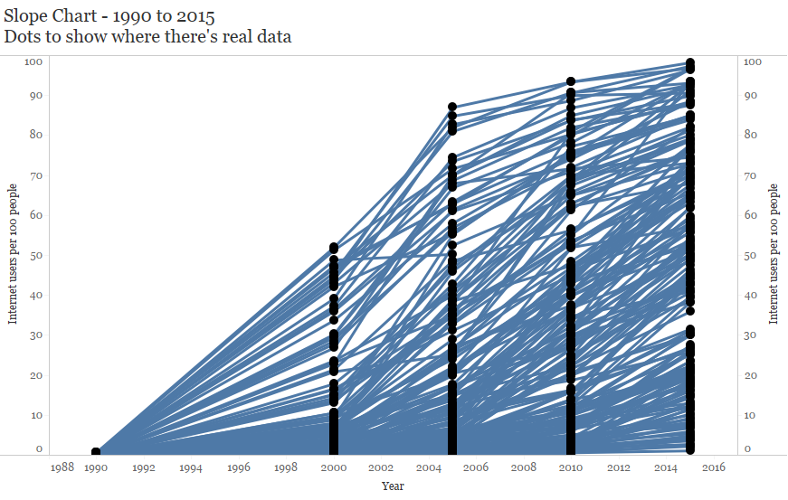
This is perhaps a bit more interesting, but my mind doesn’t like the 10 year gap between 1990 and 2000, five year gaps from 2000 to 2010, and then annual measurements from 2010 to 2015 (that I didn’t include on this chart). More to the point, it seems to me that 2000 may be a better starting measurement point. And it created the inflection point of my narrative.
Looking at this chart – I went ahead and decided my narrative would be to understand not only how much more internet usage there is per country, but to also demonstrate how certain countries have grown throughout the time periods. I limited the data set to the top 50 in 2015 to eliminate some of the data noise (there were 196 members in the country domain, when I cut it to 100 there were still some 0s in 2000).
To help demonstrate that usage was just overall more prolific, I developed a consistent dimension to block out number of users. So as you read it – it goes from light gray to blue depending on the value. The point being that as we get nearer in time, there’s more dark blue, no light gray.
And then I went the route of a bump chart to show how the ranks have changed. Norway had been at the top of the charts, now it’s Iceland. When you hover over the lines you can see what happened. And in some cases it makes sense, a country is already dominating usage, increasing can only go so far.
But there are some amazing stories that can unfold in this data set: check out Andorra. It went from #33 all the way up to #3.
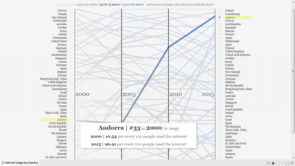
You can take this visualization and step back into different years and benchmark each country on how prolific internet usage was during the time. And do direct peer comparatives to boot.
This one deserves time spent focused on the interactivity of the visualization. That’s part of the reason why it is so dense at first glance. I’m intentionally trying to get the end user to see 3 things up front: overall internet usage in 2000 (by size and color encoding) and the starting rank of countries, the overall global increase in internet usage (demonstrated by coloration change over the spans), and then who the current usage leader is.
Take some time to play with the visualization here.
I love reading how you approach your visualisations and end up with the amazing solutions you create. Well done!
Pingback: #MakeoverMonday Week 22: Internet Usage – Dreams of Data