This week’s data set presented itself with a new and unique challenge – 100 million plus records and a slight nod to #IronViz 2016.
#MakeoverMonday is just around the corner – here is a preview of the BIG DATA challenge we have in store for you.https://t.co/KSUMWgxAb0 pic.twitter.com/2JvkfT1CdT
— Eva Murray (@TriMyData) February 4, 2017
Yep – Taxi data and lots of it, this time originating from Chicago. The city of Chicago recently released 2013 to 2016 data on taxi rides and the kind folks at EXASOL took the opportunity to ingest the massive data set and make it available for #MakeoverMonday. Synergy all around is felt: from EXASOL getting free visualizations, to data vizzers getting the opportunity to work in a data storage platform designed to make massive data vizzing possible, to understanding the unique challenges seen once you get such an explosively large data set into Tableau.
So how did I take on this challenge and what are some things I learned? Well, first I had an inkling going in that this was going to be a difficult analysis. I had some insight from an #IronViz contestant that maybe taxi data isn’t super interesting (and who would expect it to be). There’s usual things we all likely see that mirror human events (spikes around holidays, data collected around popular locations, increases in $$), but beyond that it can be tough to approach this data set looking for a ‘wow’ moment.
To offset this, my approach was exploration. Organize, separate, quantify, and educate the data interactor into the world of Chicago taxis. Let’s use the size of the aggregations to understand what Chicago is like. Essentially my end design was built to allow someone to safely interact with the data and get a sense for how things change based on several (strategically) predetermined dimensions.
The dimensions I chose to stick with for this visualization: focus on the community areas (pick up and drop off points), separate shorter trip lengths into 5 mile increments, and bucket time into 6 different chunks throughout the day. (Admittedly the chunking of time was a rip off my own week 3 makeover where I used the same calculation to bucket time.)
Having the basic parameters of how the data was being organized, it was time to go about setting up the view. I tried several combinations of both size, color, shape to facilitate a view I was committed to – using circles to represent data points for pickup locations by some time constraint. I arrived at this as the final:
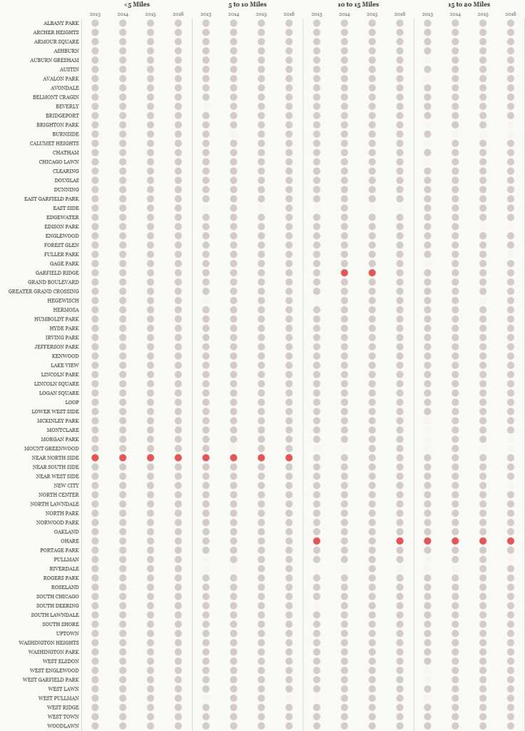
What I really like about it: red exposes the maximum for each year and ride length. Demonstrates very quickly where “most rides” are. There’s visual interest in the 10 to 15 mile range category. There’s interest in the blank space – the void of data. And this also makes a great facilitator of interactivity. Consider each circle a button enticing you to click and use it to filter additional components on the right side.
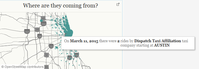
Next were the burly maps. Word of caution: do not use the unique identifier “trip id” and go plotting points. You’ll get stuck quickly. I’m not saying it is impossible, but I think to render the initial visualization it would take about an hour (based on my trying). So instead of going to the trip id level, I took a few stabs at getting granular. First step was, let’s just plot each individual day (using average lat/lon for pickup/dropoff spots). This plotted well. Then it was a continuation of adding in more and more detail to get something that sufficiently represented the data set, without crippling the entire work product. I accomplished this by adding in both the company ID (a dimension of 121 members) and the accompanying areas (pickup/drop off area, 78 member dimension). This created the final effect and should represent the data with a decent amount of precision.
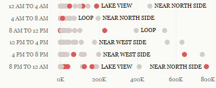
Finally I went ahead and added in a few more visually interesting dot plots that highlighted maximums for specific areas. This is ideally used in conjunction with the large table at left to start gathering more understanding.
I have to say – I am somewhat pleased with the result of this dashboard. I’m not sure it will speak to everyone (thinking the massive left side table may turn folks off or have whispers of “wasted opportunity” to encode MORE information). However – I am committed to the simplicity of the display. It accomplishes for me something I was aiming to achieve – understanding several different geographical locales of Chicago and making something that could stand alone and provide “aha” moments. In particular I’d like to know why Garfield Ridge overtook O’Hare for 10-15 mile fares in ’14 and ’15. One for Google to answer.