**Update (1/20/17) : The original data set had a date formatting snafu resulting in 1307 tweets at the 12:00-12:59 PM (UTC time) hour to be displayed as 00:00-00:59 (aka 12 AM hour). This affected 4.3% of the original data set visualization and has been corrected. I have also added a footnote denoting the visualization is in EST. This affects the shape of the data in both the 4 AM – 8 AM and 4 PM – 8 PM sections.
Rolling right along into week 3’s Makeover Monday. The data set this week: Donald Trump’s tweets. The original Buzzfeed viz and article accompanying this analyzed Trump’s retweet activity since his announcement of running for president. The final viz ended up being what I would best describe as bubble charts of the top users he retweeted during this time:

What’s interesting is that the actual article goes into significant depth on how their team systematically reviewed the tweets. It’a a bummer that the additional analysis done couldn’t be synthesized into visual form.
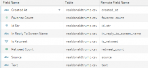
My take on the makeover this week was driven completely by the underlying data available. The TDE provided had the following fields:
Two things stuck out to me with the data. First: the username being retweeted wasn’t included; second: the entire tweet text was included. Having full text available just screams for some sort of text analysis. I got committed at that point to doing something with the text.
My initial idea was to do some sort of sentiment analysis. Recently I had installed both R-Studio and Python on my PC to try integration with Tableau. I’d had success with R-Studio (mind you after watching a brief YouTube video), but I hadn’t gotten Python to cooperate (my effort in assisting in this cooperation = 2 out of 10). I figured since I had both available maybe I should make an attempt. After marinating on the concept I didn’t feel comfortable adding more sentiment analysis to the fire of American politics. (On a personal note: I have been politically checked out since the early primaries.)
So instead of doing sentiment analysis, I decided to turn the data more into text mining for mentions and hashtags. I had done some fiddling with the time component and was digging how the cycle plot/horizon chart were playing out visually. So it seemed natural to continue on a progression of getting more details out of the bars and times of day.
Note on the time: time is graciously parsed into correct format with the data. In looking at the original time, I am under the impression it was represented in GMT (+0000). To adjust for this, I added -5 hours to all of the parsed dates to put it in EST aka Trump time.
So back to text mining. Post #data16 conference, a colleague of mine was recounting how to use regex to scrub through text. I walked away from his talk thinking I need to use that next time I have the opportunity. And what I love about it: NATIVE FUNCTION TO TABLEAU!! So this was making me sing. Now I don’t know a ton about regex (lots of notation I have yet to memorize), so I decided to quickly google my way to getting the user handles and hashtags. These handy results really made this analysis zip along: regexr & regex+twitter.
Everything else came to life pretty quickly. I knew I wanted to include at least one or two tweets to read through, but I wanted to keep it curated. I think this was accomplished well and I spent a good deal of time trying out different time combinations just to see what would bubble to the surface.
A final note on aesthetics this week: I’m reading Alberto Cairo’s The Functional Art, and as I mentioned in an earlier post, I’m also participating in his MOOC that starts tomorrow. I am only 4 chapters in, but Alberto has me taking a few things to heart. I don’t think it is by coincidence that I decided to push the beauty side of things. I always strive for elegance, but I strive for it through white space and keeping that “data ink ratio” at a certain point. But I’m not blind to the different visualizations out there that attract people. So for once I used a non-white background (yay!). And I also went for a font that’s well outside of the look of my usual vizzing font.
More than focusing on aesthetics, is of course the function of the viz. I tried to spend more time thinking about the audience and what they were going to “get” out of it. I hope that the final product is less of a “visual aid” to my analysis and more of an interactive tool to explore the tweets of the soon to be President.
Full viz available on my Tableau public page.