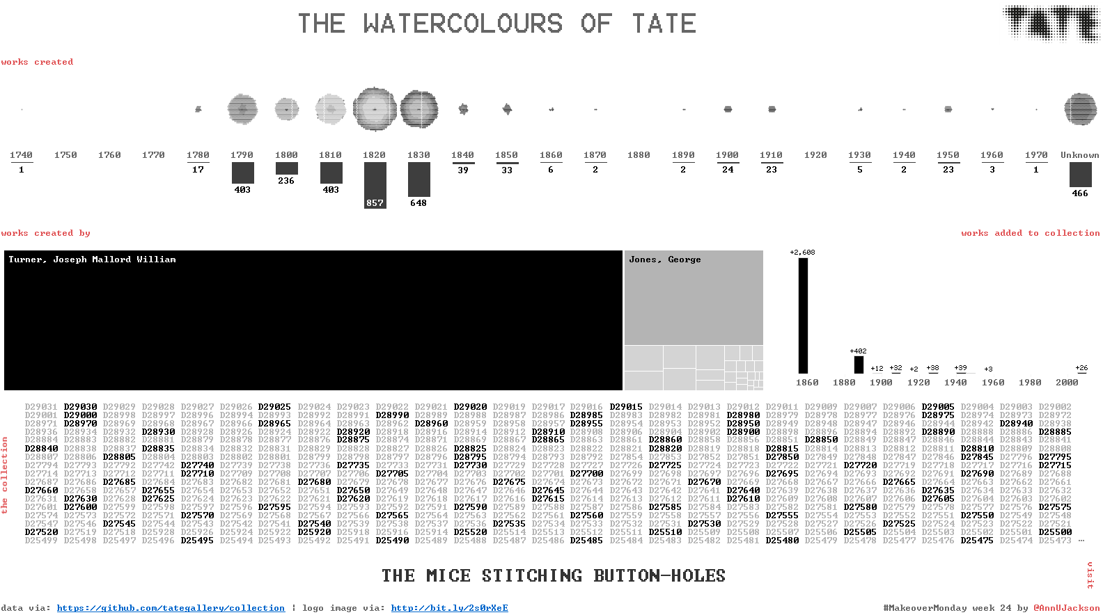
#MakeoverMonday Week 24 – The Watercolours of Tate
First – I apologize. I did a lot of web editing this week that has led to a series of system fails. The first was spelling the hashtag wrong. Next …
Data Visualization & Analytics Consulting
First – I apologize. I did a lot of web editing this week that has led to a series of system fails. The first was spelling the hashtag wrong. Next …
I’m now back in full force from an amazing analytics experience at the Alteryx Inspire conference in Las Vegas. The week was packed with learning, inspiration, and community – things …

When I went to the Tableau Conference last year, I felt it was important to spend some time documenting my experience. Anytime I go to a conference related to my …
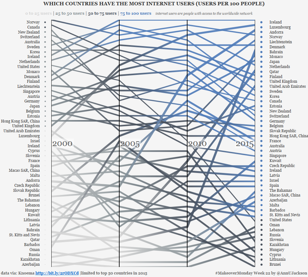
This week’s data set demonstrates the number of users per 100 people by country spanning several years. The original data set and accompanying visualization starts as an interactive map with …
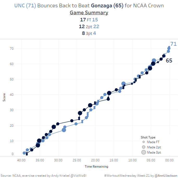
This week’s Workout Wednesday had us taking NCAA data and developing a single chart that showed the cumulative progression of a basketball game. More specifically a line chart where the …

After some botched attempts at reestablishing routine, #MakeoverMonday week 21 got made within the time-boxed week! I have one pending makeover and an in-progress blog post to talk about Viz …
I’ve been very interested in pursuing a concept I originally saw in my twitter feed, a picture of Chris Love at a pub with a blurb about ‘Viz Club.’ Following …
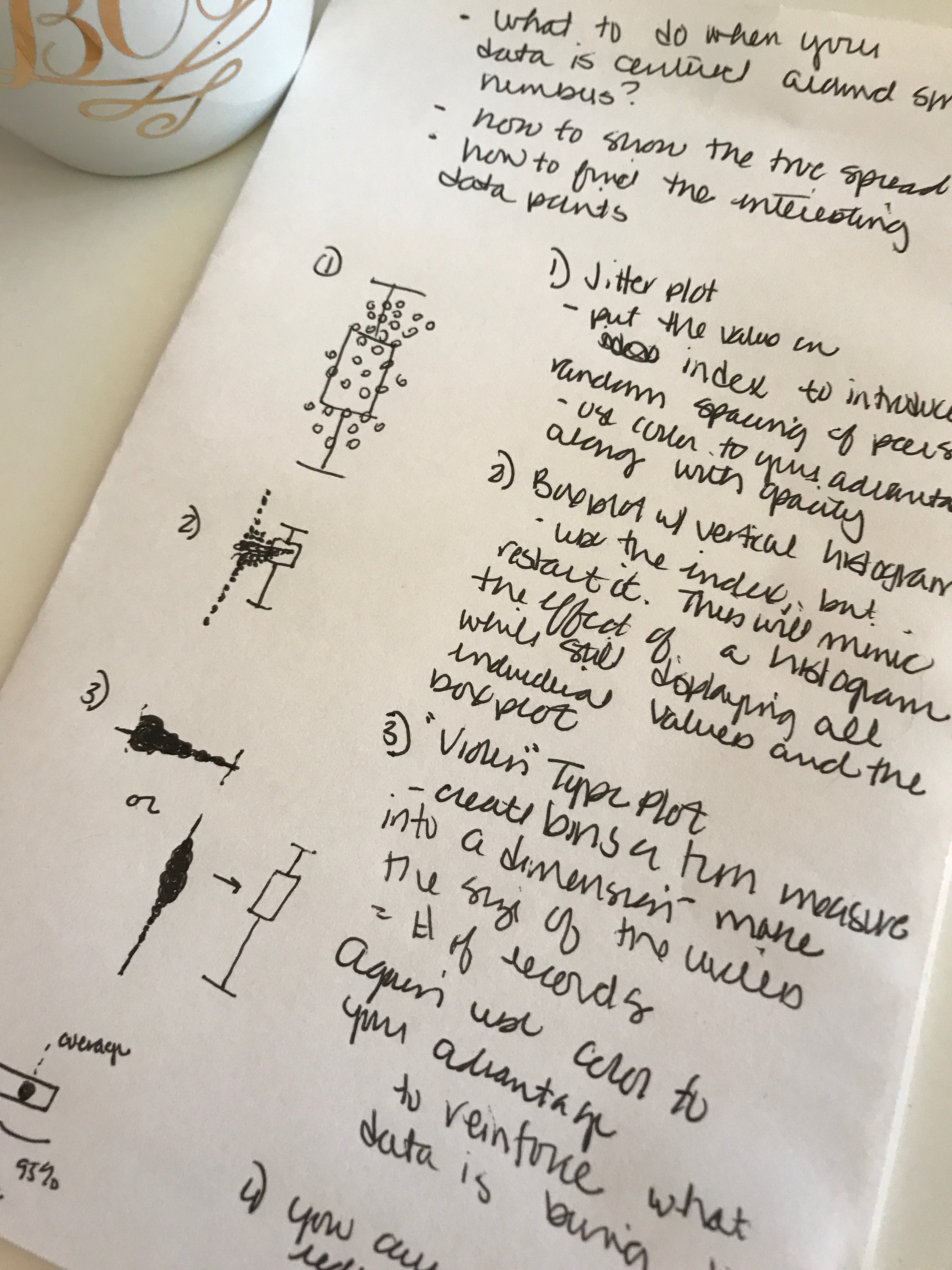
Recently I was on a project that involved working with data centered around one value. You can imagine the type: something where there is an intended value, or a maximum …
Time for another recount of the content I’ve been consuming. I missed my March post, so I figured it would be fine to do a combined effort. First up: The …
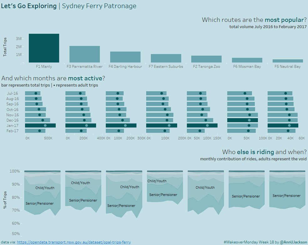
{witty intro} This week’s makeover challenge was to take Sydney ferry data for 7 ferry lines and 8 months. What’s even better is there was another dimension with a domain …